5

I am moving my plots into ggplot. Almost there except for this one (code got from this previous question):
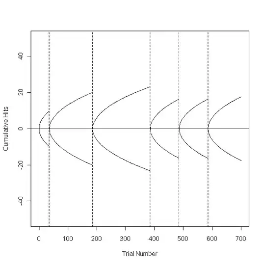
ggplot plot should look like this

#Set the bet sequence and the % lines
betseq <- 0:700 #0 to 700 bets
perlin <- 0.05 #Show the +/- 5% lines on the graph

#Define a function that plots the upper and lower % limit lines
dralim <- function(stax, endx, perlin) {
  lines(stax:endx, qnorm(1-perlin)*sqrt((stax:endx)-stax))
  lines(stax:endx, qnorm(perlin)*sqrt((stax:endx)-stax))
}

#Build the plot area and draw the vertical dashed lines
plot(betseq, rep(0, length(betseq)), type="l", ylim=c(-50, 50), main="", xlab="Trial Number", ylab="Cumulative Hits")
abline(h=0)
abline(v=35, lty="dashed") #Seg 1
abline(v=185, lty="dashed") #Seg 2
abline(v=385, lty="dashed") #Seg 3
abline(v=485, lty="dashed") #Seg 4
abline(v=585, lty="dashed") #Seg 5

#Draw the % limit lines that correspond to the vertical dashed lines by calling the
#new function dralim.
dralim(0, 35, perlin) #Seg 1
dralim(36, 185, perlin) #Seg 2
dralim(186, 385, perlin) #Seg 3
dralim(386, 485, perlin) #Seg 4
dralim(486, 585, perlin) #Seg 5
dralim(586, 701, perlin) #Seg 6

I can show how far I've got (not far):

ggplot(a, aes(x=num,y=s, colour=ss)) +geom_line() +stat_smooth(method="lm", formula="y~poly(x,2)") 
my attempt

To be clear. I am plotting my data over the reference lines (top image). The bottom image shows my data and my poor attempt at getting the reference lines (which obviously hasn't worked).
Community
  • 1
  • 1
Frank Zafka
  • 829
  • 9
  • 30

1 Answers1

3

What you were doing was fitting a parabola to your data, not drawing a previously defined parabola. It's not too hard to adapt what you had to ggplot.

Same start as you had (though betseq is not actually used anywhere)

#Set the bet sequence and the % lines
betseq <- 0:700 #0 to 700 bets
perlin <- 0.05 #Show the +/- 5% lines on the graph

Not instead of a function which draws lines, make a function which returns geom_lines (in a list) that are what you want. There is an implied aes(x=x, y=y) which will be given in the ggplot declaration later, but this defines the data points that make the parabolas.

#Define a function that plots the upper and lower % limit lines
dralim <- function(stax, endx, perlin) {
  c(geom_line(data = data.frame(x=stax:endx, 
                                y=qnorm(1-perlin)*sqrt((stax:endx)-stax))),
    geom_line(data = data.frame(x=stax:endx, 
                                y=qnorm(perlin)*sqrt((stax:endx)-stax))))
}

To save repetition, define the position of the vertical lines (edges), which also can be used to define the left and right endpoints of the parabolas (ranges).

edges <- data.frame(x=c(0, 35, 185, 285, 485, 585, 700))
ranges <- data.frame(left = edges$x[-nrow(edges)],
                     right = edges$x[-1] + 1)

Now build the ggplot. There a single geom_vline to draw all the vertical lines (since we defined the positions in a single dataset). The unusual step is looping over the row (indices) of ranges and calling dralim with the corresponding left and right values (and perlin). This returns a list of lists of geom_lines, but that can just be added to a plot in the normal way and all the lines get added. The final two scale calls are just to set the labels and, in the case of the y axis, range.

ggplot(mapping=aes(x=x,  y=y)) +
  geom_vline(data=edges, aes(xintercept = x), linetype="dashed") +
  lapply(seq_len(nrow(ranges)), 
         function(r) {dralim(ranges$left[r], ranges$right[r], perlin)}) +
  scale_y_continuous("Cumulative Hits", lim=c(-50,50)) +
  scale_x_continuous("Trial Number")

enter image description here

Brian Diggs
  • 57,757
  • 13
  • 166
  • 188