a <- structure(list(
  X1 = structure(c(1L, 2L, 3L, 4L, 5L, 6L, 7L, 8L, 1L, 2L, 3L, 4L, 5L, 6L, 7L, 8L, 1L, 2L, 3L, 4L, 5L, 6L, 7L, 8L),
                  .Label = c("V1", "V2", "V3", "V4", "V5", "V6", "V7", "V8"), class = "factor"),
   X2 = structure(c(1L, 1L, 1L, 1L, 1L, 1L, 1L, 1L, 2L, 2L, 2L, 2L,  2L, 2L, 2L, 2L, 3L, 3L, 3L, 3L, 3L, 3L, 3L, 3L),
                    .Label = c("A", "B", "C"), class = "factor"),
  value = c(0.03508924, 0.03054929, 0.03820896, 0.18207091, 0.25985142, 0.03909991, 0.03079736,
            0.41436334, 0.02957787, 0.03113289, 0.03239794, 0.1691519, 0.16368845, 0.0287741, 0.02443448,
            0.33474091, 0.03283068, 0.02668754, 0.03597605, 0.17098721, 0.23048966, 0.0385765, 0.02597068, 0.36917749),
   se = c(0.003064016, 0.003189752, 0.003301929, 0.006415592, 0.00825635, 0.003479607,
          0.003195332, 0.008754099, 0.005594554, 0.006840959, 0.006098068, 0.012790908, 0.014176414,
          0.006249045, 0.005659445, 0.018284739, 0.005051873, 0.004719352, 0.005487301, 0.011454206,
          0.01290797, 0.005884275, 0.004738851, 0.014075813)),
  .Names = c("X1", "X2", "value", "se"), class = "data.frame", row.names = c(NA, -24L))
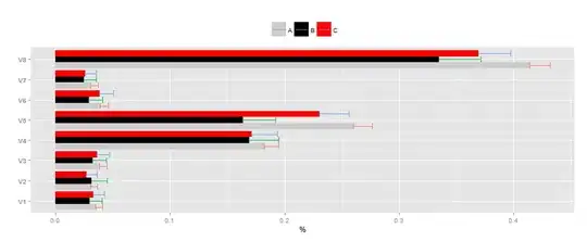
I'm plotting the above data (kept in dataset "a"), and I can't get the confidence interals to sit in the middle of the group chart.My attempts until now have only managed to put lines on the side of each bar, not in the middle like in the geom_errorbar helpfile.I've tried to manipulate the dodge parameters but it only made it worse. The chart needs to stay flipped over and in the code below I used geom_linerange but geom_errorbar would be even better. Another thing I haven't quite managed to do is to change the scale into whole numbers (without muliplying the original table ).
I've used the code below on a<-a[1:16,] (the first two groups). When I use the same code on the full table I get even worse results with the confidence intervals. Would anyone be able to help? Many thanks in advance.
limits <- aes(ymax = value + se, ymin=value - se)
 p<-ggplot(data = a, aes(x = X1, y =value))+
    geom_bar(aes(fill=X2),position = "dodge") +
    scale_x_discrete(name="")+
    scale_fill_manual(values=c("grey80","black","red"))+
    scale_y_continuous(name="%")+
    theme(axis.text.y = element_text(face='bold'),
          legend.position ="top",
          legend.title=element_blank())+
     coord_flip()
p + geom_linerange(limits)
