As other answers mentioned, there are two ways to make a scatter plot in matplotlib: One using scatter() and the other using plot() (it's actually a lineplot with markers on certain locations but it's possible to "turn off" lines leaving only the markers).
To set the border/edge width during the scatter() functional call, linewidth= (or lw=) should be used; and to do the same during a plot() functional call, markeredgewidth= (or mew=) should be used (because lw sets the width of the lines which are turned off in this case).
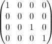
x = [0, 1, 2]

fig, (ax1, ax2) = plt.subplots(1, 2)

# square, blue, size=10 markers with black edges of width=3
ax1.plot(x, 's', ms=10, mec='black', mew=3)
ax2.scatter(x, x, marker='s', s=100, ec='black', lw=3)
To change the border/edge width after the plotter functional call, you can use set_* method on the relevant Artist object of each plotter1; plot() defines a lines object while scatter defines a collections object.2
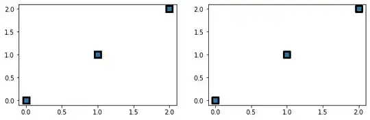
fig, (ax1, ax2) = plt.subplots(1, 2)
ax1.plot(x, 's')
ax2.scatter(x, x)

# make marker edge width = 3
ax1.lines[0].set_mew(3)
# or
ax1.lines[0].set_markeredgewidth(3)

# make marker edge width = 3
ax2.collections[0].set_linewidth(3)
# or
ax2.collections[0].set_lw(3)
As mentioned above, the properties can be changed using the dedicated set_* method. Moreover, each Artist (e.g. Line2D, PathCollection etc.) defines a set() method that can be used to change its properties as well.
# change markersize, marker, marker edge color, marker face color, marker edge width
ax1.lines[0].set(markersize=22.36, marker='s', markeredgecolor='black', markerfacecolor='green', markeredgewidth=3)

# change marker size, marker edge color, marker face color, hatch, marker edge width
ax2.collections[0].set(sizes=[500], edgecolor='black', facecolor='green', hatch='|', linewidth=3);
1 The list of set_* methods may be found as follows. As can be seen from the following code, scatter plot has a more limited API; for example, marker style cannot be changed after being plotted.
# properties that may be changed
f1 = {a for a in dir(ax1.lines[0]) if a.startswith('set_')}
f2 = {a for a in dir(ax2.collections[0]) if a.startswith('set_')}
2 plot() creates a list of Line2D objects while scatter creates a list of PathCollection objects, which can be verified by checking what's inside .lines/.collections attributes of each method.
x = [0, 1, 2]

fig, (ax1, ax2) = plt.subplots(2)
ax1.plot(x, 'o')

ax1.lines[0]         # <matplotlib.lines.Line2D at 0x23db04f34f0>
ax1.collections      # <---- has no collections


ax2.scatter(x, x)

ax2.lines            # <---- has no lines
ax2.collections[0]   # <matplotlib.collections.PathCollection at 0x23daff962b0>
Knowing which method is used to create a scatter plot is very useful if you need to change markers created by a third-party library that uses matplotlib in the backend.
For example, seaborn uses scatter, so to change the marker edge width, you'll need to use linewidth:
import seaborn as sns
sns.scatterplot(x=x, y=x, s=1000, ec='black', linewidth=3)

# or
ax = sns.scatterplot(x=x, y=x, s=1000, ec='black')
ax.collections[0].set_lw(3)
On the other hand, statsmodels' time-series decomposition plotter uses plot, so to change the marker edge width, you'll need to use markeredgewidth:
from statsmodels.tsa.seasonal import seasonal_decompose
import pandas as pd

data = pd.Series(range(366)).sample(frac=1).set_axis(pd.date_range('2022', '2023', freq='D'))
fig = seasonal_decompose(data).plot()
fig.axes[3].lines[0].set(markersize=3, markeredgewidth=0);  # <--- change the marker size and edges of the residual plot