232

I can add a y label to the left y-axis using plt.ylabel, but how can I add it to the secondary y-axis?

table = sql.read_frame(query,connection)

table[0].plot(color=colors[0],ylim=(0,100))
table[1].plot(secondary_y=True,color=colors[1])
plt.ylabel('$')
Hooked
  • 84,485
  • 43
  • 192
  • 261
Osmond Bishop
  • 7,560
  • 14
  • 42
  • 51

5 Answers5

459

The best way is to interact with the axes object directly

import numpy as np
import matplotlib.pyplot as plt
x = np.arange(0, 10, 0.1)
y1 = 0.05 * x**2
y2 = -1 *y1

fig, ax1 = plt.subplots()

ax2 = ax1.twinx()
ax1.plot(x, y1, 'g-')
ax2.plot(x, y2, 'b-')

ax1.set_xlabel('X data')
ax1.set_ylabel('Y1 data', color='g')
ax2.set_ylabel('Y2 data', color='b')

plt.show()

example graph

Paul H
  • 65,268
  • 20
  • 159
  • 136
  • 1
    How to get the right y axis like the left one, I mean, from bottom to top, from 0 to 5, aligned. – Sigur Mar 22 '18 at 01:43
  • How to rotate the blue text without overlapping the ticks? – Sigur Mar 22 '18 at 01:45
  • @Sigur you have to mess with passing the horizontalalignment and/or verticalalignment parameter to ax2.set_ylabel – Paul H Mar 22 '18 at 05:17
  • @PaulH, I found that we can get the y limits from ax1 and set it up to ax2, so the position of labels will be aligned. – Sigur Mar 22 '18 at 13:19
  • @Sigur I don't follow how axes limits and ticks interact with label rotation, but if you're happy, godspeed – Paul H Mar 22 '18 at 14:17
  • @wordsmith, I found solution for my 1st question, not for 2nd, about rotation. – Sigur Apr 16 '18 at 14:15
  • 4
    Sigur first question: ax2.set_ylim(ax.get_ylim()) Sigur second question: ax2.set_ylabel('Y2 data', rotation=0, labelpad=) Hope this helps someone out. – wellplayed Apr 16 '18 at 17:21
46

There is a straightforward solution without messing with matplotlib: just pandas.

Tweaking the original example:

table = sql.read_frame(query,connection)

ax = table[0].plot(color=colors[0],ylim=(0,100))
ax2 = table[1].plot(secondary_y=True,color=colors[1], ax=ax)

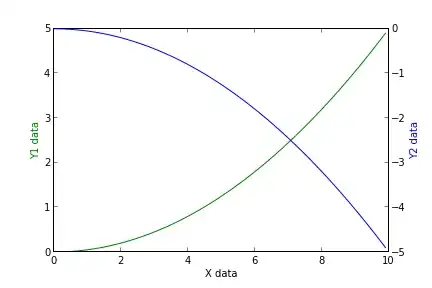
ax.set_ylabel('Left axes label')
ax2.set_ylabel('Right axes label')

Basically, when the secondary_y=True option is given (eventhough ax=ax is passed too) pandas.plot returns a different axes which we use to set the labels.

I know this was answered long ago, but I think this approach worths it.

kiril
  • 4,914
  • 1
  • 30
  • 40
  • 1
    Thanks - great approach! However, it is worth noting that this only works if you plot on the primary y-axis first, then the secondary y-axis, exactly as you have done. If you switch the order, it misbehaves. – user667489 Jan 23 '18 at 16:45
19

For everyone stumbling upon this post because pandas gets mentioned, you now have the very elegant and straightforward option of directly accessing the secondary_y axis in pandas with ax.right_ax

So paraphrasing the example initially posted, you would write:

table = sql.read_frame(query,connection)

ax = table[[0, 1]].plot(ylim=(0,100), secondary_y=table[1])
ax.set_ylabel('$')
ax.right_ax.set_ylabel('Your second Y-Axis Label goes here!')

(this is already mentioned in these posts as well: 1 2)

Nimrod
  • 271
  • 3
  • 8
13

I don't have access to Python right now, but off the top of my head:

fig = plt.figure()

axes1 = fig.add_subplot(111)
# set props for left y-axis here

axes2 = axes1.twinx()   # mirror them
axes2.set_ylabel(...)
Micke
  • 2,251
  • 5
  • 33
  • 48
12

Simple example with few loc:

plot(y1)
plt.gca().twinx().plot(y2, color = 'r') # default color is same as first ax

Explanation:

ax = plt.gca()    # Get current axis
ax2 = ax.twinx()  # make twin axis based on x
ax2.plot(...)     # ...
Hunaphu
  • 589
  • 10
  • 11