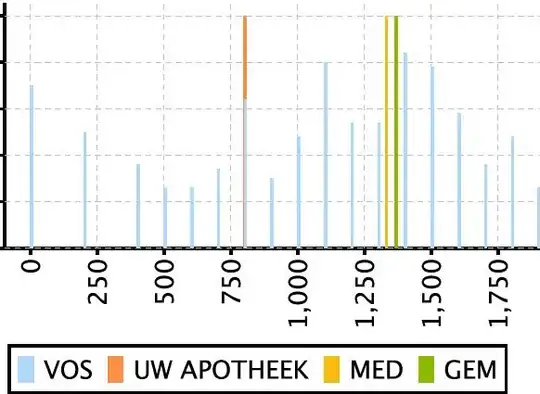
I am just getting to know the Python libraries pandas and matplotlib. Can you show me as an example how to produce a plot similar to this one with matplotlib:

On the y-axis to the right the names of the data instances are listed. The x-axis below is for some value related to each instance.
The data is in .csv format similar to this:
name;value1;value2
uk-2007-05;0.01;1000
Ideally, both value1 and value2 should be plotted in the same plot with different colors or markers.