Does anyone know the how to change Bootstrap's input:focus? The blue glow that shows up when you click on an input field?
Asked
Active
Viewed 4.8e+01k times
251
-
As I can see the focus selector in multiple places Im not sure were I should change it ? – felix001 Feb 11 '13 at 21:34
-
1Apparently @mdo is 100% against allowing us to specify the glow color with a LESS variable: https://github.com/twitter/bootstrap/issues/2742 – Ben Harold Jun 27 '13 at 19:15
22 Answers
270
In the end I changed the following css entry in bootstrap.css
textarea:focus,
input[type="text"]:focus,
input[type="password"]:focus,
input[type="datetime"]:focus,
input[type="datetime-local"]:focus,
input[type="date"]:focus,
input[type="month"]:focus,
input[type="time"]:focus,
input[type="week"]:focus,
input[type="number"]:focus,
input[type="email"]:focus,
input[type="url"]:focus,
input[type="search"]:focus,
input[type="tel"]:focus,
input[type="color"]:focus,
.uneditable-input:focus {
  border-color: rgba(126, 239, 104, 0.8);
  box-shadow: 0 1px 1px rgba(0, 0, 0, 0.075) inset, 0 0 8px rgba(126, 239, 104, 0.6);
  outline: 0 none;
}
Edu Lomeli
- 2,263
- 20
- 18
felix001
- 15,341
- 32
- 94
- 121
-
3
-
2This is no longer necessary with Bootstrap 3.x. See my answer for more info. – Nate T Sep 06 '13 at 17:16
-
@Cricket This variable is not currently available at the Boostrap customizer :( – Caumons Oct 17 '13 at 16:38
-
2@Caumons It is now. I'd recommend using `@input-border-focus` instead of this answer. – Nate T Nov 25 '13 at 22:07
-
-
7
-
Its also worth mentioning that this isn't a feasible solution if you are using Bower since your will lose these changes anytime someone needs to reinstall/change bower_components. – Scott Sword Oct 23 '14 at 15:18
-
@Cricket +1 because don't modify mixins if yopu can solve the problem through the variables.less or .sass – Zsolt Takács Feb 02 '15 at 08:52
-
for me help `outline: 0 none !important` for `a,button,tr (focus)`, big thanks – Никита Середа Mar 07 '18 at 07:11
-
-
-
-
1
216
You can use the .form-control selector to match all inputs. For example to change to red:
.form-control:focus {
  border-color: #FF0000;
  box-shadow: inset 0 1px 1px rgba(0, 0, 0, 0.075), 0 0 8px rgba(255, 0, 0, 0.6);
}
Put it in your custom css file and load it after bootstrap.css. It will apply to all inputs including textarea, select etc...
igaster
- 12,983
- 6
- 26
- 27
-
9@lonesword is right, infact you have to change both the border-color and the shadow-color. I've updated the answer – igaster Jan 07 '15 at 08:29
-
2
-
worked great for me - just added !important to the classes to overwrite bootstrap – James Osguthorpe Nov 10 '20 at 15:45
-
you know what, actually there is no need to type the first sentence of code it could simply be box-shadow: 0 0 8px rgba(255, 0, 0, 0.6); but you must include the border line – random_hooman May 05 '21 at 10:04
73
You can modify the .form-control:focus color without altering the bootstrap style in this way:
Quick fix
.form-control:focus {
        border-color: #28a745;
        box-shadow: 0 0 0 0.2rem rgba(40, 167, 69, 0.25);
    }
Full explanation
- Find the bootstrapCDN version that you are using. E.g. for me right now is 4.3.1: https://maxcdn.bootstrapcdn.com/bootstrap/4.3.1/css/bootstrap.css
- Search for the class you want to modify. E.g.
.form-control:focusand copy the parameters that you want to modify into your css. In this case isborder-colorandbox-shadow. - Choose a color for the
border-color. In this case I choose to pick up the same green the bootstrap uses for their.btn-successclass, by searching for that particular class in the bootstrap.css page mentioned in the step 1. - Convert the color you have picked to RGB and add that to the
box-shadowparameter without altering the fourth RGBA parameter (0.25) that bootstrap has for transparency.
dcx86
- 1,106
- 1
- 10
- 14
-
1
-
-
Not sure why, I haven't used bootstrap in a long time now. What I can suggest is to try find the input class that is being used as a default, try to understand what you need to change by modifying it. – dcx86 Nov 30 '20 at 08:51
-
Worked. ADDITION: if you want to style select elements, you have to add their selectors as well e.g.: `.form-control:focus, select:focus { box-shadow: 0 4px 2px -2px grey; }` – MikhailRatner Nov 11 '21 at 17:11
61
If you are using Bootstrap 3.x, you can now change the color with the new @input-border-focus variable.
See the commit for more info and warnings.
In _variables.scss update @input-border-focus.
To modify the size/other parts of this glow modify the mixins/_forms.scss
@mixin form-control-focus($color: $input-border-focus) {
  $color-rgba: rgba(red($color), green($color), blue($color), .6);
  &:focus {
    border-color: $color;
    outline: 0;
    @include box-shadow(inset 0 1px 1px rgba(0,0,0,.075), 0 0 4px $color-rgba);
  }
}
-
4Do you have an example of how to accomplish or do this? Thanks in advance – Seany84 Jan 22 '14 at 16:09
-
2You need to use the Less or [Sass](https://github.com/twbs/bootstrap-sass) versions of the Bootstrap stylesheets. Then, set your custom variable before importing the Bootstrap stylesheets and it will override the Bootstrap defaults. You'll either need to precompile your stylesheets or use something like [Sprockets](https://github.com/sstephenson/sprockets). – Nate T Feb 04 '14 at 00:03
-
You could also make use of the official bootstrap site to make custom changes on the less variables: http://getbootstrap.com/customize/ – red_trumpet Sep 05 '14 at 01:31
-
1Nice, but that won't apply to buttons and other links, only input and textarea, apparently. For buttons, you still need to override with `.btn:focus { outline: none; }`, for example. – zok Dec 26 '14 at 00:00
-
This answer does work for those using SASS/SCSS. @input-order-focus is in `_variables.scss`. – TyMayn Aug 07 '15 at 15:29
19
For Bootstrap v4.0.0 beta release you will need the following added to a stylesheet that overrides Bootstrap (either add in after CDN/local link to bootstrap v4.0.0 beta or add !important to the stylings:
.form-control:focus {
  border-color: #6265e4 !important;
  box-shadow: 0 0 5px rgba(98, 101, 228, 1) !important;
}
Replace the border-color and the rgba on the box-shadow with which ever colour style you'd like*.
17
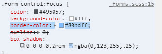
In Bootstrap 4, if you compile SASS by yourself, you can change the following variables to control the styling of the focus shadow:
$input-btn-focus-width:       .2rem !default;
$input-btn-focus-color:       rgba($component-active-bg, .25) !default;
$input-btn-focus-box-shadow:  0 0 0 $input-btn-focus-width $input-btn-focus-color !default;
Note: as of Bootstrap 4.1, the $input-btn-focus-color and $input-btn-focus-box-shadow variables are used only for input elements, but not for buttons. The focus shadow for buttons is hardcoded as box-shadow: 0 0 0 $btn-focus-width rgba($border, .5);, so you can only control the shadow width via the $input-btn-focus-width variable.
wasinger
- 381
- 3
- 7
12
Here are the changes if you want Chrome to show the platform default "yellow" outline.
textarea:focus, input[type="text"]:focus, input[type="password"]:focus, input[type="datetime"]:focus, input[type="datetime-local"]:focus, input[type="date"]:focus, input[type="month"]:focus, input[type="time"]:focus, input[type="week"]:focus, input[type="number"]:focus, input[type="email"]:focus, input[type="url"]:focus, input[type="search"]:focus, input[type="tel"]:focus, input[type="color"]:focus, .uneditable-    input:focus {
    border-color: none;
    box-shadow: none;
    -webkit-box-shadow: none;
    outline: -webkit-focus-ring-color auto 5px;
}
peater
- 1,233
- 15
- 20
-
1
-
Actually, do NOT disable all :focus outlines (as I suggested above). It is horrible for accessibility for keyboard only users. You can disable the platform defaults as above and add in something suitably accessible: `outline: dotted thin black;` (or whatever your testing suggests works) – peater Sep 23 '14 at 20:59
12
To disable the blue glow (but you can modify the code to change color, size, etc), add this to your css:
.search-form input[type="search"] {
    -webkit-box-shadow: none;
    outline: -webkit-focus-ring-color auto 0px;
}
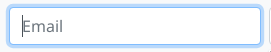
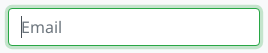
Here's a screencapture showing the effect: before and after:
Anurag Srivastava
- 14,077
- 4
- 33
- 43
radhoo
- 2,877
- 26
- 27
-
This worked for me. But I also had to add border-color since it would leave it blue. – Rachel S May 10 '16 at 15:30
10
Simple one
To remove it:
.form-control, .btn {
    box-shadow: none !important;
    outline: none !important;
}
To change it
.form-control, .btn {
    box-shadow: new-value !important;
    outline: new-value !important;
}
Mȍhǟmmǟd Șamȋm
- 261
- 1
- 4
- 14
8
I landed to this thread looking for the way to disable glow altogether. Many answers were overcomplicated for my purpose. For easy solution, I just needed one line of CSS as follows.
input, textarea, button {outline: none; }
Raj Baral
- 661
- 6
- 19
massanishi
- 2,044
- 1
- 15
- 9
-
3
-
2It worked for me, but I had to add `!important` after the `box-shadow` suggested by @silverliebt – Jefrey Sobreira Santos Sep 04 '17 at 02:26
8
Add an Id to the body tag. In your own Css (not the bootstrap.css) point to the new body ID and set the class or tag you want to override and the new properties. Now you can update bootstrap anytime without loosing your changes.
html file:
<body id="bootstrap-overrides">
css file:
#bootstrap-overrides input[type="text"]:focus, input[type="password"]:focus, input[type="email"]:focus, input[type="url"]:focus, textarea:focus{
  border-color: red;
  box-shadow: 0 1px 1px rgba(0, 0, 0, 0.075) inset, 0 0 8px rgba(126, 239, 104, 0.6);
  outline: 0 none;
}
See also: best way to override bootstrap css
Community
- 1
- 1
homefreelancer
- 106
- 1
- 5
5
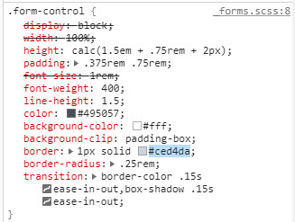
Actually, in Bootstrap 4.0.0-Beta (as of October 2017) the input element isn't referenced by input[type="text"], all Bootstrap 4 properties for the input element are actually form based.
So it's using the .form-control:focus styles. The appropriate code for the "on focus" highlighting of an input element is the following:
.form-control:focus {
  color: #495057;
  background-color: #fff;
  border-color: #80bdff;
  outline: none;
}
Pretty easy to implement, just change the border-color property.
Mindsect Team
- 2,311
- 5
- 29
- 36
-
Or if using scss, just override the $input-focus-border-color variable for bootstrap 4.0.0-Beta – Zuhaib Ali Oct 23 '17 at 18:14
-
1
5
If you want to remove the shadow completely add the class shadow-none to your input element.
Wael Assaf
- 1,233
- 14
- 24
4
Building up on @wasinger's reply above, in Bootstrap 4.5 I had to override not only the color variables but also the box-shadow itself.
$input-focus-width: .2rem !default;
$input-focus-color: rgba($YOUR_COLOR, .25) !default;
$input-focus-border-color: rgba($YOUR_COLOR, .5) !default;
$input-focus-box-shadow: 0 0 0 $input-focus-width $input-focus-color !default;
Lawrence Cherone
- 46,049
- 7
- 62
- 106
Goulven
- 777
- 9
- 20
1
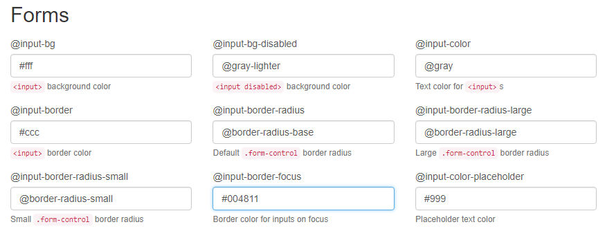
In Bootstrap 3.3.7 you can change the @input-border-focus value in the Forms section of the customizer:
Steve
- 91
- 6
1
For the input border before the focus. You can specify your favorite color you want to use and other css like padding etc
.input {
    padding: 6px 190px 6px 15px;
    outline: #2a65ea auto 105px ;
}
When we focus on input. You can specify your favorite color outline you wish
.input:focus{
    box-shadow: none;
    border-color: none;
    outline: lightgreen auto 5px ;
}
Sachin
- 1,206
- 12
- 13
1
This will work 100% use this:
.form-control, .form-control:focus{
   box-shadow: 0 0 0 0 rgba(255, 255, 255, 0);
   border: rgba(255, 255, 255, 0);
}
cela
- 2,352
- 3
- 21
- 43
Rohith Kumar
- 11
- 1
-
While this code snippet may be the solution, [including an explanation](https://meta.stackoverflow.com/questions/392712/explaining-entirely-code-based-answers) really helps to improve the quality of your post. Remember that you are answering the question for readers in the future, and those people might not know the reasons for your code suggestion. – Tibebes. M Sep 15 '20 at 20:45
0
I could not resolve this with CSS. It seems like Boostrap is getting the last say even though I have by site.css after bootstrap. In any event, this worked for me.
$(document).ready(function () {
    var elements = document.getElementsByClassName("form-control");

    Array.from(elements).forEach(function () {
        this.addEventListener("click", cbChange, false);
    })

    });

function cbChange(event) {
    var ele = event.target;
    var obj = document.getElementById(ele.id);
    obj.style.borderColor = "lightgrey";
}
Later I found this to work in the css. Obviously with form-controls only
.form-control.focus, .form-control:focus {
    border-color: gainsboro;
}
Here are before and after shots from Chrome Developer tool. Notice the difference in border color between focus on and focus off. On a side note, this does not work for buttons. With buttons. With buttons you have to change outline property to none.
0
This should help remove it!
input[type = text] {
  border: none;
}

input[type = text]:focus {
  border: none;
  box-shadow: none;
 }
Amanda
- 1
- 2
-
Hi, just wanted to say that the code snippet feature is not necessary here, you can use code fences to format the code instead. Have a great day, Bye! – I_love_vegetables Jul 29 '21 at 01:23
0
Try this, it's same as bootstrap's input...
input:focus{
  color: #212529;
  background-color: #FFF;
  border-color: #86B7FE;
  outline: 0;
  box-shadow: 0 0 0 .25rem rgba(13, 110, 253, .25);
}
Mukesh
- 11
- 1
0
outline: 0; box-shadow: none; css
Pratap Raju
- 1
- 2
-
Your answer could be improved with additional supporting information. Please [edit] to add further details, such as citations or documentation, so that others can confirm that your answer is correct. You can find more information on how to write good answers [in the help center](/help/how-to-answer). – Community May 10 '23 at 12:27