I'm using Paul Bleicher's Calendar Heatmap to visualize some events over time and I'm interested to add black-and-white fill patterns instead of (or on top of) the color coding to increase the readability of the Calendar Heatmap when printed in black and white.
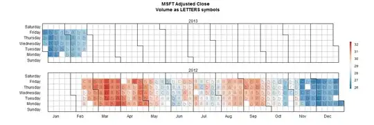
Here is an example of the Calendar Heatmap look in color,

and here is how it look in black and white,
it gets very difficult to distinguish between the individual levels in black and white.
Is there an easy way to get R to add some kind of patten to the 6 levels instead of color?
Code to reproduce the Calendar Heatmap in color.
source("http://blog.revolution-computing.com/downloads/calendarHeat.R")

stock <- "MSFT"
start.date <- "2012-01-12"
end.date <- Sys.Date()

quote <- paste("http://ichart.finance.yahoo.com/table.csv?s=", stock, "&a=", substr(start.date,6,7), "&b=", substr(start.date, 9, 10), "&c=", substr(start.date, 1,4), "&d=", substr(end.date,6,7), "&e=", substr(end.date, 9, 10), "&f=", substr(end.date, 1,4), "&g=d&ignore=.csv", sep="")
stock.data <- read.csv(quote, as.is=TRUE)

# convert the continuous var to a categorical var
stock.data$by <- cut(stock.data$Adj.Close, b = 6, labels = F)

calendarHeat(stock.data$Date, stock.data$by, varname="MSFT Adjusted Close")
update 02-13-2013 03:52:11Z, what do I mean by adding a pattern,
I envision adding a pattern to the individual day-boxes in the Calendar Heatmap as pattern is added to the individual slices in the pie chart to the right (B) in this plot,