Questions tagged [heatmap]

A heat map is a graphical representation of data where the individual values contained in a matrix are represented as colors.

A heat map (or heatmap) is a graphical representation of data where the individual values contained in a matrix are represented as colors.

Heat maps can be used to display statistics (especially in statistical computing and graphics), user experience on websites.

An example of a heat map:

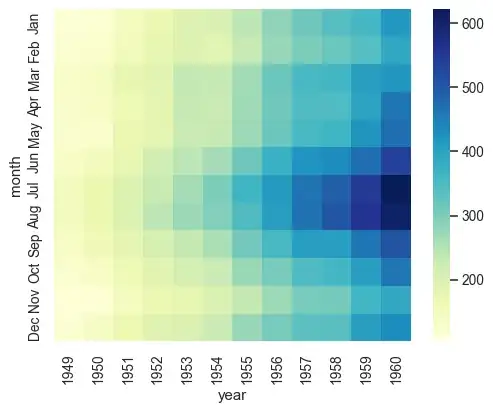
Source: seaborn.heatmap

Additional Resources

Related Tags

4357 questions
258
votes
6 answers

Plotting a 2D heatmap

Using Matplotlib, I want to plot a 2D heat map. My data is an n-by-n Numpy array, each with a value between 0 and 1. So for the (i, j) element of this array, I want to plot a square at the (i, j) coordinate in my heat map, whose color is…
Karnivaurus
  • 22,823
  • 57
  • 147
  • 247
232
votes
13 answers

Generate a heatmap using a scatter data set

I have a set of X,Y data points (about 10k) that are easy to plot as a scatter plot but that I would like to represent as a heatmap. I looked through the examples in Matplotlib and they all seem to already start with heatmap cell values to generate…
greye
  • 8,921
  • 12
  • 41
  • 46
187
votes
3 answers

Seaborn showing scientific notation in heatmap for 3-digit numbers

I'm creating a heatmap from a pandas pivot_table as below: table2 = pd.pivot_table(df,values='control',columns='Year',index='Region',aggfunc=np.sum) sns.heatmap(table2,annot=True,cmap='Blues') It creates a heat map as shown below. You can see the…
cigrainger
  • 2,096
  • 2
  • 15
  • 11
185
votes
11 answers

Making heatmap from pandas DataFrame

I have a dataframe generated from Python's Pandas package. How can I generate heatmap using DataFrame from pandas package. import numpy as np from pandas import * Index= ['aaa','bbb','ccc','ddd','eee'] Cols = ['A', 'B', 'C','D'] df =…
Curious
  • 3,507
  • 8
  • 28
  • 30
142
votes
10 answers

First and last row cut in half of heatmap plot

When plotting heatmaps with seaborn (and correlation matrices with matplotlib) the first and the last row is cut in halve. This happens also when I run this minimal code example which I found online. import pandas as pd import seaborn as sns import…
Flops
  • 1,523
  • 2
  • 11
  • 5
116
votes
3 answers

Make the size of a heatmap bigger with seaborn

I create a heatmap with seaborn df1.index = pd.to_datetime(df1.index) df1 = df1.set_index('TIMESTAMP') df1 = df1.resample('30min').mean() ax = sns.heatmap(df1.iloc[:, 1:6:], annot=True, linewidths=.5) But the probleme is when there is lot of data…
Bio
  • 1,503
  • 3
  • 12
  • 15
105
votes
4 answers

Heatmap in matplotlib with pcolor?

I'd like to make a heatmap like this (shown on FlowingData): The source data is here, but random data and labels would be fine to use, i.e. import numpy column_labels = list('ABCD') row_labels = list('WXYZ') data = numpy.random.rand(4,4) Making…
Jason Sundram
  • 12,225
  • 19
  • 71
  • 86
89
votes
7 answers

Correlation heatmap

I want to represent correlation matrix using a heatmap. There is something called correlogram in R, but I don't think there's such a thing in Python. How can I do this? The values go from -1 to 1, for example: [[ 1. 0.00279981 0.95173379 …
Kobe-Wan Kenobi
  • 3,694
  • 2
  • 40
  • 67
86
votes
3 answers

Changing the rotation of tick labels in Seaborn heatmap

I'm plotting a heatmap in Seaborn. The problem is that I have too many squares in my plot so the x and y labels are too close to each other to be useful. So I'm creating a list of xticks and yticks to use. However passing this list to the function…
Artturi Björk
  • 3,643
  • 6
  • 27
  • 35
80
votes
4 answers

Understanding `scale` in R

I'm trying to understand the definition of scale that R provides. I have data (mydata) that I want to make a heat map with, and there is a VERY strong positive skew. I've created a heatmap with a dendrogram for both scale(mydata) and log(my data),…
Jen
  • 1,141
  • 2
  • 11
  • 16
79
votes
3 answers

seaborn heatmap y-axis reverse order

Have a look at this heatmap found in the seaborn heatmap documentation. Right now the y-axis starts with 9 at the bottom, and ends with 0 on top. Is there a way to turn this around, i.e. start with 0 at bottom and end with 9 at the top?
john kals
  • 811
  • 1
  • 6
  • 8
79
votes
3 answers

How do I add a title and axis labels to Seaborn Heatmap?

I want to add a title to a seaborn heatmap. Using Pandas and iPython Notebook code is below, a1_p = a1.pivot_table( index='Postcode', columns='Property Type', values='Count', aggfunc=np.mean, fill_value=0) sns.heatmap(a1_p, cmap="YlGnBu") the…
Ammar Akhtar
  • 1,698
  • 3
  • 13
  • 25
72
votes
2 answers

How to add a label to Seaborn Heatmap color bar?

If I have the following data and Seaborn Heatmap: import pandas as pd data = pd.DataFrame({'x':(1,2,3,4),'y':(1,2,3,4),'z':(14,15,23,2)}) sns.heatmap(data.pivot_table(index='y', columns='x', values='z')) How do I add a label to the colour bar?
ishido
  • 4,065
  • 9
  • 32
  • 42
60
votes
4 answers

Seaborn Heatmap with logarithmic-scale colorbar

Is there a way to set the color bar scale to log on a seaborn heat map graph? I am using a pivot table output from pandas as an input to the call sns.heatmap(df_pivot_mirror, annot=False, xticklabels=256, yticklabels=128, cmap=plt.cm.YlOrRd_r)
fulatoro
  • 655
  • 1
  • 5
  • 8
53
votes
2 answers

Set max value for color bar on seaborn heatmap

I need to set the max value on the seaborn heatmap cbar to 2. I've tried: cbar_kws = { 'ticks' : [0, 2] } sns.heatmap(tiles, robust=True, fmt="f", cmap= 'RdBu_r', cbar_kws = cbar_kws) But this doesn't work and the documentation isn't very clear.…
Michael Berry
  • 923
  • 3
  • 13
  • 17
1
2 3
99 100