I'm making a liquid page, and I have an horizontal menubar (ul) absolute positioned to bottom (sticky footer).

No problem with this stuff, but when I resize the browser, obviously the inner elements in the menu stacked upwards each other, making the menu too high and overlapping the main content.

Is there any way to (any of the following)
- make the absolute postioned menu grow "downwards"?
- or to setting the edge that aligns to the bottom in a certain high (to make it grow from that point to bottom)?
- or give layout to the menu making it to push the above elements (I've tried playing with
overflowbut doesn't work for me)?
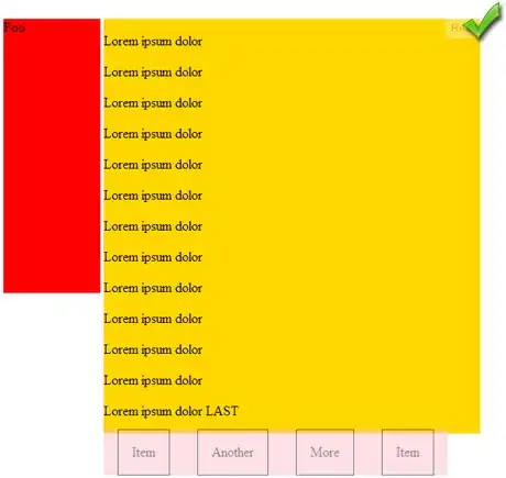
That's the html:
<div class="container">
    <div class="izda">
        Foo
    </div>
    <div class="dcha">
        <p>Lorem ipsum dolor</p>
        <p>Lorem ipsum dolor</p>
        <p>Lorem ipsum dolor</p>

        <p>Lorem ipsum dolor LAST</p>
        <ul>
            <li>Item</li>
            <li>Another</li>
            <li>More</li>
            <li>Item</li>
        </ul>
    </div>
</div>
And the css:
.container {position:relative}
.izda {background:red;
       height:20em;
       display:inline-block;
       width:20%;
       vertical-align:top;
}
.dcha {background:gold;
       display:inline-block;
       width:78%;
       margin-bottom:3em;
}
ul {position:absolute;
    bottom:0;
    background:pink;
    margin:0;
    padding:0;
    max-width:100%;
}
ul li {float:left;
       list-style:none;
       border:1px solid black;
       margin:0 1em;
       padding:1em;
}
A working example here: http://jsfiddle.net/KQhLs/2/
If you write more paragraphs, the menu go down properly thanks to the margin bottom of his father.
But when resizing the frame you can see the overlapping effect.
Thanks in advance. The web are supposed to work only in modern browsers and, if possible, with pure css (no JS).
EDIT: I think the wind is blowing these ways: How to avoid fixed element from hovering page contents? To end at this: Sticky Footer for Responsive Site
But there's no useful answers...
Well, in fact I can prevent this behavior with mediaqueries, that's simple. But I'd like to know if it's there a "one for all" solution.
EDIT2: I have just read A list apart - Exploring footers. Aside JS solutions I tried all, but the problem stills here - if you put floating elements inside the footer, it overlaps the main content.
Also, I have read CSS Sticky Footer and it seems it have same problem.
I can't figure that this is impossible to achieve with pure css... should I give up?