18

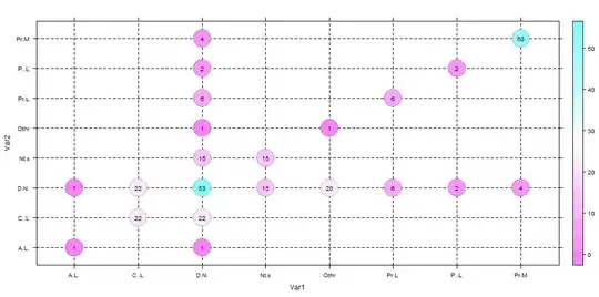
How to create a categorical bubble plot, using GNU R, similar to that used in systematic mapping studies (see below)?
categorical bubble plot used in mapping studies

EDIT: ok, here's what I've tried so far. First, my dataset (Var1 goes to the x-axis, Var2 goes to the y-axis):

> grid
                         Var1                      Var2 count
1              Does.Not.apply            Does.Not.apply    53
2               Not.specified            Does.Not.apply    15
3   Active.Learning..general.            Does.Not.apply     1
4      Problem.based.Learning            Does.Not.apply     2
5              Project.Method            Does.Not.apply     4
6         Case.based.Learning            Does.Not.apply    22
7               Peer.Learning            Does.Not.apply     6
10                      Other            Does.Not.apply     1
11             Does.Not.apply             Not.specified    15
12              Not.specified             Not.specified    15
21             Does.Not.apply Active.Learning..general.     1
23  Active.Learning..general. Active.Learning..general.     1
31             Does.Not.apply    Problem.based.Learning     2
34     Problem.based.Learning    Problem.based.Learning     2
41             Does.Not.apply            Project.Method     4
45             Project.Method            Project.Method     4
51             Does.Not.apply       Case.based.Learning    22
56        Case.based.Learning       Case.based.Learning    22
61             Does.Not.apply             Peer.Learning     6
67              Peer.Learning             Peer.Learning     6
91             Does.Not.apply                     Other     1
100                     Other                     Other     1

Then, trying to plot the data:

# Based on http://flowingdata.com/2010/11/23/how-to-make-bubble-charts/
grid <- subset(grid, count > 0)
radius <- sqrt( grid$count / pi )
symbols(grid$Var1, grid$Var2, radius, inches=0.30, xlab="Research type", ylab="Research area")
text(grid$Var1, grid$Var2, grid$count, cex=0.5)

Here's the result: What I've got
Problems: axis labels are wrong, the dashed grid lines are missing.

rodrigorgs
  • 855
  • 2
  • 9
  • 20
  • 1
    Welcome to stackoverflow. You're getting a number of downvotes because you haven't provided a data set or any code you've tried. Check out this [LINK](http://stackoverflow.com/questions/5963269/how-to-make-a-great-r-reproducible-example) for more info on how to set up your question. – Tyler Rinker Apr 05 '13 at 18:48
  • 5
    For the downvoters I can understand why you downvoted but please take the time to explain to people as to why. rodrigorgs is a first time poster and doesn't get the norms of SO. If you downvote w/o explaining, that serves no purpose but to give us a bad reputation. – Tyler Rinker Apr 05 '13 at 18:50
  • 1
    Hi @rodrigorgs, to echo Tyler's comment. IF you can provide some sample data, you are more likely to get helpful answers. (you can either post a link to the data, or you can paste a small sample in the body of your question. Please do not put it in the comments) – Ricardo Saporta Apr 05 '13 at 19:01
  • What should the axis labels be? – Ricardo Saporta Apr 05 '13 at 19:15

3 Answers3

15

Here is ggplot2 solution. First, added radius as new variable to your data frame.

grid$radius <- sqrt( grid$count / pi )

You should play around with size of the points and text labels inside the plot to perfect fit.

library(ggplot2)
ggplot(grid,aes(Var1,Var2))+
  geom_point(aes(size=radius*7.5),shape=21,fill="white")+
  geom_text(aes(label=count),size=4)+
  scale_size_identity()+
  theme(panel.grid.major=element_line(linetype=2,color="black"),
        axis.text.x=element_text(angle=90,hjust=1,vjust=0))

enter image description here

Didzis Elferts
  • 95,661
  • 14
  • 264
  • 201
  • 1
    +1 very nice! How about a tiny drop shadow like in the original image: `.. geom_point(aes(size=radius*7.8), position=position_dodge(width=.05), shape=21,fill="#333333", color="#999999")+` – Ricardo Saporta Apr 05 '13 at 19:49
1

This will get you started by adding the tick marks to your xaxis.

To add the lines, just add a line at each level

ggs <- subset(gg, count > 0)
radius <- sqrt( ggs$count / pi )

# ggs$Var1 <- as.character(ggs$Var1)

# set up your tick marks 
#  (this can all be put into a single line in `axis`, but it's placed separate here to be more readable)
#--------------
# at which values to place the x tick marks
x_at <- seq_along(levels(gg$Var1))
# the string to place at each tick mark
x_labels <-   levels(gg$Var1)


# use xaxt="n" to supress the standard axis ticks 
symbols(ggs$Var1, ggs$Var2, radius, inches=0.30, xlab="Research type", ylab="Research area", xaxt="n")
axis(side=1, at=x_at, labels=x_labels)

text(ggs$Var1, ggs$Var2, ggs$count, cex=0.5)

also, notice that instead of calling the object grid I called it gg, and then ggs for the subset. grid is a function in R. While it is "allowed" to overwrite the function with an object, it is not recommended and can lead to annoying bugs down the line.

Ricardo Saporta
  • 54,400
  • 17
  • 144
  • 178
1

Here a version using levelplot from latticeExtra.

library(latticeExtra)
levelplot(count~Var1*Var2,data=dat,
          panel=function(x,y,z,...)
          {
            panel.abline(h=x,v=y,lty=2)
            cex <- scale(z)*3
            panel.levelplot.points(x,y,z,...,cex=5)
            panel.text(x,y,label=z,cex=0.8)
          },scales=(x=list(abbreviate=TRUE))) ## to get short labels

enter image description here

To get the size of bubble proprtional to the count , you can do this

library(latticeExtra)
levelplot(count~Var1*Var2,data=dat,
          panel=function(x,y,z,...)
          {
            panel.abline(h=x,v=y,lty=2)
            cex <- scale(z)*3
            panel.levelplot.points(x,y,z,...,cex=5)
            panel.text(x,y,label=z,cex=0.8)

          })

I don't display it since the render is not clear as in the fix size case.

agstudy
  • 119,832
  • 17
  • 199
  • 261