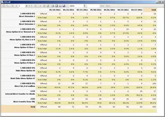
I would say what you are looking for is facetting - in your case you would want to have a factor that distinguishes data entries between the red and the blue part and then have a facet_grid() to split up the graph with respective labels. Say your factor is called subset in the melted dataframe, you would need to add the following to your plot:
facet_grid(. ~ subset)
For further details, have a look at the facet_grid() documentation.
And for an answer that more explicitly addresses your problem, you should describe your problem in more detail. Have a look at some info on how to produce a great reproducible example in R.
