20

I have been struggling with how to make a Pareto Chart in R using the ggplot2 package. In many cases when making a bar chart or histogram we want items sorted by the X axis. In a Pareto Chart we want the items ordered descending by the value in the Y axis. Is there a way to get ggplot to plot items ordered by the value in the Y axis? I tried sorting the data frame first but it seems ggplot reorders them.

Example:

val <- read.csv("http://www.cerebralmastication.com/wp-content/uploads/2009/11/val.txt")
val<-with(val, val[order(-Value), ])
p <- ggplot(val)
p + geom_bar(aes(State, Value, fill=variable), stat = "identity", position="dodge") + scale_fill_brewer(palette = "Set1")

the data frame val is sorted but the output looks like this:
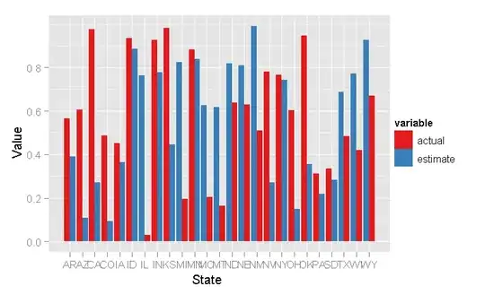
alt text
(source: cerebralmastication.com)

Hadley correctly pointed out that this produces a much better graphic for showing actuals vs. predicted:

ggplot(val, aes(State, Value)) + geom_bar(stat = "identity", subset = .(variable == "estimate"), fill = "grey70") + geom_crossbar(aes(ymin = Value, ymax = Value), subset = .(variable == "actual"))

which returns:
alt text
(source: cerebralmastication.com)

But it's still not a Pareto Chart. Any tips?
Glorfindel
  • 21,988
  • 13
  • 81
  • 109
JD Long
  • 59,675
  • 58
  • 202
  • 294
  • You can do this with base graphics using the par(new) trick of overplotting -- same approach as for the usual 'chart with two y-axes' problem. Ggplot2 I cannot help with (yet, one day maybe I get time to catch up on it). – Dirk Eddelbuettel Nov 14 '09 at 20:51
  • I'm trying soooo hard to avoid learning base graphics. I'm fantastically lazy :) – JD Long Nov 14 '09 at 20:55

8 Answers8

23

Subsetting and sorting your data;

valact <- subset(val, variable=='actual')
valsort <- valact[ order(-valact[,"Value"]),]

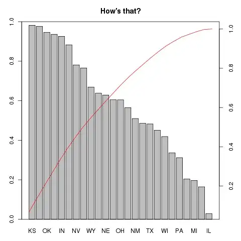
From there it's just a standard boxplot() with a very manual cumulative function on top:

op <- par(mar=c(3,3,3,3)) 
bp <- barplot(valsort [ , "Value"], ylab="", xlab="", ylim=c(0,1),    
              names.arg=as.character(valsort[,"State"]), main="How's that?") 
lines(bp, cumsum(valsort[,"Value"])/sum(valsort[,"Value"]), 
      ylim=c(0,1.05), col='red') 
axis(4)
box() 
par(op)

which should look like this

alt text
(source: eddelbuettel.com)

and it doesn't even need the overplotting trick as lines() happily annotates the initial plot.

Glorfindel
  • 21,988
  • 13
  • 81
  • 109
Dirk Eddelbuettel
  • 360,940
  • 56
  • 644
  • 725
  • I accepted Chang's answer because I really wanted to do this with ggplot. But I still owe you a beer for giving such a kick ass answer. – JD Long Nov 15 '09 at 01:45
  • you gave a far more through answer to the Perato part than I was expecting! My question was grossly stylized and I had coded myself into a corner where using ggplot2 was the easiest way out. What you did with base graphics was really cool. Thanks again. – JD Long Nov 18 '09 at 22:05
  • @DirkEddelbuettel -- as a crazy followup, I was wondering if you could modify your answer so that it accepts a facet_wrap? – d_a_c321 Dec 16 '13 at 17:38
16

The bars in ggplot2 are ordered by the ordering of the levels in the factor.

val$State <- with(val, factor(val$State, levels=val[order(-Value), ]$State))
Jonathan Chang
  • 24,567
  • 5
  • 34
  • 33
7

A traditional Pareto chart in ggplot2.......

Developed after reading Cano, E. L., Moguerza, J. M., & Redchuk, A. (2012). Six Sigma with R. (G. Robert, K. Hornik, & G. Parmigiani, Eds.) Springer.

library(ggplot2);library(grid)

counts  <- c(80, 27, 66, 94, 33)
defects <- c("price code", "schedule date", "supplier code", "contact num.", "part num.")
dat <- data.frame(count = counts, defect = defects, stringsAsFactors=FALSE )
dat <- dat[order(dat$count, decreasing=TRUE),]
dat$defect <- factor(dat$defect, levels=dat$defect)
dat$cum <- cumsum(dat$count)
count.sum<-sum(dat$count)
dat$cum_perc<-100*dat$cum/count.sum

p1<-ggplot(dat, aes(x=defect, y=cum_perc, group=1))
p1<-p1 + geom_point(aes(colour=defect), size=4) + geom_path()

p1<-p1+ ggtitle('Pareto Chart')+ theme(axis.ticks.x = element_blank(), axis.title.x = element_blank(),axis.text.x = element_blank())
p1<-p1+theme(legend.position="none")

p2<-ggplot(dat, aes(x=defect, y=count,colour=defect, fill=defect))
p2<- p2 + geom_bar()

p2<-p2+theme(legend.position="none")

plot.new()
grid.newpage()
pushViewport(viewport(layout = grid.layout(2, 1)))
print(p1, vp = viewport(layout.pos.row = 1,layout.pos.col = 1))
print(p2, vp = viewport(layout.pos.row = 2,layout.pos.col = 1))
Isaiah
  • 2,091
  • 3
  • 19
  • 28
5

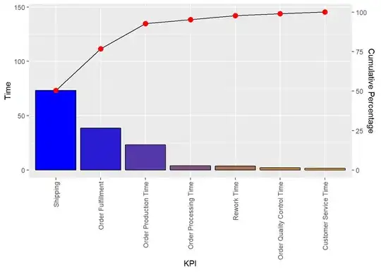
We can use the ggQC package.

library(ggplot2)
library(ggQC)
Data4Pareto <- data.frame(
  KPI = c("Customer Service Time", "Order Fulfillment", "Order Processing Time",
          "Order Production Time", "Order Quality Control Time", "Rework Time",
          "Shipping"),
  Time = c(1.50, 38.50, 3.75, 23.08, 1.92, 3.58, 73.17)) 


ggplot2::ggplot(Data4Pareto, aes(x = KPI, y = Time)) +
 ggQC::stat_pareto(point.color = "red",
                   point.size = 3,
                   line.color = "black",
                   bars.fill = c("blue", "orange")) +
  theme(axis.text.x = element_text(angle = 90, hjust = 1, vjust=0.5))

enter image description here

Source

bbiasi
  • 1,549
  • 2
  • 15
  • 31
4

With a simple example:

 > data
    PC1     PC2     PC3     PC4     PC5     PC6     PC7     PC8     PC9    PC10 
0.29056 0.23833 0.11003 0.05549 0.04678 0.03788 0.02770 0.02323 0.02211 0.01925 

barplot(data) does things correctly

the ggplot equivalent "should be": qplot(x=names(data), y=data, geom='bar')

But that incorrectly reorders/sorts the bars alphabetically... because that's how levels(factor(names(data))) would be ordered.

Solution: qplot(x=factor(names(data), levels=names(data)), y=data, geom='bar')

Phew!

Yannick Wurm
  • 3,617
  • 6
  • 25
  • 28
3

Also, see the package qcc which has a function pareto.chart(). Looks like it uses base graphics too, so start your bounty for a ggplot2-solution :-)

Dirk Eddelbuettel
  • 360,940
  • 56
  • 644
  • 725
1

To simplify things, let's just consider only the estimates.

estimates <- subset(val, variable == "estimate")

First we reorder the factor levels, so that States are plotted in decreasing order of Value.

estimates$State <- with(estimates, reorder(State, -Value))

Similarly, we reorder the dataset and calculate a cumulative value.

estimates <- estimates[order(estimates$Value, decreasing = TRUE),]
estimates$cumulative <- cumsum(estimates$Value)

Now we are ready to draw the plot. The trick to get a line and bar on the same axes is to convert the State variable (a factor) to be numeric.

p <- ggplot(estimates, aes(State, Value)) + 
  geom_bar() +
  geom_line(aes(as.numeric(State), cumulative))
p

As mentioned in the question, trying to draw two Pareto plots of two variable groups right next to each other isn't very easy. You'd probably be better off using facetting if you want multiple Pareto plots.

Richie Cotton
  • 118,240
  • 47
  • 247
  • 360
0
freqplot = function(x, by = NULL, right = FALSE)
{
if(is.null(by)) stop('Valor de "by" precisa ser especificado.')
breaks = seq(min(x), max(x), by = by )
ecd = ecdf(x)
den = ecd(breaks)
table = table(cut(x, breaks = breaks, right = right))
table = table/sum(table)

intervs = factor(names(table), levels = names(table))
freq = as.numeric(table/sum(table))
acum = as.numeric(cumsum(table))

normalize.vec = function(x){
  (x - min(x))/(max(x) - min(x))
}

dados = data.frame(classe = intervs, freq = freq, acum = acum, acum_norm = normalize.vec(acum))
p = ggplot(dados) + 
  geom_bar(aes(classe, freq, fill = classe), stat = 'identity') +
  geom_point(aes(classe, acum_norm, group = '1'), shape = I(1), size = I(3), colour = 'gray20') +
  geom_line(aes(classe, acum_norm, group = '1'), colour = I('gray20'))

p
}
Fernando
  • 7,785
  • 6
  • 49
  • 81