8

I am currently facing the problem of visualizing three dimensional data. Concretely, I have two parameters that are varying and the third dimension is the resulting output which in this case is a value between zero and one (percentage).

I have several distinct datasets that I want to illustrate. It is working well with using heatmaps in matplotlib (pcolor).

However, I want to directly compare the distinct datasets with each other. I am not quite happy with producing a seperate plot for each dataset and representing it this way. I somehow want to plot it in one figure to be able to directly compare them.

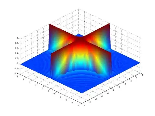
I have tried 3D plots (scatter and surface) which is working quite decent, but the values are overlapping and most of the time you can only see one dataset. 3D Plots are really not working that well.

So my main question is if someone has an idea of how I could represent this in one plot.

Regards!

Trenton McKinney
  • 56,955
  • 33
  • 144
  • 158
fsociety
  • 1,791
  • 4
  • 22
  • 32

3 Answers3

8

Although it 's an old question, i recently did something related: plotting two heatmaps in the same figure. I did that by converting the squares into scatterplots where i converted the squares to two triangles.

I made the two triangles by using custom markers:

 import matplotlib
 import matplotlib.pyplot as plt
 import numpy as np

 def getCustomSymbol1(path_index=1):
  if path_index==1:  #upper triangle
      verts = [
      (0.0,0.0),
      (1.0,0.0),
      (1.0,1.0),
      (0.0,0.0),]
  else:              #lower triangle
      verts = [
      (0.0,0.0),
      (0.0,1.0),
      (1.0,1.0),
      (0.0,0.0),]
  codes = [matplotlib.path.Path.MOVETO,
           matplotlib.path.Path.LINETO,
           matplotlib.path.Path.LINETO,
           matplotlib.path.Path.CLOSEPOLY,
           ] 
  pathCS1 = matplotlib.path.Path(verts, codes)
  return pathCS1, verts

 def plot_mat(matrix=np.random.rand(20,20), path_index=1, alpha=1.0, vmin=0., vmax=1.):
    nx,ny = matrix.shape
    X,Y,values = zip(*[ (i,j,matrix[i,j]) for i in range(nx) for j in range(ny) ] )
    marker,verts = getCustomSymbol1(path_index=path_index)
    ax.scatter(X,Y,s=4000, 
               marker=marker, 
               c=values, 
               cmap='viridis', 
               alpha=alpha, 
               vmin=vmin, vmax=vmax )
    return

 fig = plt.figure()
 ax = fig.add_subplot(111)
 A  = np.random.uniform(20,50,30).reshape([6,5])
 B  = np.random.uniform(40,70,30).reshape([6,5])
 vmin = np.min([A,B])
 vmax = np.max([A,B])
 plot_mat(path_index=1,vmin=vmin,vmax=vmax,matrix=A)
 plot_mat(path_index=2,vmin=vmin,vmax=vmax,matrix=B)
 plt.xlim([0,6])
 plt.ylim([0,5])
 # for the colorbar i did the trick to make first a fake mappable:
 sm = plt.cm.ScalarMappable(cmap='viridis', norm=plt.Normalize(vmin=vmin, vmax=vmax ) )
 sm._A=[]
 plt.colorbar(sm)
 plt.show()

That together can give you something like: enter image description here

JLT
  • 712
  • 9
  • 15
2

There are a few options to present 2 datasets together:

Options 1 - draw a heatmap of the difference of 2 datasets (or ratio, whatever is more appropriate in your case)

pcolor(D2-D1)

and then present several of these comparison figures.

Option 2 - present 1 dataset as pcolor, and another as countour:

pcolor(D1)
contour(D2)

If you really need to show N>2 datasets together, I would go with contour or contourf:

contourf(D1,cmap='Blues')
contourf(D2,cmap='Reds', alpha=0.66)
contourf(D2,cmap='Reds', alpha=0.33)

example output of 3 contourf commands

or

contour(D1,cmap='Blues')
contour(D2,cmap='Reds')

example output of 3 contour commands

unfortunately, simiar alpha tricks do not work well with pcolor.

Ofri Raviv
  • 24,375
  • 3
  • 55
  • 55
  • Thanks for that hint. I like the contourf approach. However, somehow the alpha values do not seem to work that well. The more controuf plots I add with lower alpha values, also the primary one with alpha value 1.0 gets toned down. Is this supposed to work that way? – fsociety Jul 23 '13 at 13:10
0

The nicest way I can think of is to plot one as the height (e.g a surface) and the other as a heatmap mapped onto this surface. The answer given here by @HYRY is an example with a random coloring, you would need to specify the colors array using one of your data sets

You could also think about how they are related, if you divide one by the other can you get some other parameter which encodes what is happening, or subtract them?

Community
  • 1
  • 1
Greg
  • 11,654
  • 3
  • 44
  • 50