21

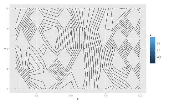
I need to add lines via stat_contour() to my ggplot/ggplot2-plot. Unfortunately, I can not give you the real data from which point values should be evaluated. However, another easily repreducably example behaves the same:

testPts <- data.frame(x=rep(seq(7.08, 7.14, by=0.005), 200))
testPts$y <- runif(length(testPts$x), 50.93, 50.96)
testPts$z <- sin(testPts$y * 500)

ggplot(data=testPts, aes(x=x, y=y, z=z)) + geom_point(aes(colour=z))
       + stat_contour()

This results in the following error message:

Error in if (nrow(layer_data) == 0) return() : argument is of length zero In addition: Warning message: Not possible to generate contour data

The example looks not different from others posted on stackoverflow or in the official manual/tutorial to me, and it seemingly doesn't matter if I provide more specifications to stat_contour. It seems the function does not pass the data(-layer) as pointed ou tint the error message.

UseR10085
  • 7,120
  • 3
  • 24
  • 54
Florian R. Klein
  • 1,375
  • 2
  • 15
  • 32
  • 4
    It appears to me that `stat_contour()` requires an equidistant grid and does not simply take common 2D points which are irragularly distributed. Man, this make the functionality extremely limited. – Florian R. Klein Sep 29 '13 at 11:49
  • 2
    I had a situation where `stat_contour` gave really poor results, but base graphics contour gave a good solution. Turns out, there is a function `contourLines` that gets you the data of the contour lines. Then you can use this with `geom_line` to plot it. – kasterma Feb 09 '15 at 06:04
  • @[kasterma](https://stackoverflow.com/users/489448/kasterma), can you exapand on these, please? I tried the method by @[florian-r-klein](https://stackoverflow.com/users/2167276/florian-r-klein), but unable to map the contours with color. Should I post a new question explaining my dataset? I am trying `plotly` as well, but don't know if it's advantageous compared to `ggplot2`! – massisenergy Dec 10 '18 at 06:00
  • I came to this question because I had the same question, and this post got me what I needed to make this work: https://www.r-statistics.com/2016/07/using-2d-contour-plots-within-ggplot2-to-visualize-relationships-between-three-variables/ . Crucially, it used a loess model fit to help generate a grid I could use, and that seems to be the missing link. The contour graph functions I've seen all require a grid, so you need to somehow generate a grid from your long dataframe of scattered points. – mpettis Jun 07 '19 at 19:09

3 Answers3

12

Use stat_density2d instead of stat_contour with irregularly spaced data.

library(ggplot2)

testPts <- data.frame(x=rep(seq(7.08, 7.14, by=0.005), 200))
testPts$y <- runif(length(testPts$x), 50.93, 50.96)
testPts$z <- sin(testPts$y * 500)

(ggplot(data=testPts, aes(x=x, y=y, z=z))
+ geom_point(aes(colour=z))
+ stat_density2d()
)

enter image description here

Andy W
  • 5,031
  • 3
  • 25
  • 51
  • 1
    it does not seem to provide reasonable results. The perfect contour-solutuin would be straight horizontal lines. The function, furthermore, appears to be a little bit unflexible with its aesthetics. – Florian R. Klein Sep 29 '13 at 13:42
  • The docs say it is just a wrapper for [`kde2d`](http://www.inside-r.org/r-doc/MASS/kde2d). You may have to set the levels for the contour and amount of smoothing to get the desired result. Aesthetics work the same way as any other lines or paths, so not sure what you are complaining about exactly. – Andy W Sep 29 '13 at 13:45
  • 3
    Id does not react one bit on `aes(size=z)` when it is defined beforehand for example. This is confusing because the documentation lists exactly this paramteter to be "understandable". – Florian R. Klein Sep 29 '13 at 14:02
  • I highly doubt you want the contour lines to change size. Maybe the colors of the contours to change, but not the lines themselves. See the examples in the docs using `..level..`, it calculates a seperate density object, so referencing the original z values doesn't make sense. See for example `stat_density2d(size = 2, aes(color = ..level..)` – Andy W Sep 29 '13 at 14:17
  • 2
    I am slowly getting the meaning of ..level.. and ..density.. now. The `stat_density()`-function works in a way with filled polygon-contours as well as colored contour lines. However, the dynamically calculated `..level..` is not in the original value range. It does not reflect the flow field of my observed groundwater levels. My guess: The kernel density estimation does what it name implies (I don't know the details): It reflects the point density, not data-field-dependent contours. In this case, it would be not what I was looking for in the first place. – Florian R. Klein Sep 29 '13 at 15:05
  • 3
    You probably want to interpolate the Z values then (e.g. inverse distance weighting, kriging), not make a density estimate. You will probably have to do that outside of `ggplot` and then add the layers in. See [here](http://stats.stackexchange.com/a/38658/1036) for an example of inverse distance weighting. – Andy W Sep 29 '13 at 15:21
  • Thank you @AndyW, I will have a deeper look into it. – Florian R. Klein Sep 29 '13 at 16:10
  • 3
    I do not agree that stat_density2d is what he wants. The contour lines in stat_density2d give the density of points per grid area. @FlorianR.Klein is asking for contours that pass through equal z, e.g. elevation contours. – Eric Krantz Mar 29 '17 at 13:32
  • Agree @EricKrantz - see the prior comments asking for clarification. – Andy W Mar 29 '17 at 13:42
8

One solution to this problem is the generation of a regular grid and the interpolation of point values in respect to that grid. Here is how I did it for just one of multiple data fields:

pts.grid <- interp(as.data.frame(pts)$coords.x1, as.data.frame(pts)$coords.x2, as.data.frame(pts)$GWLEVEL_TI)
pts.grid2 <- expand.grid(x=pts.grid$x, y=pts.grid$y)
pts.grid2$z <- as.vector(pts.grid$z)

This results in a data frame which can be used in a ggplot in stat_contour() when defined in the data-parameter of that function:

(ggplot(as.data.frame(pts), aes(x=coords.x1, y=coords.x2, z=GWLEVEL_TI))
#+ geom_tile(data=na.omit(pts.grid2), aes(x=x, y=y, z=z, fill=z))
+ stat_contour(data=na.omit(pts.grid2), binwidth=2, colour="red", aes(x=x, y=y, z=z))
+ geom_point()
)

This solution most likely includes unneccessary transformations because I don't know better yet. Furthermore I must make the same grid generation for every data field individually before combining them in a single data frame again - not as efficient as I would like it to be for bigger data sets.

Florian R. Klein
  • 1,375
  • 2
  • 15
  • 32
2

You should generate a z for each combination of x and y using expand.grid or outer. For example:

library(ggplot2)
testPts <- transform(expand.grid(x=1:10,y=1:5),z=sin(x*y))
(ggplot(data=testPts, aes(x=x, y=y, z=z))
 + stat_contour()
 + geom_point(aes(colour=z))
)

enter image description here

agstudy
  • 119,832
  • 17
  • 199
  • 261
  • 2
    Although that works, it does not explain why my previous mentioned data frame is insufficient. Every `x` and `y` has its `z`. I tested it with common point plot in ggplot2. The same goes for actual shapefile data (spatial data frame). – Florian R. Klein Sep 28 '13 at 14:46