27

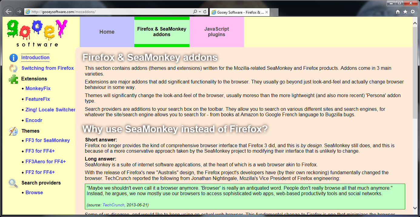
I am developing a site which displays OK in the latest versions of Firefox/SeaMonkey/Chrome, but interestingly in IE11 there is a rendering problem:
http://devel.gooeysoftware.com/mozaddons/switching.php

If you load this in IE11, the "Switching from Firefox to SeaMonkey" menu item along the left does not get its text wrapped to the size of the containing DIV, but instead overflows. I can't see why this is. Is it just a bug in IE11 or am I missing some CSS to get it to wrap?

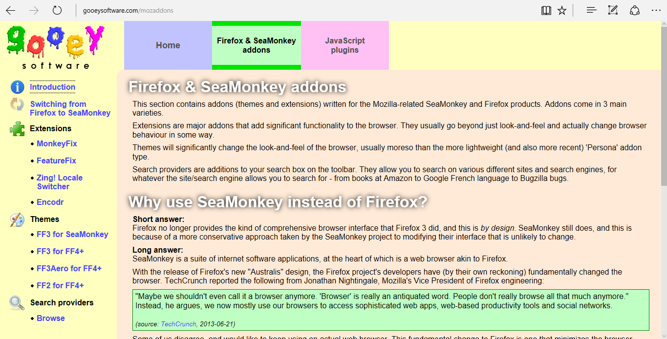
Looks like they fixed a bunch of the IE11 flexbox rendering bugs in Edge.

IE11:
IE11 rendering

Edge:
Edge rendering

M--
  • 25,431
  • 8
  • 61
  • 93
Jez
  • 27,951
  • 32
  • 136
  • 233

10 Answers10

24

Found this easy fix in the Flexbox bugs repository:

/**
* Flexbug demo 2.1.b (workaround)
*
* 1. Set `max-width:100%` to prevent
*    overflow.
* 2. Set `box-sizing:border-box` if
*    needed to account for padding
*    and border size.
*/

.FlexItem {
box-sizing: border-box; /* 2 */
max-width: 100%; /* 1 */
}

Flexbox bug repository

MsMaryMak
  • 332
  • 2
  • 13
  • Although the bug seems similar, I couldn't get that fix to work on my example site. – Jez Mar 21 '15 at 19:12
  • 3
    Could articulate more the way you used to fix the issue? – abarisone Mar 21 '15 at 19:16
  • **This** is the answer that worked for me. I have an image browser for websites with folder navigation above and the images below with a `float: right` upload form to the right. I didn't have to add any class and could just plop it in to the current selector. Granted this is extremely subjective to *what kind* of layout you're attempting; thank you for posting this! – John Sep 25 '15 at 20:15
8

I came across a similar problem and found with IE11 you need to use the syntax:

flex: 1 1 auto;

rather than:

flex: 1;

Thanks to this Github commit: https://github.com/philipwalton/solved-by-flexbox/pull/8/files

Steve Farthing
  • 792
  • 6
  • 10
  • I'm not using `flex: 1;` anywhere; I'm using `flex: none;`. – Jez Feb 14 '14 at 19:08
  • flex-shrink and flex-basis are already 1 and auto by default so it won't change a thing. The flexbox in IE is just broken. It breaks as soon as there's too much content in the flex children, but not everytime. Random content based content, reminds me of IE6. – Capsule Sep 24 '15 at 02:05
7

As far as I can tell, IE's flexbox implementation is just broken. That's the long and short answer to this question. The text should be wrapping, but it isn't. It does in Firefox and Chrome.

UPDATE:

IE11's flexbox implementation was indeed broken. This now renders properly in Edge.

Jez
  • 27,951
  • 32
  • 136
  • 233
7

I was able to get the text to properly wrap in IE10 & 11 by explicitly setting a width or max-width on the display: flex element and the child that needs to have its text wrapped.

.flex-fix {
  display: flex;
  flex-wrap: wrap;
}

.flex-fix,
.flex-fix > * {
  max-width: 100%;
}

Here's a Codepen demo.

shshaw
  • 3,123
  • 2
  • 23
  • 33
2

Does this pen help? Here's what i found gives my a workaround for ie11.

http://codepen.io/dukebranding/pen/vLQxGy

p {
    /* Wrap the child text in a block tag, add the following styles */
    display: flex;
    width: 100%;
}
1

I solved this issue by adding overflow: hidden to the flex item.

But this also prevents all child elements to overflow, so it maybe a bad solution if you are using tooltips or popovers inside your flex item.

envic
  • 11
  • 1
0

Thanks to pyko, add the following class to the parent of anything that is not behaving flex's usual overflow rules:

.ie-dont-overflow {
  -ms-overflow-x: hidden;
  -ms-overflow-y: hidden;
}

I have no idea why this works. IE sucks...

Garrett
  • 231
  • 1
  • 3
  • 4
  • 1
    Please read this [how-to-answer](http://stackoverflow.com/help/how-to-answer) and follow the guideline there to provide quality answer. – thewaywewere Jun 20 '17 at 01:11
  • @thewaywewere Is there something in particular wrong with my answer? I found a solution that worked for me, so wanted to share it with others. – Garrett Jul 19 '17 at 02:09
0

I ran into a version of this bug, where text inside a flex item wasn't wrapping, and found that what fixed it in our particular case was simply to wrap the text inside the flex item in a <span> element, so that the text node is not a direct descendant of the flex item. This allowed the text to wrap in IE11 as it does in other browsers.

I suspect this works for similar reasons to isralCDuke's answer to this question, but seems a bit simpler, since it involves no extra CSS rules.

Nick F
  • 9,781
  • 7
  • 75
  • 90
-1

Just remove

align-items: flex-start

for #ContentNav. There is no reason to use it for columned flexbox.

-2

A bit late to the party, but setting white-space: normal did the trick for me.

Bramus
  • 1,732
  • 14
  • 19