Consider the following snippet:
.parent {
  display: flex;
  flex-direction: column;
  width: 400px;
  border: 1px solid red;
  align-items: center;
}
.child {
  border: 1px solid blue;
}
<div class="parent">
<div class="child">
Lorem Ipsum is simply dummy text of the printing and typesetting industry
</div>
<div class="child">
Lorem Ipsum is simply dummy text of the printing and typesetting industry
</div>
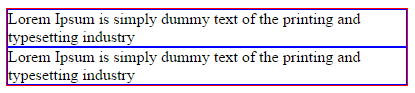
</div>In Chrome, the text is wrapping as expected:
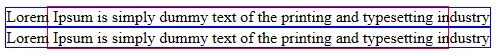
But, in IE11, the text is not wrapping:
Is this a known bug in IE? (if yes, a pointer will be appreciated)
Is there a known workaround?
This similar question doesn't have a definite answer and an official pointer.