With Swift 5.1 / iOS 13, you can create a subclass of UIButton in order to have a custom button that will look like the blue rounded border button in iOS AppStore app.
The following code shows how to manage properly the tint color (when the button appears behind the dimmed view of a UIAlertController), the title's color, the highlighted background color, the border's style, the border's color and the content insets.
CustomButton.swift:
import UIKit

class CustomButton: UIButton {

    override init(frame: CGRect) {
        super.init(frame: frame)
        setProperties()
    }

    required init?(coder aDecoder: NSCoder) {
        super.init(coder: aDecoder)
        setProperties()
    }

    func setProperties() {
        // Set the layer's properties
        layer.borderColor = tintColor?.cgColor
        layer.borderWidth = 1
        layer.cornerRadius = 4

        // Set colors for title's states
        setTitleColor(tintColor, for: .normal)
        setTitleColor(.white, for: .highlighted)

        // Add some margins between the title (content) and the border
        contentEdgeInsets = UIEdgeInsets(top: 5, left: 10, bottom: 5, right: 10)
    }

    override var isHighlighted: Bool {
        didSet {
            // Toggle the background color according to button's highlighted state
            backgroundColor = super.isHighlighted ? tintColor : nil
        }
    }

    override func tintColorDidChange() {
        super.tintColorDidChange()

        // When the tint color is changed by the system (e.g. when the button appears below the dimmed view of a UIAlertController), we have to manually update border color and title's text color
        layer.borderColor = tintColor?.cgColor
        setTitleColor(tintColor, for: .normal)
    }

}
ViewController.swift:
import UIKit

class ViewController: UIViewController {

    override func viewDidLoad() {
        super.viewDidLoad()

        view.backgroundColor = .secondarySystemBackground

        let button = CustomButton()
        button.setTitle("Normal", for: .normal)
        button.setTitle("Highlighted", for: .highlighted)
        button.addTarget(self, action: #selector(presentAlert(_:)), for: .touchUpInside)
        view.addSubview(button)

        // auto layout
        button.translatesAutoresizingMaskIntoConstraints = false
        button.centerXAnchor.constraint(equalTo: view.centerXAnchor).isActive = true
        button.topAnchor.constraint(equalTo: view.topAnchor, constant: 100).isActive = true
    }

    /// Present alert when button is tapped
    @objc func presentAlert(_ sender: UIButton) {
        let alertController = UIAlertController(title: "Title", message: "Message", preferredStyle: .alert)
        let alertAction = UIAlertAction(title: "OK", style: .default)
        alertController.addAction(alertAction)
        present(alertController, animated: true, completion: nil)
    }

}
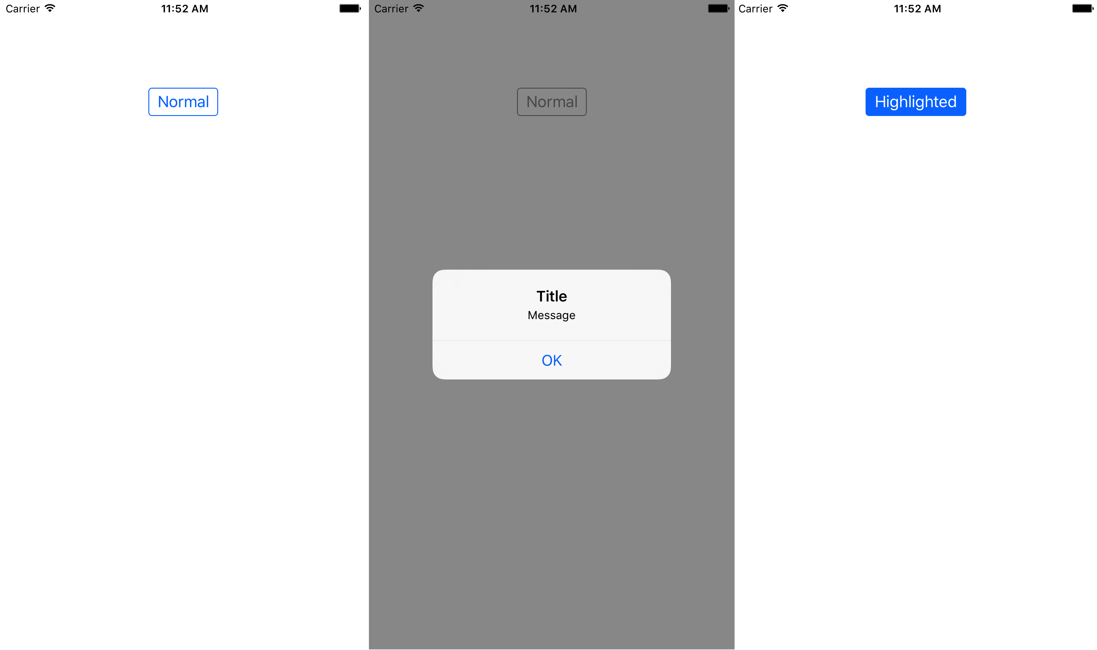
The images below show how the custom button will appear in normal state, when the system tinColor is changed (behind the dimmed view of a UIAlertController) and in highlighted state.

