I have a 132 x 107 dataset which consists of 2 patient types - (33 of patient 1) and (99 of patient 2).
I'm looking for outliers so I've run pca on the dataset and done qqplots of the 1st 4 components, using the following commands
pca = prcomp(data, scale. = TRUE)
plot(pca$x, pch = 20, col = c(rep("red", 33), rep("blue", 99)))
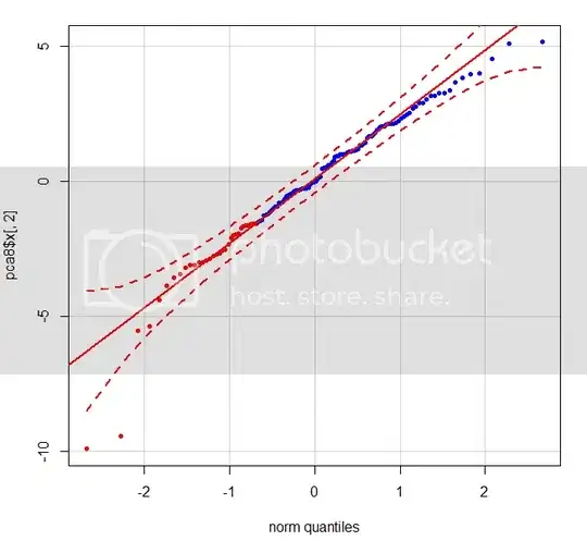
When I do the qqplot of the 2nd component using:
qqPlot(pca$x[,2],pch = 20, col = c(rep("red", 33), rep("blue", 99)))
the following graph shows 2 clear outliers - the red dots in the bottom left corner which are patient 1s.
Is there any straightforward way of working out the index of these points in the data so they can be removed?