2

Consider the following vector:

vec <- c(-0.137042293280008 ,-0.0085530023889108 ,7.696986350237e-05 ,9.85275557252565e-05 ,0.000246261331270769 ,-0.0013658222244989 ,0.00117046787783182 ,-0.000423648394606887 ,-0.000112607126438433 ,0.00212185051472275 ,-0.000110104526782098)
names(vec) <- paste("var", 1:length(vec), sep = " ")

I would like to plot vec using a bar plot in R. However, as you can see, there is one or two values that are extreme compared to the rest of the vector. When the bar plot is drawn, the small values barely show on the graph.

par(xaxs='i',yaxs='i', mai = c(0.5,2,0.5,1.5))
bp2 <- barplot(vec, horiz = TRUE, col = "lightblue4", border = "lightblue4", yaxt = 'n', cex.axis = 0.7)
axis(2, at = bp2, labels = names(vec), tick = FALSE, las = 2, cex.axis = 0.7)
enter image description here

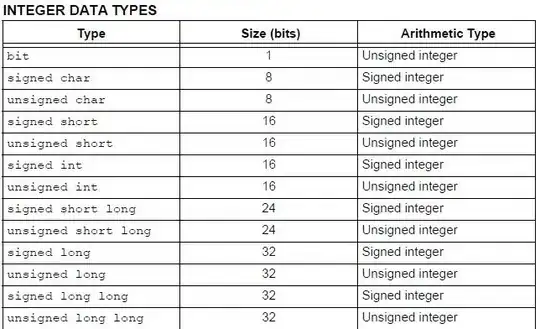
Is there a way to better display the chart? For example, is there a way to eventually split the x-axis? The graph below is an (unrelated) example, but it shows how the y-axis in this case is split to allow for all values to show on the graph.

P.S: Plotting with a log-scale is not an option in my case, as some of the vector values are negative.
enter image description here

Thank you!

Mayou
  • 8,498
  • 16
  • 59
  • 98
  • 1
    Would it be possible to use some other transformation, such as sign(x) * log(abs(x))? – Christopher Louden Nov 12 '13 at 14:54
  • 2
    You may have a look at `gap.barplot` in the `plotrix` package, which basically produces a plot like the lower one. – Henrik Nov 12 '13 at 14:54
  • @ChristopherLouden Unfortunately, no. The interpretation of the graph wouldn't be intuitive. – Mayou Nov 12 '13 at 14:59
  • [This question](http://stackoverflow.com/questions/19612348/break-x-axis-in-r/19612566#19612566) can be useful for you. – Jilber Urbina Nov 12 '13 at 14:59
  • @Jiber It is helpful indeed. Thanks! However, I am still trying to figure out how to work that function with a bar chart.. – Mayou Nov 12 '13 at 15:03

1 Answers1

2

You need gap.barplot from plotrix package. Take a look at this:

library(plotrix)
gap.barplot(vec,gap=c(-0.12,-0.04),xlab="Index",ytics=c(-0.04,-0.02,0),
            ylab="",main="Barplot with gap", horiz=TRUE)

Modify gap and ytics argument to get the desired aesthetic for your plot.

enter image description here

Jilber Urbina
  • 58,147
  • 10
  • 114
  • 138