19

My goal is to create a two-column layout with flexbox wherein the first column has two rows and the second column has one, like this:

enter image description here

Setting flex-basis: 100% on the third item gives the desired effect, but only when the container's flex-direction is row:

enter image description here

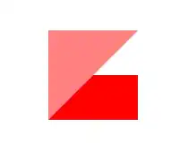
Changing flex-direction to column results in the following, unless the height is set explicitly, which is infeasible in my project:

enter image description here

How can I get the first image without explicitly setting the height of the container?

Here's a Plunker illustrating the problem.

body {
  display: flex;
  height: 100px;
  width: 100px;
}
.container {
  display: flex;
  flex-direction: column; /* Setting this to `row` gives the expected effect,but rotated */
  flex-grow: 1;
  flex-wrap: wrap;
  /* height: 100%; */ /* Setting this fixes the problem, but is infeasible for my project*/
}
.item {
  flex-grow: 1;
}
.one {
  background-color: red;
}
.two {
  background-color: blue;
}
.three {
  background-color: green;
  flex-basis: 100%;
}
<div class="container">
  <div class="item one">&nbsp;</div>
  <div class="item two">&nbsp;</div>
  <div class="item three">&nbsp;</div>
</div>
Michael Benjamin
  • 346,931
  • 104
  • 581
  • 701
Alek Storm
  • 707
  • 2
  • 8
  • 14
  • 2
    Why not nest the read and blue blocks? Then give your outer grid a horizontal direction and the inner grid vertical. It's more markup, but will work :P – Mark Simpson Nov 22 '13 at 03:21
  • 2
    The column orientation requires an explicit height in order for the flex-basis value to be honored as you would expect with wrapping elements. – cimmanon Nov 22 '13 at 04:30
  • @cimmanon Thanks. Out of curiosity, why isn't that the case when the grid is row-major? I can't find anything relevant in the spec. – Alek Storm Nov 22 '13 at 09:15
  • 4
    I don't know why it is the way it is (and yes, I do wish a height wasn't required). If you look outside Flexbox for a moment, all elements prefer to grow vertically rather than horizontally if the content is going to force scrolling. In a way, block elements do have an explicit width even when it is set to auto (the width of the parent element). Height, on the other hand, is determined by the contents of the element when set to auto. – cimmanon Nov 22 '13 at 13:36
  • Thanks for the clarification. There must be some deeper principle of CSS at work here that I'm not familiar with; it certainly does make sense, most of the time, for widgets to prefer growing vertically over horizontally. Perhaps this is tied to writing orientation somehow? I'll play with some modes designed for CJK languages and see how far I get. – Alek Storm Nov 22 '13 at 23:01
  • 1
    Interestingly, your Plunker example works for me in Firefox 32 (Win 7) 'as is'. Maybe it's just Chrom(e|ium) bug? – Ilya Streltsyn Sep 21 '14 at 22:23
  • The original code works in Chrome 51, so it must have been a Chromium bug. – Maximillian Laumeister Jun 03 '16 at 02:13

4 Answers4

23

Why it doesn't work:

Flex wrap only happens when the initial main size of the flex items overflows the flex container. In the case of flex-direction: row, this is when they flex items are wider than the container. With flex-direction: column, they must overflow the height of the container.

But in CSS, height behaves fundamentally differently than width. The height of a container in CSS is determined by the height of its children. Thus, without something constraining the container’s height, they flex items will never overflow; they just make their container taller. If they don’t overflow, they won’t wrap.

Possible solutions:

You have to constrain the height of the container. The obvious way (which you said is off the table), is setting an explicit height or max-height.

Ask yourself why you need to constrain the height. Is it to stay within the viewport? You could use viewport-relative units and set something like max-height: 100vh. Is it to equal the height of another column outside this flex container? You might be able to constrain it with another flexbox. Make this flex container a flex item in an outer flexbox. Something else in that outer flexbox would have to establish its height, though.

keithjgrant
  • 12,421
  • 6
  • 54
  • 88
2

Try to set flex: none for blocks inside the container in the condition when you change the orientation (@media etc.)

I tested it in Chrome and Firefox.

Miheretab Alemu
  • 956
  • 2
  • 20
  • 43
Deez
  • 21
  • 1
0

As far as i understand, the following code give the result you want:

body {
  display: flex;
  height: 100px;
  width: 100px;
}

.container {
  display: flex;
  flex-direction: column; 
  flex-wrap: wrap;
  flex-grow:1;
}

.item {
  flex-basis:50%;
}

.one {
  background-color: red;
}

.two {
  background-color: blue;

}

.three {
  background-color: green;
  flex-basis:100%;
}

Except from the flex-basis:50%; this code is equal to the code you use in the plunker. For some reason the plunker does not support flex-basis, see also:

enter image description here

Bass Jobsen
  • 48,736
  • 16
  • 143
  • 224
  • The OP wants to do this *without* setting an explicit height, which is not possible (at least, not without nesting). – cimmanon Sep 21 '14 at 23:33
  • yes, i agree the nesting seems to be a solution. Do you think setting `flex-basis` is an explicit height? Or do you refer to the height of the body? – Bass Jobsen Sep 21 '14 at 23:42
  • The height of the flex container. The flex-basis is *not* an explicit height, it is the suggested measurement across the main axis. – cimmanon Sep 21 '14 at 23:46
  • Well okay, but than i don't understand why the OP sets the height in his example code or call his question "CSS flex-basis not working when flex-direction is 'column'" The code works in FF (whitout height) but not in chrome, see http://codepen.io/anon/pen/Ezanf – Bass Jobsen Sep 22 '14 at 08:44
  • I know this might have been hard to imagine, but at the time the question was asked, it *didn't* work (note that this question is almost a year old. at the time, Firefox was still only supporting the original Flexbox properties). – cimmanon Sep 22 '14 at 12:56
0

I think you should build your layout using a Grid System in mind. On your first picture we can see 2 cols: first col is red and blue boxes, second col is the green box.

And then the structure should be like this:

<div class="flex-container">
    <div class="col column">
        <div class="content red"></div>
        <div class="content blue"></div>
    </div>
    <div class="col">
        <div class="content green"></div>
    </div>
</div>

Using these styles:

.flex-container {
   display:flex;
}
.col {
   flex:1;
   display:flex;
}
.column {
   flex-direction:column;
}
.content {
   flex:1;
}

Here is a quick code using your demo goal: https://jsfiddle.net/wyyLvymL/ Hope it helps! (if you need to understand how does it works, ping me)