I have a responsive website with a two-column layout in large browser windows. The two-column layout is currently implemented using float. On smaller screens I'd like to have just one column. The content of the other column should be displayed between the two elements of the main column, like shown here:
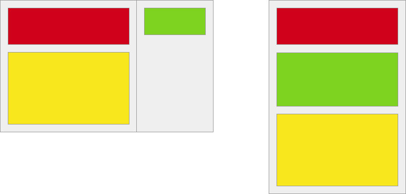
<div class="two-columns">
  <div class="main-column">
    <div class="red-element"></div>
    <div class="yellow-element"></div>
  </div>
  <div class="sidebar-column">
    <div class="green-element"></div>
  </div>
</div>
I tried using a flex-box-based approach, basically the one described in this question, but flex-basis still seems to be unsupported in Safari when flex-direction is column. Proper Safari support is a must as Safari is the main browser of my visitors.
Is there a way this can be achieved using CSS only without having to place the green element twice in my markup?