203

I am trying to create a rounded progressbar. This is what I want to achieve

There is a grey color background ring. On top of it, a blue color progressbar appears which moves in a circular path from 0 to 360 in 60 or whatever amount of seconds.

enter image description here

Here is my example code.

<ProgressBar
            android:id="@+id/ProgressBar"
            android:layout_width="match_parent"
            android:layout_height="match_parent"
            style="?android:attr/progressBarStyleLarge"
            android:indeterminateDrawable="@drawable/progressBarBG"
            android:progress="50"
            />

To do this, in the drawable "progressBarBG", I am creating a layerlist and inside that layer list I am giving two items as shown.

<layer-list xmlns:android="http://schemas.android.com/apk/res/android">
<item android:id="@android:id/background">
    <shape
            android:shape="ring"
            android:innerRadius="64dp"
            android:thickness="8dp"
            android:useLevel="false">

        <solid android:color="@color/grey" />
    </shape>
</item>

<item android:id="@android:id/progress">
    <clip>
        <shape
                android:shape="ring"
                android:innerRadius="64dp"
                android:thickness="8dp"
                android:useLevel="false">

            <solid android:color="@color/blue" />
        </shape>
    </clip>
</item>

Now, the first grey ring is generated fine. The blue ring however starts from the left of the drawable and goes to the right just like how a linear progressbar works. This is how it shows at 50% progress with the red color arrow showing direction.

enter image description here

I want to move the blue progressbar in circular path as expected.

Mahozad
  • 18,032
  • 13
  • 118
  • 133
Saurav Srivastava
  • 2,081
  • 3
  • 13
  • 7
  • 1
    I looked before posting this question. I found some answers but they did not work for what I am trying to achieve. Maybe someone downvoted me thinking this is a duplicate post. – Saurav Srivastava Jan 24 '14 at 13:51
  • I think you will need a customized solution. A ProgressBar, when not in indeterminate mode, uses a clip drawable to clip the progress layer of the drawable. But clip drawables only work horizontally or vertically, not as an angular wedge. I think you will have to create a subclass of Drawable to draw an arc that spans `getLevel()*360` degrees. And then since you can't use a custom view in an xml drawable, you will have to subclass ProgressBar so it will directly use your custom Drawable . – Tenfour04 Jan 24 '14 at 14:29
  • Check out this post: http://stackoverflow.com/questions/12776587/android-circular-determinate-progressbar – Yjay Jan 31 '14 at 16:09
  • 1
    maybe this can point you in the right direction https://github.com/grmaciel/two-level-circular-progress-bar – gmemario Oct 13 '15 at 23:26
  • 1
    you can use this library https://github.com/emre1512/CircleProgressBar – Zapdos Aug 04 '17 at 08:11
  • can anyone suggest how to do this type of progress bar https://drive.google.com/file/d/1coNXNUUAmo1tbgjnz6YitcXWaGibZTKg/view?usp=sharing – Suresh Mar 15 '18 at 09:28
  • https://github.com/Adilhusen/circle-progress-ad-android – Adil Feb 19 '19 at 12:35
  • This is totally unrelated but google search for filled android circular progress bar is showing me this question again and again so i am posting a link to show filled circular progress bar in android below. [Filled Circular android progressbar](https://stackoverflow.com/questions/67154062/show-circular-progress-bar-on-android-filled-circle/67154063#67154063) Feel free to down vote but please do not delete this answer as it might help people in future looking for a different type of progressbar and coming to the same answer again and again. – SATYAJEET RANJAN Apr 18 '21 at 22:48

16 Answers16

387

Here are my two solutions.

Short answer:

Instead of creating a layer-list, I separated it into two files. One for ProgressBar and one for its background.

This is the ProgressDrawable file (@drawable folder): circular_progress_bar.xml

<?xml version="1.0" encoding="utf-8"?>
<rotate xmlns:android="http://schemas.android.com/apk/res/android"
    android:fromDegrees="270"
    android:toDegrees="270">
    <shape
        android:innerRadiusRatio="2.5"
        android:shape="ring"
        android:thickness="1dp"
        android:useLevel="true"><!-- this line fixes the issue for lollipop api 21 -->

        <gradient
            android:angle="0"
            android:endColor="#007DD6"
            android:startColor="#007DD6"
            android:type="sweep"
            android:useLevel="false" />
    </shape>
</rotate>

And this is for its background(@drawable folder): circle_shape.xml

<?xml version="1.0" encoding="utf-8"?>
<shape
    xmlns:android="http://schemas.android.com/apk/res/android"
    android:shape="ring"
    android:innerRadiusRatio="2.5"
    android:thickness="1dp"
    android:useLevel="false">

    <solid android:color="#CCC" />

</shape>

And at the end, inside the layout that you're working:

<ProgressBar
        android:id="@+id/progressBar"
        android:layout_width="200dp"
        android:layout_height="200dp"
        android:indeterminate="false"
        android:progressDrawable="@drawable/circular_progress_bar"
        android:background="@drawable/circle_shape"
        style="?android:attr/progressBarStyleHorizontal"
        android:max="100"
        android:progress="65" />

Here's the result:

result 1

Long Answer:

Use a custom view which inherits the android.view.View

result 2

Here is the full project on github

M. Reza Nasirloo
  • 16,434
  • 2
  • 29
  • 41
  • @Pedram How should I set percentage to the progress bar? Like for example, currently it'd 50%. How should I set the 50% to the progress bar? –  Oct 03 '14 at 14:19
  • @20 Cents, Read the documentation, you should get a reference to your progressbar and the call its `setProgress` method then pass the value. https://www.google.com/url?sa=t&source=web&rct=j&ei=HbEuVOCSK8fiavW3gdAH&url=http://developer.android.com/reference/android/widget/ProgressBar.html&cd=1&ved=0CB0QFjAA&usg=AFQjCNHuxEkeDHP4UeDgdafyiPKGcoNtsQ&sig2=wUYbO83HxALfzoO26oyYJA – M. Reza Nasirloo Oct 03 '14 at 14:27
  • I went nuts trying to find the correct values, red dozens of stackoverflow topics, only to find the solution here.. `android:fromDegrees="270" android:toDegrees="270"` solved it!! Many thanks! – Henrique de Sousa Oct 23 '14 at 21:18
  • @Skynet Yes, and I haven't tried to fix it because I prefer to create a fully customized one with extending the View Class http://developer.android.com/training/custom-views/index.html – M. Reza Nasirloo Dec 24 '14 at 18:08
  • In git repository it is showing error in colorPickerDialog.show(getFragmentManager(), "color_picker"); MainActivity.java class. Can you help me why this is showing error here? – DJhon Apr 07 '15 at 12:33
  • is it usable in a widget? – mim May 16 '15 at 18:08
  • @Pedram, your old solution is definitely better! check my answer down the page and fix your solution (I couldn't post it as a comment -- too long!) – mim May 16 '15 at 22:54
  • 1
    @MimArmand Hey thanks, Actually it start working again in lollipop 5.1 update, And that line fixes the issue for api 21. – M. Reza Nasirloo May 17 '15 at 09:59
  • @Pedran Thank you so much for your answer, it seems that the useLevel set to true helped me as well on 5.0.2. Do you know the reason for using that attribute? I've never used it before... – Zsolt Boldizsar Sep 18 '15 at 12:27
  • Thank you. It is very laconic solution! `ObjectAnimator` is brilliant thing – IliaEremin Dec 01 '15 at 08:20
  • Need to add android:indeterminate="true" and android:indeterminateDrawable="@drawable/circular_progress_bar" as well to get the animation effect – Sreehari Feb 27 '18 at 08:15
  • For counter-clockwise direction, use negative sweepAngle. – Shahzeb Dec 24 '18 at 07:17
  • @M.RezaNasirloo how can I add percentage in the middle of the circle? – frank17 Feb 20 '19 at 20:45
  • hello if we want to add drawable then how can we do that ? coz shap does not allow drawable. – Vrajesh May 03 '19 at 18:50
  • @M.RezaNasirloo I have implemented any thing you said , but it is not giving me animation as it has to. is there any thing I am missing for animation? – Kamran Ali Nov 01 '19 at 09:27
  • @KamranAli The short answer does not have animation, click on the GitHub link for a solution with animation – M. Reza Nasirloo Nov 02 '19 at 10:46
  • Actually it doesn't have to do anything with animation, it solved my problem I've set progress in points value so it solved my problem. – Kamran Ali Nov 02 '19 at 12:06
  • How to make the progress shape cornered with radius? – Md. Rejaul Karim Nov 02 '21 at 06:22
35

With the Material Components Library you can use the CircularProgressIndicator:

Something like:

<com.google.android.material.progressindicator.CircularProgressIndicator
    app:indicatorColor="@color/...."
    app:trackColor="@color/...."
    app:indicatorSize="64dp"/>

You can use these attributes:

  • indicatorSize: defines the radius of the circular progress indicator
  • trackColor: the color used for the progress track. If not defined, it will be set to the indicatorColor and apply the android:disabledAlpha from the theme.
  • indicatorColor: the single color used for the indicator in determinate/indeterminate mode. By default it uses theme primary color

enter image description here

Use progressIndicator.setProgressCompat((int) value, true); to update the value in the indicator.

Note: it requires at least the version 1.3.0-alpha04.

Gabriele Mariotti
  • 320,139
  • 94
  • 887
  • 841
32

I have done with easy way:

Please check screen shot for the same.

CustomProgressBarActivity.java:

public class CustomProgressBarActivity extends AppCompatActivity {

    private TextView txtProgress;
    private ProgressBar progressBar;
    private int pStatus = 0;
    private Handler handler = new Handler();

    @Override
    protected void onCreate(Bundle savedInstanceState) {
        super.onCreate(savedInstanceState);
        setContentView(R.layout.activity_custom_progressbar);

        txtProgress = (TextView) findViewById(R.id.txtProgress);
        progressBar = (ProgressBar) findViewById(R.id.progressBar);

        new Thread(new Runnable() {
            @Override
            public void run() {
                while (pStatus <= 100) {
                    handler.post(new Runnable() {
                        @Override
                        public void run() {
                            progressBar.setProgress(pStatus);
                            txtProgress.setText(pStatus + " %");
                        }
                    });
                    try {
                        Thread.sleep(100);
                    } catch (InterruptedException e) {
                        e.printStackTrace();
                    }
                    pStatus++;
                }
            }
        }).start();

    }
}

activity_custom_progressbar.xml:

<RelativeLayout xmlns:android="http://schemas.android.com/apk/res/android"
    xmlns:tools="http://schemas.android.com/tools"
    android:layout_width="match_parent"
    android:layout_height="match_parent"
    android:paddingBottom="@dimen/activity_vertical_margin"
    android:paddingLeft="@dimen/activity_horizontal_margin"
    android:paddingRight="@dimen/activity_horizontal_margin"
    android:paddingTop="@dimen/activity_vertical_margin"
    tools:context="com.skholingua.android.custom_progressbar_circular.MainActivity" >


    <RelativeLayout
        android:layout_width="wrap_content"
        android:layout_centerInParent="true"
        android:layout_height="wrap_content">

        <ProgressBar
            android:id="@+id/progressBar"
            style="?android:attr/progressBarStyleHorizontal"
            android:layout_width="250dp"
            android:layout_height="250dp"
            android:layout_centerInParent="true"
            android:indeterminate="false"
            android:max="100"
            android:progress="0"
            android:progressDrawable="@drawable/custom_progressbar_drawable"
            android:secondaryProgress="0" />


        <TextView
            android:id="@+id/txtProgress"
            android:layout_width="wrap_content"
            android:layout_height="wrap_content"
            android:layout_alignBottom="@+id/progressBar"
            android:layout_centerInParent="true"
            android:textAppearance="?android:attr/textAppearanceSmall" />
    </RelativeLayout>


</RelativeLayout>

custom_progressbar_drawable.xml:

<?xml version="1.0" encoding="utf-8"?>
<rotate xmlns:android="http://schemas.android.com/apk/res/android"
    android:fromDegrees="-90"
    android:pivotX="50%"
    android:pivotY="50%"
    android:toDegrees="270" >

    <shape
        android:shape="ring"
        android:useLevel="false" >
        <gradient
            android:centerY="0.5"
            android:endColor="#FA5858"
            android:startColor="#0099CC"
            android:type="sweep"
            android:useLevel="false" />
    </shape>

</rotate>

Hope this will help you.

Hiren Patel
  • 52,124
  • 21
  • 173
  • 151
  • Hi Hiren, I am trying to display only two colors in the view. Red and green. But I see some mixture of red and green in the circle as well. How can i remove that ? – Lokesh Pandey Jan 27 '19 at 11:54
29

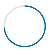
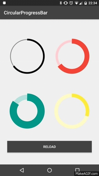
I have written detailed example on circular progress bar in android here on my blog demonuts.com. You can also fond full source code and explanation there.

Here's how I made circular progressbar with percentage inside circle in pure code without any library.

enter image description here

first create a drawable file called circular.xml

<?xml version="1.0" encoding="utf-8"?>

<layer-list xmlns:android="http://schemas.android.com/apk/res/android">
    <item android:id="@android:id/secondaryProgress">
        <shape
            android:innerRadiusRatio="6"
            android:shape="ring"
            android:thicknessRatio="20.0"
            android:useLevel="true">


            <gradient
                android:centerColor="#999999"
                android:endColor="#999999"
                android:startColor="#999999"
                android:type="sweep" />
        </shape>
    </item>

    <item android:id="@android:id/progress">
        <rotate
            android:fromDegrees="270"
            android:pivotX="50%"
            android:pivotY="50%"
            android:toDegrees="270">

            <shape
                android:innerRadiusRatio="6"
                android:shape="ring"
                android:thicknessRatio="20.0"
                android:useLevel="true">


                <rotate
                    android:fromDegrees="0"
                    android:pivotX="50%"
                    android:pivotY="50%"
                    android:toDegrees="360" />

                <gradient
                    android:centerColor="#00FF00"
                    android:endColor="#00FF00"
                    android:startColor="#00FF00"
                    android:type="sweep" />

            </shape>
        </rotate>
    </item>
</layer-list>

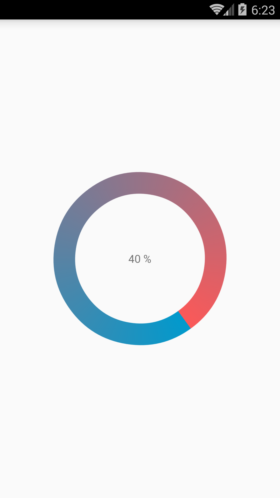
Now in your activity_main.xml add following:

  <?xml version="1.0" encoding="utf-8"?>
<RelativeLayout xmlns:android="http://schemas.android.com/apk/res/android"
    xmlns:tools="http://schemas.android.com/tools"
    android:layout_width="match_parent"
    android:layout_height="match_parent"
    android:background="@color/dialog"
    tools:context="com.example.parsaniahardik.progressanimation.MainActivity">
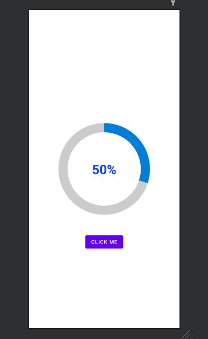
    <ProgressBar

        android:id="@+id/circularProgressbar"
        style="?android:attr/progressBarStyleHorizontal"
        android:layout_width="250dp"
        android:layout_height="250dp"
        android:indeterminate="false"
        android:max="100"
        android:progress="50"
        android:layout_centerInParent="true"
        android:progressDrawable="@drawable/circular"
        android:secondaryProgress="100"
        />

    <ImageView
        android:layout_width="90dp"
        android:layout_height="90dp"
        android:background="@drawable/whitecircle"
        android:layout_centerInParent="true"/>

    <TextView
        android:id="@+id/tv"
        android:layout_width="250dp"
        android:layout_height="250dp"
        android:gravity="center"
        android:text="25%"
        android:layout_centerInParent="true"
        android:textColor="@color/colorPrimaryDark"
        android:textSize="20sp" />

</RelativeLayout>

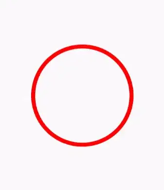
In activity_main.xml I have used one circular image with white background to show white background around percentage. Here is the image:

enter image description here

You can change color of this image to set custom color around percentage text.

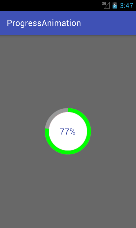
Now finally add following code to MainActivity.java :

import android.content.res.Resources;
import android.graphics.drawable.Drawable;
import android.os.Handler;
import android.support.v7.app.AppCompatActivity;
import android.os.Bundle;
import android.view.animation.DecelerateInterpolator;
import android.widget.ProgressBar;
import android.widget.TextView;

public class MainActivity extends AppCompatActivity {

    int pStatus = 0;
    private Handler handler = new Handler();
    TextView tv;
    @Override
    protected void onCreate(Bundle savedInstanceState) {
        super.onCreate(savedInstanceState);
        setContentView(R.layout.activity_main);

        Resources res = getResources();
        Drawable drawable = res.getDrawable(R.drawable.circular);
        final ProgressBar mProgress = (ProgressBar) findViewById(R.id.circularProgressbar);
        mProgress.setProgress(0);   // Main Progress
        mProgress.setSecondaryProgress(100); // Secondary Progress
        mProgress.setMax(100); // Maximum Progress
        mProgress.setProgressDrawable(drawable);

      /*  ObjectAnimator animation = ObjectAnimator.ofInt(mProgress, "progress", 0, 100);
        animation.setDuration(50000);
        animation.setInterpolator(new DecelerateInterpolator());
        animation.start();*/

        tv = (TextView) findViewById(R.id.tv);
        new Thread(new Runnable() {

            @Override
            public void run() {
                // TODO Auto-generated method stub
                while (pStatus < 100) {
                    pStatus += 1;

                    handler.post(new Runnable() {

                        @Override
                        public void run() {
                            // TODO Auto-generated method stub
                            mProgress.setProgress(pStatus);
                            tv.setText(pStatus + "%");

                        }
                    });
                    try {
                        // Sleep for 200 milliseconds.
                        // Just to display the progress slowly
                        Thread.sleep(8); //thread will take approx 1.5 seconds to finish
                    } catch (InterruptedException e) {
                        e.printStackTrace();
                    }
                }
            }
        }).start();
    }
}

If you want to make horizontal progressbar, follow this link, it has many valuable examples with source code:
http://www.skholingua.com/android-basic/user-interface/form-widgets/progressbar

Parsania Hardik
  • 4,593
  • 1
  • 33
  • 33
  • Nice and well-looked bar! But I don't understand why you're using a png image for background, not a compound drawable, so here is it: ` ` – Acuna Jul 04 '21 at 11:17
22

I realized a Open Source library on GitHub CircularProgressBar that does exactly what you want the simplest way possible:

Gif demo CircularProgressBar

USAGE

To make a circular ProgressBar add CircularProgressBar in your layout XML and add CircularProgressBar library in your projector or you can also grab it via Gradle:

compile 'com.mikhaellopez:circularprogressbar:1.0.0'

XML

<com.mikhaellopez.circularprogressbar.CircularProgressBar
    android:layout_width="wrap_content"
    android:layout_height="wrap_content"
    app:background_progressbar_color="#FFCDD2"
    app:background_progressbar_width="5dp"
    app:progressbar_color="#F44336"
    app:progressbar_width="10dp" />

You must use the following properties in your XML to change your CircularProgressBar.

Properties:

  • app:progress (integer) >> default 0
  • app:progressbar_color (color) >> default BLACK
  • app:background_progressbar_color (color) >> default GRAY
  • app:progressbar_width (dimension) >> default 7dp
  • app:background_progressbar_width (dimension) >> default 3dp

JAVA

CircularProgressBar circularProgressBar = (CircularProgressBar)findViewById(R.id.yourCircularProgressbar);
circularProgressBar.setColor(ContextCompat.getColor(this, R.color.progressBarColor));
circularProgressBar.setBackgroundColor(ContextCompat.getColor(this, R.color.backgroundProgressBarColor));
circularProgressBar.setProgressBarWidth(getResources().getDimension(R.dimen.progressBarWidth));
circularProgressBar.setBackgroundProgressBarWidth(getResources().getDimension(R.dimen.backgroundProgressBarWidth));
int animationDuration = 2500; // 2500ms = 2,5s
circularProgressBar.setProgressWithAnimation(65, animationDuration); // Default duration = 1500ms

Fork or Download this library here >> https://github.com/lopspower/CircularProgressBar

lopez.mikhael
  • 9,943
  • 19
  • 67
  • 110
16

Here is a simple customview for display circle progress. You can modify and optimize more to suitable for your project.

class CircleProgressBar @JvmOverloads constructor(
        context: Context, attrs: AttributeSet? = null, defStyleAttr: Int = 0
) : View(context, attrs, defStyleAttr) {
    private val backgroundWidth = 10f
    private val progressWidth = 20f

    private val backgroundPaint = Paint().apply {
        color = Color.LTGRAY
        style = Paint.Style.STROKE
        strokeWidth = backgroundWidth
        isAntiAlias = true
    }

    private val progressPaint = Paint().apply {
        color = Color.RED
        style = Paint.Style.STROKE
        strokeWidth = progressWidth
        isAntiAlias = true
    }

    var progress: Float = 0f
        set(value) {
            field = value
            invalidate()
        }

    private val oval = RectF()
    private var centerX: Float = 0f
    private var centerY: Float = 0f
    private var radius: Float = 0f

    override fun onSizeChanged(w: Int, h: Int, oldw: Int, oldh: Int) {
        centerX = w.toFloat() / 2
        centerY = h.toFloat() / 2
        radius = w.toFloat() / 2 - progressWidth
        oval.set(centerX - radius,
                centerY - radius,
                centerX + radius,
                centerY + radius)
        super.onSizeChanged(w, h, oldw, oldh)
    }

    override fun onDraw(canvas: Canvas?) {
        super.onDraw(canvas)
        canvas?.drawCircle(centerX, centerY, radius, backgroundPaint)
        canvas?.drawArc(oval, 270f, 360f * progress, false, progressPaint)
    }
}

Example using

xml

<com.example.androidcircleprogressbar.CircleProgressBar
    android:id="@+id/circle_progress"
    android:layout_width="200dp"
    android:layout_height="200dp" />

kotlin

class MainActivity : AppCompatActivity() {
    val TOTAL_TIME = 10 * 1000L

    override fun onCreate(savedInstanceState: Bundle?) {
        ...

        timeOutRemoveTimer.start()
    }

    private var timeOutRemoveTimer = object : CountDownTimer(TOTAL_TIME, 10) {
        override fun onFinish() {
            circle_progress.progress = 1f
        }

        override fun onTick(millisUntilFinished: Long) {
            circle_progress.progress = (TOTAL_TIME - millisUntilFinished).toFloat() / TOTAL_TIME
        }
    }
}

Result

Linh
  • 57,942
  • 23
  • 262
  • 279
5

I'm new so I can't comment but thought to share the lazy fix. I use Pedram's original approach as well, and just ran into the same Lollipop issue. But alanv over in another post had a one line fix. Its some kind of bug or oversight in API21. Literally just add android:useLevel="true" to your circle progress xml. Pedram's new approach is still the proper fix, but I just thought I share the lazy fix as well.

Community
  • 1
  • 1
Miao Liu
  • 440
  • 4
  • 9
5

enter image description here

<?xml version="1.0" encoding="utf-8"?>
<RelativeLayout
    xmlns:android="http://schemas.android.com/apk/res/android"
    android:layout_width="match_parent"
    android:layout_height="match_parent">
    <ProgressBar
        android:id="@+id/progress_circular_id"
        android:layout_width="250dp"
        android:layout_height="250dp"
        android:layout_centerInParent="true"
        android:indeterminate="false"
        android:progress="30"
        android:progressDrawable="@drawable/circular_progress_bar"
        android:background="@drawable/circle_shape"
        style="?android:attr/progressBarStyleHorizontal"
        android:max="100">
    </ProgressBar>
    <TextView
        android:id="@+id/textview_progress_status_id"
        android:layout_width="wrap_content"
        android:layout_height="wrap_content"
        android:text="50%"
        android:layout_centerInParent="true"
        android:textStyle="bold"
        android:textColor="@color/blue"
        android:textSize="35dp">
    </TextView>

    <Button
        android:id="@+id/check"
        android:layout_width="wrap_content"
        android:layout_height="wrap_content"
        android:layout_marginTop="50dp"
        android:text="click me"
        android:textColor="@color/white"
        android:layout_below="@+id/progress_circular_id"
        android:layout_centerHorizontal="true"
        >
    </Button>
</RelativeLayout>

Create a Drawable File with name circle_shape.xml

<?xml version="1.0" encoding="utf-8"?>
<shape
    xmlns:android="http://schemas.android.com/apk/res/android"
    android:shape="ring"
    android:innerRadiusRatio="2.5"
    android:thickness="25dp"
    android:useLevel="false">
    <solid android:color="#CCC" />

</shape>

Create a file with circular_progress_bar.xml

<?xml version="1.0" encoding="utf-8"?>
<rotate xmlns:android="http://schemas.android.com/apk/res/android"
    android:fromDegrees="270"
    android:toDegrees="270">
    <shape
        android:innerRadiusRatio="2.5"
        android:shape="ring"
        android:thickness="25dp"
        android:useLevel="true"><!-- this line fixes the issue for lollipop api 21 -->

        <gradient
            android:angle="0"
            android:endColor="#007DD6"
            android:startColor="#007DD6"
            android:type="sweep"
            android:useLevel="false" />
    </shape>
</rotate>

In java File For example purpose used fragmet.

public class FragmentRegistration extends BaseFragmentHelper {
    View registrationFragmentView;
    ProgressBar progressBar;
    Button button;
    int count=0;
    @Override
    public void onAttachFragment(@NonNull Fragment childFragment) {
        super.onAttachFragment(childFragment);
    }

    @Override
    public void onCreate(@Nullable Bundle savedInstanceState) {
        super.onCreate(savedInstanceState);
    }

    @Nullable
    @Override
    public View onCreateView(@NonNull LayoutInflater inflater, @Nullable ViewGroup container, @Nullable Bundle savedInstanceState) {
        registrationFragmentView = inflater.inflate(R.layout.new_device_registration, container, false);
        progressBar=(ProgressBar)registrationFragmentView.findViewById(R.id.progress_circular_id);
        button=(Button) registrationFragmentView.findViewById(R.id.check);
        button.setOnClickListener(new View.OnClickListener() {
            @Override
            public void onClick(View v) {
                count=count+10;
                progressBar.setProgress(count);
            }
        });
        return registrationFragmentView;
    }

    @Override
    public void onActivityCreated(@Nullable Bundle savedInstanceState) {
        super.onActivityCreated(savedInstanceState);
    }

    @Override
    public void onStart() {
        super.onStart();
    }

    @Override
    public void onResume() {
        super.onResume();
    }

    @Override
    public void onDetach() {
        super.onDetach();
    }

    @Override
    public void onDestroy() {
        super.onDestroy();
    }

    @Override
    public void onDestroyView() {
        super.onDestroyView();
    }
}
vinay shetty
  • 895
  • 1
  • 9
  • 15
4

try this method to create a bitmap and set it to image view.

private void circularImageBar(ImageView iv2, int i) {


    Bitmap b = Bitmap.createBitmap(300, 300,Bitmap.Config.ARGB_8888);
    Canvas canvas = new Canvas(b); 
    Paint paint = new Paint();

        paint.setColor(Color.parseColor("#c4c4c4"));
        paint.setStrokeWidth(10);
        paint.setStyle(Paint.Style.STROKE);
        canvas.drawCircle(150, 150, 140, paint);

        paint.setColor(Color.parseColor("#FFDB4C"));
        paint.setStrokeWidth(10);   
        paint.setStyle(Paint.Style.FILL);
        final RectF oval = new RectF();
        paint.setStyle(Paint.Style.STROKE);
        oval.set(10,10,290,290);

        canvas.drawArc(oval, 270, ((i*360)/100), false, paint);
        paint.setStrokeWidth(0);    
        paint.setTextAlign(Align.CENTER);
        paint.setColor(Color.parseColor("#8E8E93")); 
        paint.setTextSize(140);

        canvas.drawText(""+i, 150, 150+(paint.getTextSize()/3), paint); 

        iv2.setImageBitmap(b);
}
Mani
  • 3,394
  • 3
  • 30
  • 36
3

@Pedram, your old solution works actually fine in lollipop too (and better than new one since it's usable everywhere, including in remote views) just change your circular_progress_bar.xml code to this:

<?xml version="1.0" encoding="utf-8"?>
<rotate xmlns:android="http://schemas.android.com/apk/res/android"
    android:fromDegrees="270"
    android:toDegrees="270">
    <shape
        android:innerRadiusRatio="2.5"
        android:shape="ring"
        android:thickness="1dp"
        android:useLevel="true"> <!-- Just add this line -->
        <gradient
            android:angle="0"
            android:endColor="#007DD6"
            android:startColor="#007DD6"
            android:type="sweep"
            android:useLevel="false" />
    </shape>
</rotate>
mim
  • 1,301
  • 14
  • 24
2

https://github.com/passsy/android-HoloCircularProgressBar is one example of a library that does this. As Tenfour04 stated, it will have to be somewhat custom, in that this is not supported directly out of the box. If this library doesn't behave as you wish, you can fork it and modify the details to make it work to your liking. If you implement something that others can then reuse, you could even submit a pull request to get that merged back in!

Travis
  • 3,737
  • 1
  • 24
  • 24
  • I saw this library too but did not want to use another 3rd party library for this small task only. However, I am going to try both the methods mentioned by you and Tenfour04 to see which one works for me and reply back here. – Saurav Srivastava Jan 30 '14 at 12:45
  • 1
    @SauravSrivastava: I am also looking for a similar animation in my app.Have you found the solution? If yes,please share the solution. – Basher51 Apr 27 '14 at 05:34
  • @Travis Please see this question - https://stackoverflow.com/questions/44801280/drawing-a-circle-and-show-data-as-per-the-data-set – Kumar Jun 30 '17 at 15:59
2
package com.example.ankitrajpoot.myapplication;

import android.app.Activity;
import android.os.Bundle;
import android.view.View;
import android.widget.ProgressBar;


public class MainActivity extends Activity {

    private ProgressBar spinner;
    @Override
    protected void onCreate(Bundle savedInstanceState) {
        super.onCreate(savedInstanceState);
        setContentView(R.layout.activity_main);
        spinner=(ProgressBar)findViewById(R.id.progressBar);
        spinner.setVisibility(View.VISIBLE);
    }
}

xml

<?xml version="1.0" encoding="utf-8"?>
<RelativeLayout
xmlns:android="http://schemas.android.com/apk/res/android"
android:id="@+id/loadingPanel"
android:layout_width="match_parent"
android:layout_height="match_parent"
android:gravity="center">

<ProgressBar
    android:id="@+id/progressBar"

    android:layout_width="48dp"
    style="?android:attr/progressBarStyleLarge"
    android:layout_height="48dp"
    android:indeterminateDrawable="@drawable/circular_progress_bar"
    android:indeterminate="true" />
</RelativeLayout>


<?xml version="1.0" encoding="utf-8"?>
<rotate
    xmlns:android="http://schemas.android.com/apk/res/android"
    android:pivotX="50%"
    android:pivotY="50%"
    android:fromDegrees="0"
    android:toDegrees="1080">
    <shape
        android:shape="ring"
        android:innerRadiusRatio="3"
        android:thicknessRatio="8"
        android:useLevel="false">

        <size
            android:width="56dip"
            android:height="56dip" />

        <gradient
            android:type="sweep"
            android:useLevel="false"
            android:startColor="@android:color/transparent"
            android:endColor="#1e9dff"
            android:angle="0"
            />

    </shape>
</rotate>
Milad Ahmadi
  • 1,019
  • 12
  • 19
2

Change

android:useLevel="false"

to

android:useLevel="true"

for second sahpe with id="@android:id/progress

hope it works

Bentaye
  • 9,403
  • 5
  • 32
  • 45
ASHMIL
  • 521
  • 1
  • 7
  • 23
2

Good news is that now material design library supports determinate circular progress bars too:

<com.google.android.material.progressindicator.CircularProgressIndicator
    android:layout_width="wrap_content"
    android:layout_height="wrap_content" />

For more info about this refer here.

Mahozad
  • 18,032
  • 13
  • 118
  • 133
0

if you want to set progress in an anti-clock direction then use below image for set fromDegree and toDegree's values in progressDrawble xml.

enter image description here

<?xml version="1.0" encoding="utf-8"?>
<rotate xmlns:android="http://schemas.android.com/apk/res/android"
    android:fromDegrees="270"
    android:toDegrees="-90">
    <shape
        android:innerRadiusRatio="2"
        android:shape="ring"
        android:thickness="1dp"> 
        <gradient
            android:angle="0"
            android:endColor="#007DD6"
            android:startColor="#007DD6"
            android:type="sweep" />
    </shape>
</rotate>

This code will let your progress anti-clockwise and from the top. Change the degrees as per the above image from where you want to rotate your progress bar.

Hardik Hirpara
  • 2,594
  • 20
  • 34
0

You can use this library https://github.com/xYinKio/ArcCircleProgressBar

This is one of the most flexible circular progress bars

This picture is showing the lib powers

Jamy Cake
  • 1
  • 1