What I have is a 3-Levels Repeated Measures Factor and a continuous variable (Scores in psychological questionnaire, measured only once pre-experiment, NEO), which showed significant interaction together in a Linear Mixed Effects Model with a Dependent Variable (DV; State-Scores measured at each time level, IAS).
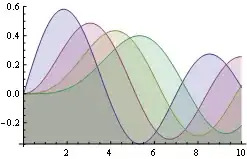
To see the nature of this interaction, I would like to create a plot with time levels on X-Axis, State-Score on Y-Axis and multiple curves for the continuous variable, similar to this. The continuous variable should be categorized in, say quartiles (so I get 4 different curves), which is exactly what I can't achieve. Until now I get a separate curve for each value in the continuous variable.
My goal is also comparable to this, but I need the categorial (time) variable not as separate curves but on the X-Axis.
I tried out a lot with different plot functions in R but did'nt manage to get what I want, maybe because I am not so skilled in dealing with R.
F. e.
gplot(Data_long, aes(x = time, y = IAS, colour = NEO, group = NEO)) +
  geom_line()
from the first link shows me dozens of curves (one for each value in the measurement NEO) and I can't find how to group continuous variables in a meaningful way in that gplot function.
Edit:
Original Data:
http://www.pastebin.ca/2598926
(I hope it is not too inconvenient.)
This object (Data_long) was created/converted with the following line:
Data_long <- transform(Data_long0, neo.binned=cut(NEO,c(25,38,46,55,73),labels=c(".25",".50",".75","1.00")))
Every value in the neo.binned col seems to be set correctly with enough cases per quantile.
What I then tried and didn't work:
ggplot(Data_long, aes(x = time, y = ias, color = neo.binned)) + stat_summary(fun.y="median",geom="line")
geom_path: Each group consist of only one observation. Do you need to adjust the group >aesthetic?
I got 92 subjects and values for NEO between 26-73. Any hints what to enter for cut and labels function? Quantiles are 0% 25% 50% 75% 100% 26 38 46 55 73.
 And stealing from CMichael's answer you can do it all in multiple (somehow you linked to facetted plots in your question):