0

Is there some trick that you can use with CSS to get %-sized elements scale towards their own center, rather than towards the corner?

Constraints:

  • Element can be absolutely positioned anywhere on page and it should still work
  • Element size is relative to the page width/height

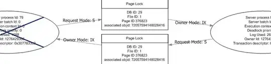
Here's an image that will hopefully help illustrate the issue:

As far as I can tell there's no solution for this other than doing it with JavaScript.

Note that I'm only looking for pure HTML/CSS solutions without using any JS for this question (although if you know a JS library for this, please do leave a comment).

Jani Hartikainen
  • 42,745
  • 10
  • 68
  • 86
  • When you say *shrinking*, what is the starting point ? The element sized at 100% 100%. ? – vals Feb 03 '14 at 18:52
  • @vals could be anything, but percentage sized in any case (in relation to container/page size) – Jani Hartikainen Feb 03 '14 at 19:17
  • Sorry, I don't get it. Could you add an example ? – vals Feb 03 '14 at 21:43
  • Basically put an image on a page, then give it `width: 50%; height: auto;` and it should show as different sizes depending on browser window size. You'll notice how it'll always shrink up and left, instead the goal would be to have it shrink towards the center like in the image – Jani Hartikainen Feb 03 '14 at 23:17

1 Answers1

0

Do you mean like this fiddle?

.positioner {
    position: absolute;
    top: 50%;
    left: 50%;

    width: 25%;
    padding-bottom: 25%;
}

.box {
    background-color: purple;
    position: absolute;
    top: -50%;
    left: -50%;

    width: 100%;
    padding-bottom: 100%;
}

It uses a wrapper DIV where the top left corner is absolutely positioned to where you want on the page. Then you adjust the center of your actual DIV on that TL corner. The size of the box is scaled to the outer.

<div class="positioner">
    <div class="box"></div>
</div>

If you can confirm that this is what you mean, we can next get it working with content. See this.

Or using translate: http://jsfiddle.net/6rQwx/1/

Community
  • 1
  • 1
cirrus
  • 5,624
  • 8
  • 44
  • 62
  • Yep, that's essentially the behavior I'm looking for. However the tricky part at least for me was actually getting it behave sanely using images :) (eg. an image with `height: auto;` to make it stay proportional) – Jani Hartikainen Feb 04 '14 at 10:32
  • With an IMG tag or a DIV with a background-image? – cirrus Feb 04 '14 at 13:05
  • With an IMG tag, the problem with using a background would be not being able to shrink the image proportionally when the size of the window becomes smaller (I think?). You'll see the problem with using a container for positioning in your fiddle with the animation, if you just disable animation and give the image a width (say 50%) it no longer shows because the width is calculated as a percentage of the positioning div instead of window. – Jani Hartikainen Feb 04 '14 at 14:20
  • That's only because I thought you wanted height:auto and I sized the xy position DIV container to be zero though. It doesn't have to be done that way of you want the image sized relative to the window area: http://jsfiddle.net/6rQwx/1/ But is translate a workable solution for you? – cirrus Feb 04 '14 at 15:06
  • Translate could work, though I might also want to animate the elements using translate which would complicate matters.. since putting things into containers as far as I can tell doesn't really work so great. Also thanks for taking the time to look into this, I realize this is kind of hard to put into a proper question due to the complexity :) – Jani Hartikainen Feb 08 '14 at 14:20
  • You can animate those. I do. – cirrus Feb 08 '14 at 21:33
  • I'll just accept this answer because these solutions are workable in some scenarios. The setup I have is a bit more complicated and it would be pretty damn tricky to get it working in an isolated environment for a question like this :) – Jani Hartikainen Feb 12 '14 at 20:03