Hello I want put another Y axis on the right of the chart with other label (Humidity %):
datos_tem <- dbGetQuery(connection, paste("SELECT temp_int,hum_int,datetime FROM datalog_v2 WHERE host_id=69 and datetime>='2013-10-01' and datetime<='2013-10-03';", sep=""))
dbDisconnect(connection)

datos_tem$datetime <- as.POSIXct(datos_tem$datetime)
datos_tem$temp_int <- as.numeric(datos_tem$temp_int)
datos_tem$hum_int <- as.numeric(datos_tem$hum_int)


#gg <- qplot(datos_tem$datetime, datos_tem$temp_int) + geom_line()        # first line
#gg <- gg + geom_line(aes( x=datos_tem$datetime, y=datos_tem$hum_int )) # add the second line!

Molten <- melt(datos_tem, id.vars = "datetime")
print(Molten)
ggplot(Molten, aes(x = datetime, y = value, colour = variable)) + geom_line() +
  scale_y_continuous(limits=c(0, 100)) +
   xlab("Temperature") +
   ylab("Time")
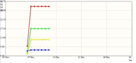
This produce:
Thanks in advance.