80

Wondering if its possible to change the size of checkbox as it's possible with buttons. I want it to be bigger, so it makes it easy to press. Right now its looking like this:

enter image description here

Code:

 <div class="form-group">
    <label  class="col-md-7 control-label">Kalsiumklorid: </label>
    <div class="col-md-5" >
      {{ Form::checkbox('O_Kals_Klor', 1 , array('class' => 'form-control' ))  }}  
    </div>
  </div>
isherwood
  • 58,414
  • 16
  • 114
  • 157
user3185936
  • 1,567
  • 6
  • 23
  • 44
  • 1
    possible duplicate, take a look at this, can help you out http://stackoverflow.com/questions/13631537/create-css-to-enlarge-checkboxes – brobken Mar 30 '14 at 12:33
  • 2
    Do you mean "as it's possible with **buttons**"? – Andrew Grimm Sep 16 '15 at 07:32
  • https://stackoverflow.com/questions/57805394/how-to-change-size-of-icheck-checkbox-and-add-border-radius/57805647?noredirect=1#comment102043290_57805647 – Pritesh Sep 05 '19 at 12:48

10 Answers10

59

Or you can style it with pixels.

 .big-checkbox {width: 30px; height: 30px;}
Rachel S
  • 3,780
  • 3
  • 24
  • 37
  • 9
    works in chrome but not in firefox :( stopped testing there. – John Feb 03 '16 at 09:34
  • 1
    @John I use this just for mobile since the default checkbox size is too small for a finger to comfortably tap it, and it worked on the mobile browsers I've tried. – Rachel S Feb 03 '16 at 14:53
  • @John Thanks to you, I didn't bother trying this one. I just added extra space on top and bottom of the checkbox to make it noticeable. – Gellie Ann Aug 01 '19 at 01:28
  • Forcing a width/height does work in Firefox, but you need to set both, else you'll just get a padded gap of the width/height you set. – Andrew West May 12 '22 at 10:46
47
input[type=checkbox]
{
  /* Double-sized Checkboxes */
  -ms-transform: scale(2); /* IE */
  -moz-transform: scale(2); /* FF */
  -webkit-transform: scale(2); /* Safari and Chrome */
  -o-transform: scale(2); /* Opera */
  padding: 10px;
}
SANA
  • 669
  • 7
  • 12
14

It is possible in css, but not for all the browsers.

The effect on all browsers:

http://www.456bereastreet.com/lab/form_controls/checkboxes/

A possibility is a custom checkbox with javascript:

http://ryanfait.com/resources/custom-checkboxes-and-radio-buttons/

Companjo
  • 1,789
  • 18
  • 24
12

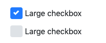
Following works in bootstrap 4 and displays well in CSS, mobile and has no issues with label spacing.

enter image description here

CSS

.checkbox-lg .custom-control-label::before, 
.checkbox-lg .custom-control-label::after {
  top: .8rem;
  width: 1.55rem;
  height: 1.55rem;
}

.checkbox-lg .custom-control-label {
  padding-top: 13px;
  padding-left: 6px;
}


.checkbox-xl .custom-control-label::before, 
.checkbox-xl .custom-control-label::after {
  top: 1.2rem;
  width: 1.85rem;
  height: 1.85rem;
}

.checkbox-xl .custom-control-label {
  padding-top: 23px;
  padding-left: 10px;
}

HTML

<div class="custom-control custom-checkbox checkbox-lg">
      <input type="checkbox" class="custom-control-input" id="checkbox-3">
      <label class="custom-control-label" for="checkbox-3">Large checkbox</label>
    </div>

You can also make it extra large by declaring checkbox-xl

If anyone from BS team is reading this, it would be really good if you make this available right out of the box, I don't see anything for it in BS 5 either

source

Robert Sinclair
  • 4,550
  • 2
  • 44
  • 46
10

It is possible to implement custom bootstrap checkbox for the most popular browsers nowadays.

You can check my Bootstrap-Checkbox project in GitHub, which contains simple .less file. There is a good article in MDN describing some techniques, where the two major are:

  1. Label redirects a click event.

    Label can redirect a click event to its target if it has the for attribute like in <label for="target_id">Text</label> <input id="target_id" type="checkbox" />, or if it contains input as in Bootstrap case: <label><input type="checkbox" />Text</label>.

    It means that it is possible to place a label in one corner of the browser, click on it, and then the label will redirect click event to the checkbox located in other corner producing check/uncheck action for the checkbox.

    We can hide original checkbox visually, but make it is still working and taking click event from the label. In the label itself we can emulate checkbox with a tag or pseudo-element :before :after.

  2. General non supported tag for old browsers

    Some old browsers does not support several CSS features like selecting siblings p+p or specific search input[type=checkbox]. According to the MDN article browsers that support these features also support :root CSS selector, while others not. The :root selector just selects the root element of a document, which is html in a HTML page. Thus it is possible to use :root for a fallback to old browsers and original checkboxes.

    Final code snippet:

:root {
  /* larger checkbox */
}
:root label.checkbox-bootstrap input[type=checkbox] {
  /* hide original check box */
  opacity: 0;
  position: absolute;
  /* find the nearest span with checkbox-placeholder class and draw custom checkbox */
  /* draw checkmark before the span placeholder when original hidden input is checked */
  /* disabled checkbox style */
  /* disabled and checked checkbox style */
  /* when the checkbox is focused with tab key show dots arround */
}
:root label.checkbox-bootstrap input[type=checkbox] + span.checkbox-placeholder {
  width: 14px;
  height: 14px;
  border: 1px solid;
  border-radius: 3px;
  /*checkbox border color*/
  border-color: #737373;
  display: inline-block;
  cursor: pointer;
  margin: 0 7px 0 -20px;
  vertical-align: middle;
  text-align: center;
}
:root label.checkbox-bootstrap input[type=checkbox]:checked + span.checkbox-placeholder {
  background: #0ccce4;
}
:root label.checkbox-bootstrap input[type=checkbox]:checked + span.checkbox-placeholder:before {
  display: inline-block;
  position: relative;
  vertical-align: text-top;
  width: 5px;
  height: 9px;
  /*checkmark arrow color*/
  border: solid white;
  border-width: 0 2px 2px 0;
  /*can be done with post css autoprefixer*/
  -webkit-transform: rotate(45deg);
  -moz-transform: rotate(45deg);
  -ms-transform: rotate(45deg);
  -o-transform: rotate(45deg);
  transform: rotate(45deg);
  content: "";
}
:root label.checkbox-bootstrap input[type=checkbox]:disabled + span.checkbox-placeholder {
  background: #ececec;
  border-color: #c3c2c2;
}
:root label.checkbox-bootstrap input[type=checkbox]:checked:disabled + span.checkbox-placeholder {
  background: #d6d6d6;
  border-color: #bdbdbd;
}
:root label.checkbox-bootstrap input[type=checkbox]:focus:not(:hover) + span.checkbox-placeholder {
  outline: 1px dotted black;
}
:root label.checkbox-bootstrap.checkbox-lg input[type=checkbox] + span.checkbox-placeholder {
  width: 26px;
  height: 26px;
  border: 2px solid;
  border-radius: 5px;
  /*checkbox border color*/
  border-color: #737373;
}
:root label.checkbox-bootstrap.checkbox-lg input[type=checkbox]:checked + span.checkbox-placeholder:before {
  width: 9px;
  height: 15px;
  /*checkmark arrow color*/
  border: solid white;
  border-width: 0 3px 3px 0;
}
<link href="https://maxcdn.bootstrapcdn.com/bootstrap/3.3.7/css/bootstrap.min.css" rel="stylesheet"/>
<p>
 Original checkboxes:
</p>
<div class="checkbox">
      <label class="checkbox-bootstrap">                                        
          <input type="checkbox">             
          <span class="checkbox-placeholder"></span>           
          Original checkbox
      </label>
 </div>
 <div class="checkbox">
      <label class="checkbox-bootstrap">                                        
          <input type="checkbox" disabled>             
          <span class="checkbox-placeholder"></span>           
          Original checkbox disabled
      </label>
 </div>
 <div class="checkbox">
      <label class="checkbox-bootstrap">                                        
          <input type="checkbox" checked>             
          <span class="checkbox-placeholder"></span>           
          Original checkbox checked
      </label>
 </div>
  <div class="checkbox">
      <label class="checkbox-bootstrap">                                        
          <input type="checkbox" checked disabled>             
          <span class="checkbox-placeholder"></span>           
          Original checkbox checked and disabled
      </label>
 </div>
 <div class="checkbox">
      <label class="checkbox-bootstrap checkbox-lg">                           
          <input type="checkbox">             
          <span class="checkbox-placeholder"></span>           
          Large checkbox unchecked
      </label>
 </div>
  <br/>
<p>
 Inline checkboxes:
</p>
<label class="checkbox-inline checkbox-bootstrap">
  <input type="checkbox">
  <span class="checkbox-placeholder"></span>
  Inline 
</label>
<label class="checkbox-inline checkbox-bootstrap">
  <input type="checkbox" disabled>
  <span class="checkbox-placeholder"></span>
  Inline disabled
</label>
<label class="checkbox-inline checkbox-bootstrap">
  <input type="checkbox" checked disabled>
  <span class="checkbox-placeholder"></span>
  Inline checked and disabled
</label>
<label class="checkbox-inline checkbox-bootstrap checkbox-lg">
  <input type="checkbox" checked>
  <span class="checkbox-placeholder"></span>
  Large inline checked
</label>
Artur A
  • 7,115
  • 57
  • 60
6

I used just "save in zoom", in example:

.my_checkbox {
    width:5vw;
    height:5vh;
}
Alex
  • 1,297
  • 1
  • 16
  • 12
3

just use simple css

.big-checkbox {width: 1.5rem; height: 1.5rem;top:0.5rem}
BJ Coder
  • 350
  • 5
  • 16
2

I have used this library with sucess

http://plugins.krajee.com/checkbox-x

It requires jQuery and bootstrap 3.x

Download the zip here: https://github.com/kartik-v/bootstrap-checkbox-x/zipball/master

Put the contents of the zip in a folder within your project

Pop the needed libs in your header

<link href="http://netdna.bootstrapcdn.com/bootstrap/3.3.6/css/bootstrap.min.css" rel="stylesheet">
<link href="path/to/css/checkbox-x.min.css" media="all" rel="stylesheet" type="text/css" />
<script src="//ajax.googleapis.com/ajax/libs/jquery/1.12.3/jquery.min.js"></script>
<script src="path/to/js/checkbox-x.min.js" type="text/javascript"></script>

Add the data controls to the element using the data-size="xl" to change the size as shown here http://plugins.krajee.com/cbx-sizes-demo

<label for="element_id">CheckME</label>
<input type="checkbox" name="my_element" id="element_id" value="1" data-toggle="checkbox-x" data-three-state="false" data-size="xl"/>

There are numerous other features as well if you browse the plugin site.

DropHit
  • 1,695
  • 15
  • 28
2

Aqui lo que me ayudo a solucionarlo:

.checkbox-xl .form-check-input 
{
    scale: 2.5;
}
.checkbox-xl .form-check-label 
{
    padding-left: 25px;
}
<div class="form-check checkbox-xl">
<input class="form-check-input" type="checkbox" value="1" id="checkbox-3" name="check1"/>
<label class="form-check-label" for="checkbox-3">Etiqueta</label>
</div>
1
<div id="rr-element">
   <label for="rr-1">
      <input type="checkbox" value="1" id="rr-1" name="rr[]">
      Value 1
   </label>
</div>
//do this on the css
div label input { margin-right:100px; }
SANA
  • 669
  • 7
  • 12