38

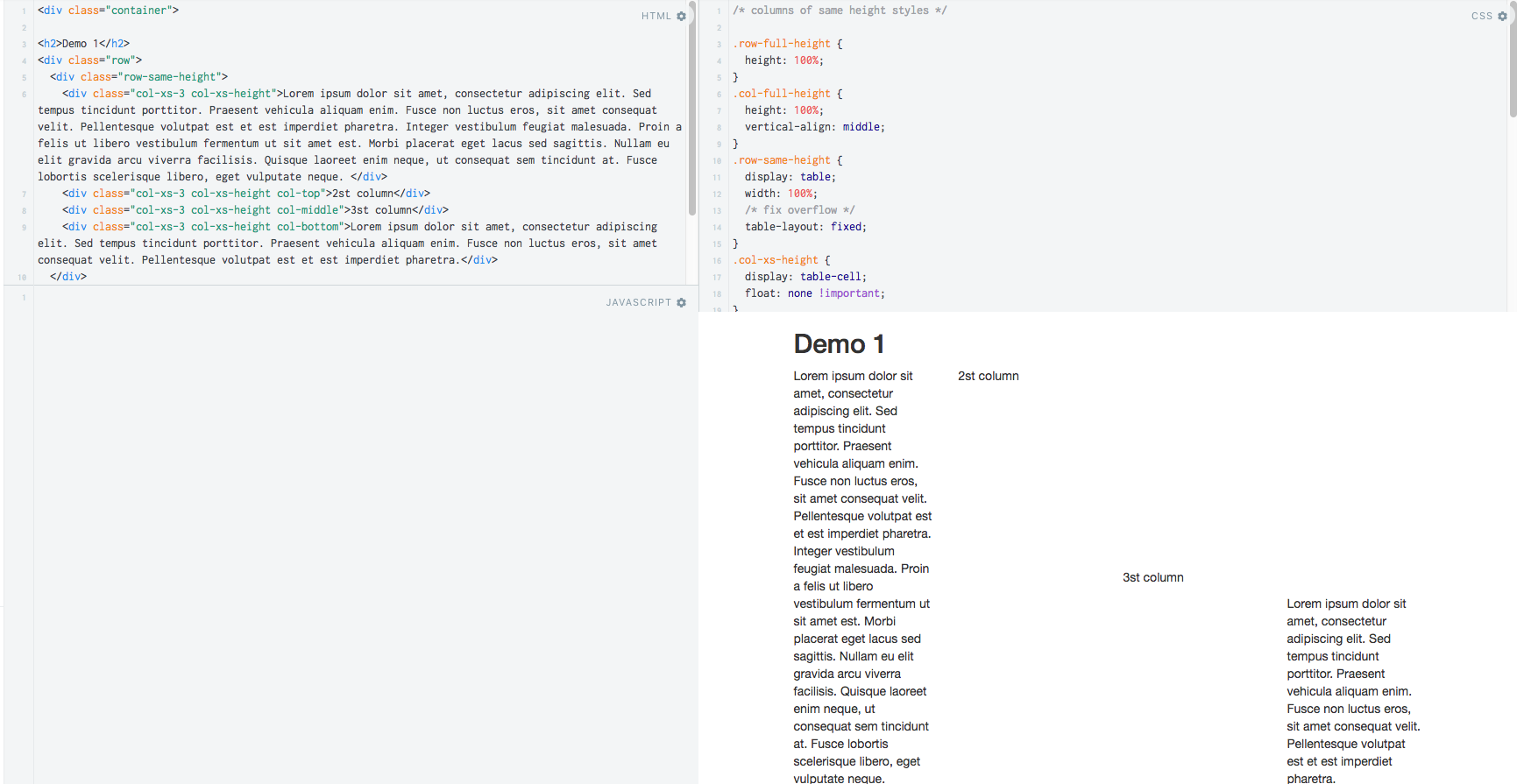
Hi I have four divs in a bootstrap row. I want all divs in this row to have the same height and not break responsibility. I don't know how to do this without breaking responsibility.

I have tried solving this with fixed heights but in terms of responsiveness this is a bad solution.

Thanks :-)

<div class="row">
    <div class="col-md-3 index_div_item">
        <a href="#">
        <div class="well" id="item1">
                <h1 class="h1_item"><span class="titre_item">Title</span></h1>
                <h2 class="h2_item_glyphicon"><span class="glyphicon glyphicon-ok-circle"></span></h2>
                <p>sidiis amicorum mariti inops cum liberis uxor alitur Reguli et dotatur ex aerario filia Scipionis, cum nobilitas florem adultae virginis diuturnum absentia pauperis erubesceret patr</p>                
        </div>
        </a>
    </div>    
    <div class="col-md-3 index_div_item">
        <a href="#">
            <div class="well" id="item2">
                <h1 class="h1_item"><span class="titre_item">Title</span></h1>
                <h2  class="h2_item_glyphicon"><span class="glyphicon glyphicon-stats"></span></h2>
                <p>sidiis amicorum mariti inops cum liberis uxor alitur Reguli et dotatur ex aerario filia Scipionis, cum nobilitas florem adultae virginis diuturnum absentia pauperis erubesceret patr</p>
            </div>  
        </a>
    </div>    
    <div class="col-md-3 index_div_item">
        <a href="#">
            <div class="well" id="item3">
                <h1 class="h1_item"><span class="titre_item">Title</span></h1>
                <h2  class="h2_item_glyphicon"><span class="glyphicon glyphicon-send"></span></h2>
                <p>sidiis amicorum mariti inops cum liberis uxor alitur Reguli et dotatur ex aerario filia Scipionis, cum nobilitas florem adultae virginis diuturnum absentia pauperis erubesceret patr</p>
            </div>
        </a> 
    </div>  
    <div class="col-md-3 index_div_item">
        <a href="#">
            <div class="well" id="item4">
                <h1 class="h1_item"><span class="titre_item">Title</span></h1>
                <h2  class="h2_item_glyphicon"><span class="glyphicon glyphicon-cog"></span></h2>
                <p>sidiis amicorum mariti inops cum liberis uxor alitur Reguli et dotatur ex aerario filia Scipionis, cum nobilitas florem adultae virginis diuturnum absentia pauperis erubesceret patr</p>                
            </div>  
        </a>  
    </div>              
</div>
APC
  • 144,005
  • 19
  • 170
  • 281
user3279494
  • 451
  • 1
  • 6
  • 14

16 Answers16

69

You can achieve this by using javascript. Find out the biggest height of the 4 divs and make all of them at the same height like the biggest one.

Here is the code:

$( document ).ready(function() {
    var heights = $(".well").map(function() {
        return $(this).height();
    }).get();

    maxHeight = Math.max.apply(null, heights);

    $(".well").height(maxHeight);
});

edit history: changed the ',' sign into ';' sign

Community
  • 1
  • 1
paulalexandru
  • 9,218
  • 7
  • 66
  • 94
  • 6
    That was actually the only solution that worked together with the responsiveness. – oktopus Feb 08 '15 at 16:04
  • 6
    the ONLY solution indeed. All the other answers that I've found are breaking responsiveness! I'm no webdev, barely a sysadmin trying to align some content.... but I was expecting this to be an easy one with bootstrap 3? what's the holdup? – user237419 Feb 26 '15 at 20:12
  • 2
    Well you know when we speak about responsive design we speak about width in general not height. Everything is about the width...equal heights has nothing to do with responsive design and unfortunately it seems like bootstrap 3 does not have a easyer solution for this. – paulalexandru Feb 26 '15 at 21:00
  • For some reason this seems to work well with Firefox but not Chrome. The height cuts itself. – Dynelight Apr 20 '15 at 00:22
  • To be honest, I did not tried this on Chrome, but I can't find any reason not to work on that browser. – paulalexandru Apr 20 '15 at 06:14
  • This doesn't work when the responsiveness causes the cells to be pushed below each other (each cell with a different top). Also, once the height is set, the cells don't shrink again when they need to. See my answer below. – Beakie Nov 10 '15 at 10:42
  • @Beakie - Do you think that I got all the votes for this answer because it doesn't work perfect? If you want to treat the browser resize issue, you can also insert this code in a resize window event and the job is done. – paulalexandru Nov 10 '15 at 11:56
  • 4
    IT DOESN'T WORK (as explained). I made a js fiddle: https://jsfiddle.net/mkjbq9ap/ Try resizing the page so that the blocks won't fit on a single line in the row. They keep the height. This is not as good as code below. – Beakie Nov 10 '15 at 12:11
  • 1
    Awesome solution. I copied and pasted into my javascript area and everything aligned in milliseconds. Thanks for posting that. – Andreas3204 Jun 15 '16 at 07:00
  • 1
    This is the best solution than CSS flex and things like that. Javascript rocks!! – Gijo Varghese Jul 20 '16 at 09:46
21

There was at one point an official experimental example of same-height columns using CSS flexbox with Bootstrap. Here's the gist of it:

.row-eq-height {
  display: -webkit-box;
  display: -webkit-flex;
  display: -ms-flexbox;
  display: flex;
}

And then use <div class="row row-eq-height"> instead of <div class="row">.

Note that flexbox isn't supported in IE<10.

cvrebert
  • 9,075
  • 2
  • 38
  • 49
  • 13
    note that just doing this removes pretty much all the default grid stylings of child col* classes. Almost none of the responsive features will work within the flex row. – ragefuljoe May 01 '14 at 15:00
  • 1
    http://jsbin.com/yihiq/2/edit No more col class behavior, and stacking on xs isn't working. Unless I'm missing something, doesn't seem like that's what I want to happen. – ragefuljoe May 02 '14 at 18:58
  • Part of that is mentioned in the "Warning: Changes column wrapping behavior" box in the docs that I linked to. The default-to-stacking-on-XS behavior can be achieved by adding a media query; you're right that we ought to document that. Otherwise, the col classes work the same though. – cvrebert May 03 '14 at 05:42
  • I replied to the same-height issue on gh. it's some progress at least to flexing. https://github.com/twbs/bootstrap/issues/13486 – ragefuljoe May 12 '14 at 16:01
  • 2
    This worked beautifully, except that it breaks column stacking. Therefore, enclose it in a @media rule and apply only when not stacked. – akame Jul 27 '16 at 10:37
  • this just breaks the whole grid system! – Arootin Aghazaryan Mar 04 '19 at 05:52
8

FYI - I did this to solve my issue to include responsive breakpoints which match the breakpoints in bootstrap. (I use LESS variables from bootstrap to synchronise the breakpoints but below is the compiled css version)

@media (min-width: 0px) and (max-width: 767px) {
  .fsi-row-xs-level {
    display: -webkit-box;
    display: -webkit-flex;
    display: -ms-flexbox;
    display: flex;
  }
}
@media (min-width: 768px) and (max-width: 991px) {
  .fsi-row-sm-level {
    display: -webkit-box;
    display: -webkit-flex;
    display: -ms-flexbox;
    display: flex;
  }
}
@media (min-width: 992px) and (max-width: 1199px) {
  .fsi-row-md-level {
    display: -webkit-box;
    display: -webkit-flex;
    display: -ms-flexbox;
    display: flex;
  }
}
@media (min-width: 1200px) {
  .fsi-row-lg-level {
    display: -webkit-box;
    display: -webkit-flex;
    display: -ms-flexbox;
    display: flex;
  }
}

then added the classes to the parent which were required.

<div class="row fsi-row-lg-level fsi-row-md-level">
<div class="col-sm-4">column 1</div>
<div class="col-sm-4">column 2</div>
<div class="col-sm-4">column 3</div>
</div>
5

EDIT 1 : I had to help someone with that so i made a plunkr. Go to "script.js" and comment "bootstrap_equalizer();" function to see original bootstrap, without same height columns.

I know this is a bit late but i'm sure that could improve your code and help some others ! :)

As i'm used to work with Foundation 5, when i have to work with bootstrap i miss the "equalizer".

I make a little function to call on pages where you have to "Equalize" some columns. My code is based on @paulalexandru response !

function bootstrap_equalizer() {
  $(".equalizer").each(function() {
    var heights = $(this).find(".watch").map(function() {
      return $(this).height();
    }).get(),

    maxHeight = Math.max.apply(null, heights);

    $(".watch").height(maxHeight);
  });
}

On html side, you just need to do this :

<div class="container">
   <div class="row equalizer">
      <div class="watch">
         Column 1
      </div>

      <div class="watch">
         Column 2
      </div>
   </div>
</div>

column 1 & column 2 will have same height ! You can of course have more than 2 columns !

Hope this can help ! =)

maxime1992
  • 22,502
  • 10
  • 80
  • 121
  • 1
    I had something similar where I would put a class or ID into a jquery function called `matchTallest`, but I like this implementation where I just add a class into the HTML. Thanks! – Mark Rummel Apr 24 '15 at 20:22
  • 1
    Combined your each iterator with the answer by @paulalexandru to come to a working solution. Your last line replaced by the one from the other answer: $(this).find(".watch").height(maxHeight); Else all ".watches" get modified at once. Now only the ".watches" in the row currently evaluated by jQuery's "each" iterator ;) – Youp Bernoulli Aug 25 '15 at 09:19
  • This works pretty well, but if you resize the browser to be smaller and your columns grow due to text wrapping the columns never shrink back to their former smaller size. – Matthew Lock May 18 '16 at 01:27
2

You can make use of the display:table properties:

.row {display:table; width:100%; border-spacing:10px; }
.col-md-3 {display:table-cell; width:25%;}

Example

Update

As people seem to be downvoting this as it breaks bootstrap, you should really be targeting the elements with different classes to what bootstrap uses - so here is an updated fiddle that won't break the rest of bootstrap - for the above code, if you add another class of table-row to the row, then you can use the following styles:

@media (min-width: 992px) {
  .row.table-row {
    display: table;
    width: 100%;
    min-width: 800px;
    border-spacing: 10px;
  }
  .row.table-row > .col-md-3 {
    display: table-cell;
    width: 25%;
  }
  .row.table-row > .col-md-3 {
    float: none;
  }
}

Example

Pete
  • 57,112
  • 28
  • 117
  • 166
2

I had same kind of situation wherein each column within a row should be of same height. By considering above answers and with little trick, it was easy to implement and resolve the issue of window resize also.

$(document).ready(function() {
    //Initiate equalize on load
    equalize();
});

//Equalize on resizing of window
$(window).resize(function() {
    removeHeights();
    equalize();
});

function equalize(){

    $(".container .row").each(function() {
        var heights = $(this).find("p").map(function() {
          return $(this).height();
        }).get(),

        maxHeight = Math.max.apply(null, heights);

      $(this).find("p").height(maxHeight);

    });
}

function removeHeights(){

    $(".container .row").each(function() {

      $(this).find("p").height("auto");

    });
}

Check the demo here - https://jsfiddle.net/3Lam7z68/ (Resize the output pane to see the each div column size's changing)

1

Bootstrap's experiment, as mentioned by @cvrebert, works for me on Microsoft Internet Explorer (version 11) and Mozilla Firefox (version 37), but does not work for me on Google Chrome (version 42, 64-bit).

Inspired by @cvrebert's and @Maxime's answers, I came up with this solution, that works for me on those three browsers. I decided to share it, so maybe others can use it too.

Suppose you have something like this in your HTML:

<div class="row row-eq-height">
    <div class="col-eq-height col-xs-3">
        Your content
    </div>
    <div class="col-eq-height col-xs-3">
        Your content
    </div>
    <div class="col-eq-height col-xs-3">
        Your content
    </div>
    <div class="col-eq-height col-xs-3">
        Your content
    </div>
</div>

Add this to your JS:

$(document).ready(function() {
    $(".row-eq-height").each(function() {
        var heights = $(this).find(".col-eq-height").map(function() {
            return $(this).outerHeight();
        }).get(), maxHeight = Math.max.apply(null, heights);

        $(this).find(".col-eq-height").outerHeight(maxHeight);
    });
});

It uses jQuery's .outerHeight() function to calculate and set the inner div's heights.

Also, I added this to my CSS, I'm not sure if this helps, but it surely does not hurt:

.row-eq-height {
    display: -webkit-box;
    display: -webkit-flex;
    display: -ms-flexbox;
    display: flex;
}
Antônio Medeiros
  • 3,068
  • 1
  • 27
  • 22
  • 1
    Now I realized doing that breaks responsiveness. Writing JS this way may help when the window is resized down: function equalize() { $(".row-eq-height").each(function() { // The code above }); } $(document).ready(function() { equalize(); $(window).resize(function() { equalize(); }); }); When the window is resized up, `div`'s heights remain the same. That new piece of code works only on Mozilla Firefox and Google Chrome (does not work on Microsoft Internet Explorer). – Antônio Medeiros May 13 '15 at 13:27
1

To have same columns height and not breaking responsiveness, you should try this:

https://github.com/liabru/jquery-match-height

It uses "JQuery". Until now, for me, It is the simpliest solution out there.

Omar Gonzales
  • 3,806
  • 10
  • 56
  • 120
0

For all the div's to have the same height you have to specfy a fixed height for the inner div (div class="well"),

CSS

.index_div_item{
    display: block;
    height: 400px;
}

.index_div_item a .well{
    height: 400px;
}

You can follow this link demo for example.

paulalexandru
  • 9,218
  • 7
  • 66
  • 94
shan
  • 78
  • 2
  • 9
0

I'm a bit late to the game, but....

This will align the heights of items in a row with a class of "row-height-matched". It matches the cells based on their top value so if they move underneath each other when the page gets smaller, I don't set the height.

I know there are a number of CSS versions out there, but all of them break my layout design.

$(window).resize(function () {
    var rows = $(".row.row-height-matched");

    rows.each(function () {
        var cells = $(this).children("[class^='col-']");

        cells.css("height", "");

        var j = [];

        cells.each(function () {
            j.push($(this).offset().top);
        });

        var u = $.unique($(j));

        u.each(function () {
            var top = $(this)[0];

            var topAlignedCells = cells.filter(function () {
                return $(this).offset().top == top;
            })

            var max = 0;

            topAlignedCells.each(function () {
                max = Math.max(max, $(this).height());
            })

            topAlignedCells.filter(function () {
                return $(this).height() != max;
            }).height(max);
        })

    })
})
Beakie
  • 1,948
  • 3
  • 20
  • 46
  • First this is not working on page load. Secondly you use way to much javascript code for an operation that you can handle in 5 code lines. – paulalexandru Nov 10 '15 at 11:49
  • Your code above doesn't work when the columns move to different lines within the row. You -1 me for pointing it out. Great work. This code just needs calling on document load (as yours does on resize). Yes it can be made smaller but it works... your's doesn't. – Beakie Nov 10 '15 at 12:14
0

I think that the paulalexandru's answer is quite good. I would only add some code to avoid troubles when the window is resized. If the div with the biggest height contains a photo, you could have troubles when the width of the image changes because it will change it's height also, so in this case you should deal with resizeevent.

$( document ).ready(function() {
    toAdapt();
    window.onresize=function(){toAdapt};       

});


function  toAdapt(){
    var heights = $(".well").map(function() {
        return $(this).height();
    }).get(),

    maxHeight = Math.max.apply(null, heights);

    $(".well").height(maxHeight);
}
Luis González
  • 3,199
  • 26
  • 43
0

If anybody is interested in a pure CSS solution that doesn't break the responsiveness, this worked for me (note that I added the class "row-eq-height" where the "row" class is to clarify and not interfere with bootstrap css and changed 'md' for 'xs' to check it better in the demo).

<div class="row row-eq-height">
<div class="col-xs-3 index_div_item">
    <a href="#">
    <div class="well" id="item1">
            <h1 class="h1_item"><span class="titre_item">Title</span></h1>
            <h2 class="h2_item_glyphicon"><span class="glyphicon glyphicon-ok-circle"></span></h2>
            <p>sidiis amicorum mariti inops cum liberis uxor alitur Reguli et dotatur ex aerario filia Scipionis, cum nobilitas florem adultae virginis diuturnum absentia pauperis erubesceret patr</p>                
    </div>
    </a>
</div>    
<div class="col-xs-3 index_div_item">
    <a href="#">
        <div class="well" id="item2">
            <h1 class="h1_item"><span class="titre_item">Title</span></h1>
            <h2  class="h2_item_glyphicon"><span class="glyphicon glyphicon-stats"></span></h2>
            <p>sidiis amicorum mariti inops cum liberis uxor alitur Reguli et dotatur ex aerario filia Scipionis, cum nobilitas florem adultae virginis diuturnum absentia pauperis erubesceret patr</p>
        </div>  
    </a>
</div>    
<div class="col-xs-3 index_div_item">
    <a href="#">
        <div class="well" id="item3">
            <h1 class="h1_item"><span class="titre_item">Title</span></h1>
            <h2  class="h2_item_glyphicon"><span class="glyphicon glyphicon-send"></span></h2>
            <p>sidiis amicorum mariti inops cum liberis uxor alitur Reguli et dotatur ex aerario filia Scipionis, cum nobilitas florem adultae virginis diuturnum absentia pauperis erubesceret patr</p>
        </div>
    </a> 
</div>  
<div class="col-xs-3 index_div_item">
    <a href="#">
        <div class="well" id="item4">
            <h1 class="h1_item"><span class="titre_item">Title</span></h1>
            <h2  class="h2_item_glyphicon"><span class="glyphicon glyphicon-cog"></span></h2>
            <p>sidiis amicorum mariti inops cum liberis uxor alitur Reguli et dotatur ex aerario filia Scipionis, cum nobilitas florem adultae virginis diuturnum absentia pauperis erubesceret patr</p>                
        </div>  
    </a>  
</div>              

css:

    .row-eq-height{
    overflow: hidden; 
}

.row-eq-height > [class*="col-"]{
    margin-bottom: -99999px;
    padding-bottom: 99999px;
}

You can check a demo here.

Watchmaker
  • 4,908
  • 1
  • 37
  • 38
  • this solution works. The content I'm putting in these divs is animated though, so it does cause a problems as the animation is based on whether or not the content is in the viewable area. So with those big margins and padding I'm either getting no animation because the div is so big, or the animation is flickering. – mediaguru Mar 16 '17 at 20:12
0

For people who are coming here for this solution in React, here it is:

  constructor(props) {
    super(props);
    this.state = {
      maxHeight: undefined,
    };

    this.putBootstrapColumnSameHeight = this.putBootstrapColumnSameHeight.bind(this);
  }

  componentDidMount() {
    this.putBootstrapColumnSameHeight();
  }

  putBootstrapColumnSameHeight() {
    const heights = [];
    document.querySelectorAll('.col').forEach(el => heights.push(el.clientHeight));
    this.setState(
      {
        maxHeight: Math.max.apply(null, heights),
      },
    );
  }

Then to your columns :

<Col xs={12} md={7} className="col" style={{ height: this.state.maxHeight }}>
 // etc..
</Col>

<Col xs={12} md={5} className="col" style={{ height: this.state.maxHeight }}>
 // etc..
</Col>

Enjoy ;)

Emidomenge
  • 1,172
  • 17
  • 26
-1

paulalexandru has a great answer that I used to solve my issue. However it doesn't address the problem that occurred for me when I resized the window. Sometimes the text would extend past the height specified and bleed into text in the row below.

So I added a second function that would detect the window resize, reset the height to auto and then set the height on the div if greater than 967. The 967 number can be changed to whatever number you wish to use when responsive brings everything down to just one column.

$(window).resize(function () {

        // reset height to auto.
        $(".div-name1").height("auto");  
        $(".div-name1").height("auto");            

        // check if the width is greater than 967 under 967 responsive switches to only 1 column per row
        if ($(window).width() > 967) {
            // resize the height
            myresize1(".row-name1", ".div-name-row1");
            myresize1(".row-name2", ".div-name-row2");
         }

            function myresize1(name1, name2) {
                $(name1).each(function () {
                    var heights = $(this).find(name2).map(function () {
                        console.log($(this).height() + " - ");
                        return $(this).height();
                    }).get(),

                    maxHeight = Math.max.apply(null, heights);
                    console.log(maxHeight + " - ");
                    $(name2).height(maxHeight);
                });
            };            
    });
Prescient
  • 1,051
  • 3
  • 17
  • 42
-1

We can achieve this by -

  1. By using table layout mechanism
  2. Using jquery-match-height js plugin

1. By using table layout mechanism

Demo - JS Fiddle

The mechanism is -

  1. Wrap all columns in one div
  2. Make that div as a Table with fixed layout
  3. Make each column as a table cell
  4. Use vertical-align property to control content position

We can make columns of same height and vertically aligned using following css and classes.

enter image description here

Base css will be-

  /* columns of same height styles */

.row-full-height {
  height: 100%;
}

.col-full-height {
  height: 100%;
  vertical-align: middle;
}

.row-same-height {
  display: table;
  width: 100%;
  /* fix overflow */
  table-layout: fixed;
}

.col-xs-height {
  display: table-cell;
  float: none !important;
}

@media (min-width: 768px) {
  .col-sm-height {
    display: table-cell;
    float: none !important;
  }
}

@media (min-width: 992px) {
  .col-md-height {
    display: table-cell;
    float: none !important;
  }
}

@media (min-width: 1200px) {
  .col-lg-height {
    display: table-cell;
    float: none !important;
  }
}


/* vertical alignment styles */

.col-top {
  vertical-align: top;
}

.col-middle {
  vertical-align: middle;
}

.col-bottom {
  vertical-align: bottom;
}

Base html will be-

<div class="container">
  <h2>Demo 1</h2>
  <div class="row">
    <div class="row-same-height">
      <div class="col-xs-3 col-sm-height">1st column</div>
      <div class="col-xs-3 col-sm-height col-top">2st column</div>
      <div class="col-xs-3 col-sm-height col-middle">3st column</div>
      <div class="col-xs-3 col-sm-height col-bottom">4th column</div>
    </div>
  </div>
</div>

2. Match Media Js

MatchHeight makes the height of all selected elements exactly equal. It handles many edge cases that cause similar plugins to fail.

Demo link - here

enter image description here

Community
  • 1
  • 1
Mohan Dere
  • 4,497
  • 1
  • 25
  • 21
-2

To make the website responsive you should specify the width in % and to display 4 divs with same height and specify height

.col-md-3 {
    width:25%;
    height:250px;
}

.row {
    width:100%;
}
paulalexandru
  • 9,218
  • 7
  • 66
  • 94
meena
  • 189
  • 1
  • 3
  • 12
  • Using a fixed height is not a solution for this question. Your code will also affect all other `.col-md-3` columns... – Mat Mar 26 '19 at 17:48