21

I have an R function which produces 95% confidence ellipses for scatterplots. The output looks like this, having a default of 50 points for each ellipse (50 rows):

           [,1]         [,2]
 [1,]  0.097733810  0.044957994
 [2,]  0.084433494  0.050337990
 [3,]  0.069746783  0.054891438

I would like to superimpose a number of such ellipses for each level of a factor called 'site' on a ggplot2 scatterplot, produced from this command:

> plat1 <- ggplot(mapping=aes(shape=site, size=geom), shape=factor(site)); plat1 + geom_point(aes(x=PC1.1,y=PC2.1))

This is run on a dataset, called dflat which looks like this:

site      geom         PC1.1        PC2.1       PC3.1        PC1.2       PC2.2
1 Buhlen 1259.5649 -0.0387975838 -0.022889782  0.01355317  0.008705276  0.02441577
2 Buhlen  653.6607 -0.0009398704 -0.013076251  0.02898955 -0.001345149  0.03133990

The result is fine, but when I try to add the ellipse (let's say for this one site, called "Buhlen"):

> plat1 + geom_point(aes(x=PC1.1,y=PC2.1)) + geom_path(data=subset(dflat, site="Buhlen"),mapping=aes(x=ELLI(PC1.1,PC2.1)[,1],y=ELLI(PC1.1,PC2.1)[,2]))

I get an error message: "Error in data.frame(x = c(0.0977338099339815, 0.0844334944904515, 0.0697467834016782, : arguments imply differing number of rows: 50, 211

I've managed to fix this in the past, but I cannot remember how. It seems that geom_path is relying on the same points rather than plotting new ones. Any help would be appreciated.
radu
  • 241
  • 2
  • 3
  • 7
  • Did you try to change the default of 50 points to 211? Does it work? You might have to add another argument to your function (the number of points) – gd047 Mar 07 '10 at 17:26
  • Hi, thanks for the quick reply. The function can change number of points, and I did try it with 211 points. It produces a strange very thick circle. I think it is not subsetting the data, first of all, and it should be able to plot it with 50 points - at least from the documentation, you can use different datasets on the same plot, so naturally, different numbers of points should be ok too. – radu Mar 07 '10 at 18:36
  • it will be much easier for us if you provide a minimal reproducible example. – xiechao Mar 08 '10 at 13:18
  • The things in the aes call should be variable names. – hadley Mar 08 '10 at 21:03
  • It would be amazing to have 95% confidence intervals ellipses as one of the smoothing functions! – Etienne Low-Décarie Apr 17 '12 at 11:18
  • 1
    Someone actually has implemented a ggplot2 stat for this (posted in my answer). – Etienne Low-Décarie Apr 17 '12 at 11:47

2 Answers2

23

Maybe this could help you:

#bootstrap
set.seed(101)
n <- 1000
x <- rnorm(n, mean=2)
y <- 1.5 + 0.4*x + rnorm(n)
df <- data.frame(x=x, y=y, group="A")
x <- rnorm(n, mean=2)
y <- 1.5*x + 0.4 + rnorm(n)
df <- rbind(df, data.frame(x=x, y=y, group="B"))

#calculating ellipses
library(ellipse)
df_ell <- data.frame()
for(g in levels(df$group)){
df_ell <- rbind(df_ell, cbind(as.data.frame(with(df[df$group==g,], ellipse(cor(x, y), 
                                         scale=c(sd(x),sd(y)), 
                                         centre=c(mean(x),mean(y))))),group=g))
}
#drawing
library(ggplot2)
p <- ggplot(data=df, aes(x=x, y=y,colour=group)) + geom_point(size=1.5, alpha=.6) +
  geom_path(data=df_ell, aes(x=x, y=y,colour=group), size=1, linetype=2)

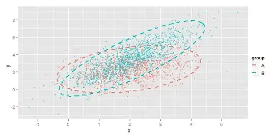
Output looks like this:

enter image description here

Here is more complex example.

Community
  • 1
  • 1
Yuriy Petrovskiy
  • 7,888
  • 10
  • 30
  • 34
  • Odd behavior can occur if color is turned off. Specifically without `color=...` in the plot call, there is a line drawn between the edges of the ellipses. This can be avoided with `group=group` (using the infelicitous variable name). – sautedman Apr 18 '16 at 16:56
22

Keelan Evanini, Ingrid Rosenfelder and Josef Fruehwald (JoFrhwld@gmail.com) have created a ggplot2 stat implementation of a 95% confidence interval ellipses (and an easier way to plot ellipses in ggplot2):

GitHub stat-ellipse.R

their site

You can use it as:

library(ggplot2)
library(devtools)
library(digest)
source_url("https://raw.github.com/low-decarie/FAAV/master/r/stat-ellipse.R")    
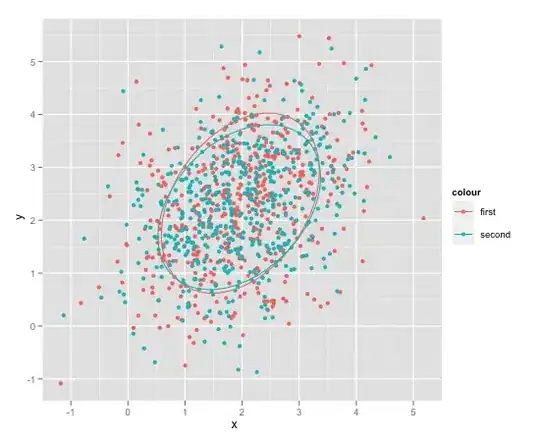
qplot(data=df, x=x, y=y, colour=colour)+stat_ellipse()

enter image description here

To create the data

set.seed(101)
n <- 1000
x <- rnorm(n, mean=2)
y <- 1.5 + 0.4*x + rnorm(n)
colour <- sample(c("first", "second"), size=n, replace=T)
df <- data.frame(x=x, y=y, colour=colour)
Etienne Low-Décarie
  • 13,063
  • 17
  • 65
  • 87