15

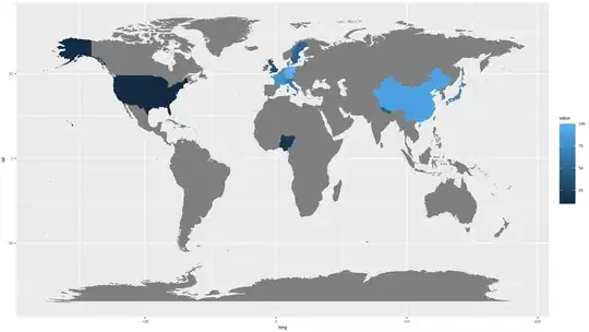
I have following simple example data which I want to plot on a map with gradient color corresponding to value of the given country.

ddf = read.table(text="
country value
USA 10
UK 30
Sweden 50
Japan 70
China 90
Germany 100
France 80
Italy 60
Nepal 40
Nigeria 20
", header=T)

On google search, I found several sites. However, I am looking for code which is small and clear, and should preferably be fast (I found ggplot methods to be relativley slow). The resolution of world map need not be high.

I tried following code:

library(maptools)
data(wrld_simpl)
plot(wrld_simpl)

Specific nations can be colored as given on : Using [R] maps package - colouring in specific nations on a world map Using the command:

plot(wrld_simpl, col = c(gray(.80), "red")[grepl("^U", wrld_simpl@data$NAME) + 1])

But how can I get map with above data in a gradient of colors. Thanks for your help.

Community
  • 1
  • 1
rnso
  • 23,686
  • 25
  • 112
  • 234

4 Answers4

12

Define "slow". ggplot provides one of the most flexible ways to present data on maps at the the cost of a few extra seconds.

library(RColorBrewer)
library(maptools)
library(ggplot2)

data(wrld_simpl)

ddf = read.table(text="
                 country value
                 'United States' 10
                 'United Kingdom' 30
                 'Sweden' 50
                 'Japan' 70
                 'China' 90
                 'Germany' 100
                 'France' 80
                 'Italy' 60
                 'Nepal' 40
                 'Nigeria' 20", header=TRUE)

# Pascal had a #spiffy solution that is generally faster

plotPascal <- function() {

  pal <- colorRampPalette(brewer.pal(9, 'Reds'))(length(ddf$value))
  pal <- pal[with(ddf, findInterval(value, sort(unique(value))))]

  col <- rep(grey(0.8), length(wrld_simpl@data$NAME))
  col[match(ddf$country, wrld_simpl@data$NAME)] <- pal

  plot(wrld_simpl, col = col)

}

plotme <- function() {

  # align colors to countries

  ddf$brk <- cut(ddf$value, 
                 breaks=c(0, sort(ddf$value)), 
                 labels=as.character(ddf[order(ddf$value),]$country),
                 include.lowest=TRUE)

  # this lets us use the contry name vs 3-letter ISO
  wrld_simpl@data$id <- wrld_simpl@data$NAME

  wrld <- fortify(wrld_simpl, region="id")
  wrld <- subset(wrld, id != "Antarctica") # we don't rly need Antarctica

  gg <- ggplot()

  # setup base map
  gg <- gg + geom_map(data=wrld, map=wrld, aes(map_id=id, x=long, y=lat), fill="white", color="#7f7f7f", size=0.25)

  # add our colored regions
  gg <- gg + geom_map(data=ddf, map=wrld, aes(map_id=country, fill=brk),  color="white", size=0.25)

  # this sets the scale and, hence, the legend
  gg <- gg + scale_fill_manual(values=colorRampPalette(brewer.pal(9, 'Reds'))(length(ddf$value)), 
                               name="Country")

  # this gives us proper coords. mercator proj is default
  gg <- gg + coord_map()
  gg <- gg + labs(x="", y="")
  gg <- gg + theme(plot.background = element_rect(fill = "transparent", colour = NA),
                   panel.border = element_blank(),
                   panel.background = element_rect(fill = "transparent", colour = NA),
                   panel.grid = element_blank(),
                   axis.text = element_blank(),
                   axis.ticks = element_blank(),
                   legend.position = "right")
  gg

}

system.time(plotme())
##  user  system elapsed 
## 1.911   0.005   1.915 

system.time(plotthem())
##  user  system elapsed 
## 1.125   0.014   1.138 

The ggplot code produces the following map:
enter image description here

The timings vary per-run, but I've not seen them go more than a full minute apart (it appeard to average 0.6m on my system, but I wasn't about to do extensive benchmarking).

UPDATE

As your requirements continue to be teased out, you can replace the discrete scale with a continuous one rather easily.

pal <- colorRampPalette(brewer.pal(9, 'Reds'))(length(ddf$value))
palSz <- 10 # not sure what you really want/need for this range

gg <- gg + scale_fill_gradient2(low = pal[1],
                                mid = pal[palSz/2],
                                high = pal[palSz],
                                midpoint = (max(ddf$value) + min(ddf$value)) / 2,
                                name="value")

enter image description here

But, it sounds like you should probably stick with @Andy's rworldmap since it abstracts the complexity.

hrbrmstr
  • 77,368
  • 11
  • 139
  • 205
  • Thanks. It is very good. I am trying it out further and will give a response. – rnso Jun 10 '14 at 11:45
  • Can we get numbers in legend rather than country names? – rnso Jun 10 '14 at 13:36
  • yes. just change the `labels` in the `ddf$brk` line. – hrbrmstr Jun 10 '14 at 14:07
  • Replacing $value for $country works but fails if two values are identical. Adding 'unique(' corrects this but I want palette scale to be shown (as in rworldmap solution) rather than value labels which are usually not round figures like 10, 20 etc. – rnso Jun 10 '14 at 16:48
  • I can see that in this code I can adjust everything. However, I cannot make it work. When 2 values are identical, I get this error: Error in cut.default(ddf$value, breaks = c(0, sort(ddf$value)), labels = as.character(ddf[order(ddf$value), : 'breaks' are not unique. Using 'unique(' does not solve this problem. ddf$brk <- cut( line needs to be modified. I tried but could not do it. Please do a really final edit after making values for Sweden & Japan as 67 (identical and not round figures). – rnso Jun 11 '14 at 01:32
  • you don't need the cut/breaks if you do the gradient fill. as Tyler suggested below, some leg work is in order. – hrbrmstr Jun 11 '14 at 01:37
  • 1
    I am attempting to do it myself as should be apparent in my comment above. Thanks for all your time & effort. Not everyone is a programmer here and I thought R was not only for programmers. I am sure after some time ggplot will come out with geom_map() function which will simplify this. Thanks again. – rnso Jun 11 '14 at 04:00
  • Any ideas for addressing: ` Error: isTRUE(gpclibPermitStatus()) is not TRUE ` – Brian P Mar 26 '15 at 18:12
  • @BrianP prbly http://stackoverflow.com/questions/27203231/error-istruegpclibpermitstatus-is-not-true-when-using-fortify-function-rgd – hrbrmstr Mar 27 '15 at 00:10
  • The code is very useful. But to change the discrete legend to continuous, in your code gg <- gg + scale_fill_gradient2..., which 'gg' I should add the 'scale_fill_gradient2'? I got 'Discrete value supplied to continuous scale' error when replacing the line 'gg <- gg + scale_fill_manual...' by 'gg <- gg + scale_fill_gradient2...' – yliueagle Jul 31 '18 at 17:48
  • Is there an updated version of `wrld_simpl` that recognizes South Sudan, Curacao, Bonaire, and Sint Maarten as their own countries? – pfadenhw May 20 '22 at 13:49
12

You could use rworldmap if you wanted less code and a coarser resolution map.

library(rworldmap)

#create a map-shaped window
mapDevice('x11')
#join to a coarse resolution map
spdf <- joinCountryData2Map(ddf, joinCode="NAME", nameJoinColumn="country")

mapCountryData(spdf, nameColumnToPlot="value", catMethod="fixedWidth")

Default categorisation, colours and legends can be altered, see this RJournal paper.

It would be faster with country codes rather than names.

rworldmap map

Andy
  • 1,821
  • 13
  • 23
  • This is really good. Minimal, clear coding, fast execution, plot complete with title and legend scale of numbers. Thanks. – rnso Jun 10 '14 at 13:45
  • Is something similar available at more granular levels for Indian administrative levels like states, cities or may be pin code levels? – Sandeep May 10 '16 at 09:16
  • I wonder why I get QuartzBitmap_Output - unable to open file '/var/folders/5z/gtbz8c5x10lc6fc67n3flmq00000gn/T//Rtmpy5dZU6/7b05e095ecc1462eabffd93a610e7bfe.png – Emmanuel Goldstein May 21 '21 at 05:02
  • I only have some countries, can I select a subset of countries instead the entire world map? – Marco Aug 25 '23 at 09:18
4

Probably not optimized:

library(RColorBrewer)
library(maptools)
data(wrld_simpl)

ddf = read.table(text="
country value
'United States' 10
'United Kingdom' 30
'Sweden' 50
'Japan' 70
'China' 90
'Germany' 100
'France' 80
'Italy' 60
'Nepal' 40
'Nigeria' 20", header=TRUE)

Reds is the name of a color palette. See ?brewer.pal for other available palettes.

pal <- colorRampPalette(brewer.pal(9, 'Reds'))(length(ddf$value))
pal <- pal[with(ddf, findInterval(value, sort(unique(value))))]

col <- rep(grey(0.8), length(wrld_simpl@data$NAME))
col[match(ddf$country, wrld_simpl@data$NAME)] <- pal

plot(wrld_simpl, col = col)

enter image description here

hrbrmstr
  • 77,368
  • 11
  • 139
  • 205
  • 1
    Thanks. Can we get a legend showing what values the colors correspond to? – rnso Jun 10 '14 at 10:24
  • 2
    @rnso Have a look at the [`legend`](http://stat.ethz.ch/R-manual/R-devel/library/graphics/html/legend.html) function. Do some leg work. – Tyler Rinker Jun 10 '14 at 12:41
1

I thought the other answers were slightly complicated, perhaps because this was asked/answered a relatively long time ago? Here's a simple way using ggplot2. I don't know what the benchmark is with respect to whether or not this is "fast".

library(ggplot2)
library(dplyr)

ddf = read.table(text="
country value
USA 10
UK 30
Sweden 50
Japan 70
China 90
Germany 100
France 80
Italy 60
Nepal 40
Nigeria 20
", header=T)

world <- map_data("world")

world %>%
  merge(ddf, by.x = "region", by.y = "country", all.x = T) %>%
  arrange(group, order) %>%
  ggplot(aes(x = long, y = lat, group = group, fill = value)) + geom_polygon()

world map, colored by value

This makes it easy to modify using all the common ggplot2 handles. For example, if we wanted to pretty this up quickly:

library(viridis)

world %>%
  merge(ddf, by.x = "region", by.y = "country", all.x = T) %>%
  arrange(group, order) %>%
  ggplot(aes(x = long, y = lat, group = group, fill = value)) +
  geom_polygon(color = "white", size = 0.2) +
  scale_fill_viridis("", na.value = "gray90") +
  theme_minimal() +
  theme(axis.text = element_blank(),
        axis.title = element_blank(),
        panel.grid = element_blank())

prettier map with viridis color scale, no axis titles, etc.

Hendy
  • 10,182
  • 15
  • 65
  • 71
  • 1
    Thanks for a good answer. I asked this question >7 years back and ggplot2 did not exist at that time (I think). – rnso Dec 10 '21 at 17:25
  • @rnso no problem and I just had one of my old questions or answers updated for the same reason. It's nice that these commonly found questions can get refreshed as the landscape changes :) – Hendy Dec 11 '21 at 21:04