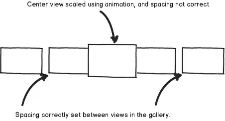
I'm assuming you want the 3rd box to be directly below the 1st box while the 2nd box is higher than the 1st box. This can only be achieved in Bootstrap by duplicating the contents of the 3rd box and hiding/showing it based on the grid size (e.g. sm). Pushing or pulling columns, using e.g. col-sm-push-4, won't help as they'll never make a column wrap to the next line.
As Bootstrap is a mobile first framework, the first step is to create the small layout. In order to get the 3rd box directly below the 1st box we'll need to use column nesting. The idea is to put the 1st and 3rd box in an inner grid inside the left column of the outer grid, while the 2nd box will be put in right column of the outer grid. Notice that the inner grid needs a .row to offset the padding of its parents col-xs-6, and that the columns inside the inner grid count up to 12. Some people think it needs to count up to 6 as they exist inside a col-xs-6, but that isn't the case.
<div class="container">
  <div class="row">
    <div class="col-xs-6">
      <div class="row">
        <div class="col-xs-12">
          <div class="box box--one">One</div>
        </div>
        <div class="col-xs-12">
          <div class="box box--three">Three</div>
        </div>
      </div>
    </div>
    <div class="col-xs-6">
      <div class="box box--two">Two</div>
    </div>
  </div>
</div>
The small layout now looks good. To get the other layout (I've assumed md as its breakpoint) change both col-xs-6 to col-xs-6 col-md-4 and add a 3rd column to the outer grid containing the 3rd box.
<div class="container">
  <div class="row">
    <div class="col-xs-6 col-md-4">
      ...
    </div>
    <div class="col-xs-6">
      ...
    </div>
    <div class="col-md-4">
      <div class="box box--three">Three</div>
    </div>
  </div>
</div>
It now looks completely broken, the 3rd box is shown twice and one of them is overlapping the 1st and 2nd box on screens smaller than md. We can fix this by hiding the columns containing the 3rd box for specific grid sizes. To hide the 3rd box inside the inner grid for larger screens change <div class="col-sm-12"> into <div class="col-sm-12 hidden-md hidden-lg">. And to hide the 3rd outer column for smaller screens change <div class="col-md-4"> into <div class="col-md-4 hidden-xs hidden-sm">
See the entire example code below:
.box {
  border: 1px solid #c66;
  background-color: #f99;
  padding: 15px;
  color: #fff;
  font-family: Helvetica, Arial;
  font-size: 24px;
}
.box--one,
.box--three {
  height: 100px;
}
.box--two {
  height: 200px;
}
<link href="http://maxcdn.bootstrapcdn.com/bootstrap/3.3.1/css/bootstrap.min.css" rel="stylesheet" />

<div class="container">
  <div class="row">
    <div class="col-xs-6 col-md-4">
      <div class="row">
        <div class="col-xs-12">
          <div class="box box--one">One</div>
        </div>
        <div class="col-xs-12 hidden-md hidden-lg">
          <div class="box box--three">Three</div>
        </div>
      </div>
    </div>
    <div class="col-xs-6 col-md-4">
      <div class="box box--two">Two</div>
    </div>
    <div class="col-md-4 hidden-xs hidden-sm">
      <div class="box box--three">Three</div>
    </div>
  </div>
</div>
PS If you don't like duplicating the 3rd box, as perhaps there's a lot of content inside, you can also use JavaScript to move the box into it's proper column when a breakpoint change occurs. I've made some jQuery plugin prototype that should be able to do this, see https://github.com/ckuijjer/jquery-breakpointspy
PS I just saw your updated question: if the boxes have a fixed height, simply add a class to the 3rd box of the large layout that gets a fixed height. If they don't have a fixed height, create some JavaScript that set the height to be equal and attach it to the resize event. A completely different solution would be to look into flexbox.

