17

I would like, when in mobile view, for the menu icon (defined with class icon-bar in the bootstrap basic navbar example) to change to an X shape (Something similar to what happens here: https://www.mint.com but less fancy (I just want to replace the 3 stripes with an X).

At the moment I am using a custom id: #ChangeToggle

<button id="ChangeToggle" type="button" class="navbar-toggle collapsed" data-toggle="collapse" data-target="#navbar" aria-expanded="false" aria-controls="navbar">
            <span class="sr-only">Toggle navigation</span>
            <span class="icon-bar"></span>
            <span class="icon-bar"></span>
            <span class="icon-bar"></span>
</button>

Along with the following javascript function (I know it's basic but I'm new to this):

<script>    
$('#ChangeToggle').click(function () {
    if($('#ChangeToggle span').hasClass('ToggleButton')) {
        $('#ChangeToggle').html('<span class="sr-only">Toggle navigation</span><span class="icon-bar"></span><span class="icon-bar"></span><span class="icon-bar"></span>'); 
    }
    else {      
        $('#ChangeToggle').html('<span class="ToggleButton glyphicon glyphicon-remove"></span>'); 
    }
});
</script>

Everything works, the only issue is that when I click exactly on the X icon the menu does not close. It only closes when I click outside of it (anywhere else in the button). The only thing it does while clicking on the X icon is going back to the original 3 stripes.

Anyone knows what I am doing wrong?

isherwood
  • 58,414
  • 16
  • 114
  • 157
DoubleD
  • 183
  • 1
  • 1
  • 6

9 Answers9

21

Your JavaScript replaces the inner html of the #ChangeToggle element to show either the X or the hamburger icon. Precisely clicking on the X or the hamburger menu instead of the #ChangeToggle will remove the element being clicked on which I think prevents it from bubbling up. As Bootstrap's collapse plugin uses an event handler on the document to determine if an element has been clicked, the collapse plugin will never get notified.

I've created a small example where a click handler on the pink .outer area replaces the green .inner area. Note that clicking on the pink area (your #ChangeToggle) will lead to two events, where clicking on the green area (your X icon) will lead to a single event.

$(function() {
  $('.outer')
    .click(function() {
      $('.outer').html('<div class="inner"></div>');
      fired('.js-outer');
    });

  $(document).on('click', '.outer', function() {
    fired('.js-document');
  });
});

function fired(el) {
  $(el).addClass('event--fire');
  window.setTimeout(function() {
    $(el).removeClass('event--fire')
  }, 100);
}
body {
  font-family: Helvetica Neue, Helvetica, Arial;
}
.outer,
.inner {
  display: inline-block;
  padding: 20px;
}
.outer {
  border: 1px solid #c66;
  background-color: #f99;
}
.inner {
  border: 1px solid #6c6;
  background-color: #9f9;
}
.event {
  margin: 10px 0;
}
.event::before {
  display: inline-block;
  content: '';
  border: 1px solid #ccc;
  padding: 10px;
  vertical-align: middle;
  margin-right: 10px;
}
.event--fire:before {
  background-color: #ff9;
}
<script src="//code.jquery.com/jquery-1.11.0.min.js"></script>


<div class="outer">
  <div class="inner">
  </div>
</div>

<div class="event js-outer">Event fires on .outer</div>
<div class="event js-document">Event fires on document</div>

The easiest way to solve this issue for your navigation bar is to hide/show the X or hamburger icon instead of replacing. In the example below both the X and the hamburger icon are in the html, and toggling the class .hidden is used to show the correct icon.

$(function() {
  $('#ChangeToggle').click(function() {
    $('#navbar-hamburger').toggleClass('hidden');
    $('#navbar-close').toggleClass('hidden');  
  });
});
<link href="//maxcdn.bootstrapcdn.com/bootstrap/3.3.2/css/bootstrap.min.css" rel="stylesheet" />
<script src="//code.jquery.com/jquery-1.11.0.min.js"></script>
<script src="//maxcdn.bootstrapcdn.com/bootstrap/3.3.2/js/bootstrap.min.js"></script>

<nav class="navbar navbar-default">
  <div class="container-fluid">
    <!-- Brand and toggle get grouped for better mobile display -->
    <div class="navbar-header">
      <button id="ChangeToggle" type="button" class="navbar-toggle collapsed" data-toggle="collapse" data-target="#bs-example-navbar-collapse-1">
        <div id="navbar-hamburger">
          <span class="sr-only">Toggle navigation</span>
          <span class="icon-bar"></span>
          <span class="icon-bar"></span>
          <span class="icon-bar"></span>
        </div>
        <div id="navbar-close" class="hidden">
          <span class="glyphicon glyphicon-remove"></span>
        </div>
      </button>
      <a class="navbar-brand" href="#">Brand</a>
    </div>

    <div class="collapse navbar-collapse" id="bs-example-navbar-collapse-1">
      <ul class="nav navbar-nav">
        <li class="active"><a href="#">Link <span class="sr-only">(current)</span></a>
        </li>
      </ul>
    </div>
  </div>
</nav>

Instead of adding a jQuery click handler next to Bootstrap's collapse plugin, you could also use the events fired by the collapse plugin to hide or show the correct icon. Use the shown.bs.collapse event to show the X icon, and the hidden.bs.collapse event to show the hamburger icon.

$(function() {
  
  $('#bs-example-navbar-collapse-1')
    .on('shown.bs.collapse', function() {
      $('#navbar-hamburger').addClass('hidden');
      $('#navbar-close').removeClass('hidden');    
    })
    .on('hidden.bs.collapse', function() {
      $('#navbar-hamburger').removeClass('hidden');
      $('#navbar-close').addClass('hidden');        
    });
  
});
#navbar-close {
  color: #888;
  width: 22px;
  height: 14px;
}
<link href="//maxcdn.bootstrapcdn.com/bootstrap/3.3.2/css/bootstrap.min.css" rel="stylesheet" />
<script src="//code.jquery.com/jquery-1.11.0.min.js"></script>
<script src="//maxcdn.bootstrapcdn.com/bootstrap/3.3.2/js/bootstrap.min.js"></script>

<nav class="navbar navbar-default">
  <div class="container-fluid">
    <!-- Brand and toggle get grouped for better mobile display -->
    <div class="navbar-header">
      <button id="ChangeToggle" type="button" class="navbar-toggle collapsed" data-toggle="collapse" data-target="#bs-example-navbar-collapse-1">
        <div id="navbar-hamburger">
          <span class="sr-only">Toggle navigation</span>
          <span class="icon-bar"></span>
          <span class="icon-bar"></span>
          <span class="icon-bar"></span>
        </div>
        <div id="navbar-close" class="hidden">
          <span class="glyphicon glyphicon-remove"></span>
        </div>
      </button>
      <a class="navbar-brand" href="#">Brand</a>
    </div>

    <div class="collapse navbar-collapse" id="bs-example-navbar-collapse-1">
      <ul class="nav navbar-nav">
        <li class="active"><a href="#">Link <span class="sr-only">(current)</span></a>
        </li>
      </ul>
    </div>
  </div>
</nav>
ckuijjer
  • 13,293
  • 3
  • 40
  • 45
17

This worked for me

Theory

CSS provides all the necessary animation tools. Basically what's happening is this:

  • The top and bottom lines must rotate to form the X
  • The middle line must disappear

The X will be taller an more narrow than the hamburger lines, so:

  • The top and middle lines must move out vertically and to the right to maintain its center

Application

/* Define the shape and color of the hamburger lines */
.navbar-toggler span {
    display: block;
    background-color: #4f4f4f;
    height: 3px;
    width: 25px;
    margin-top: 5px;
    margin-bottom: 5px;
    position: relative;
    left: 0;
    opacity: 1;
    transition: all 0.35s ease-out;
    transform-origin: center left;
}


/* top line needs a little padding */
.navbar-toggler span:nth-child(1) {
    margin-top: 0.3em;
}

/**
 * Animate collapse into X.
 */

/* top line rotates 45 degrees clockwise and moves up and in a bit to close the center of the X in the center of the button */
.navbar-toggler:not(.collapsed) span:nth-child(1) {
    transform: translate(15%, -33%) rotate(45deg);
}
/* center line goes transparent */
.navbar-toggler:not(.collapsed) span:nth-child(2) {
    opacity: 0;
}
/* bottom line rotates 45 degrees counter clockwise, in, and down a bit to close the center of the X in the center of the button  */
.navbar-toggler:not(.collapsed) span:nth-child(3) {
    transform: translate(15%, 33%) rotate(-45deg) ;
}


/**
 * Animate collapse open into hamburger menu
 */

/* top line moves back to initial position and rotates back to 0 degrees */
.navbar-toggler span:nth-child(1) {
    transform: translate(0%, 0%) rotate(0deg) ;
}
/* middle line goes back to regular color and opacity */
.navbar-toggler span:nth-child(2) {
    opacity: 1;
}
/* bottom line goes back to initial position and rotates back to 0 degrees */
.navbar-toggler span:nth-child(3) {
    transform: translate(0%, 0%) rotate(0deg) ;
}
<script src="https://code.jquery.com/jquery-3.5.1.slim.min.js"></script>
<script src="https://stackpath.bootstrapcdn.com/bootstrap/4.5.2/js/bootstrap.min.js"></script>
<link href="https://stackpath.bootstrapcdn.com/bootstrap/4.5.2/css/bootstrap.min.css" rel="stylesheet"/>

<!-- Bootstrap Navigation -->
<nav class="navbar bg-light">
        <a class="navbar-toggler collapsed border-0" type="button" data-toggle="collapse" data-target="#collapsingNavbar">
            <!-- these spans become the three lines -->
            <span> </span>
            <span> </span>
            <span> </span>
        </a>
        <a class="navbar-brand" href="./">
            Brand
        </a>
        <div class="collapse navbar-collapse" id="collapsingNavbar">
            <ul class="nav navbar-nav">
                <li class="nav-item">
                    <a class="nav-link" href="#">About</a>
                </li>
                <li class="nav-item">
                    <a class="nav-link" href="#">Contact</a>
                </li>
            </ul>
        </div>
</nav>
<main class="container">
    <h1>Content Here</h1>
    <p>Shrink the viewport if to expose the hamburger menu.</p>
</main>

What makes it work

Specifically, since the top and bottom lines rotate by 45 degrees to form the X, their center lines take up 70% of the width, so they must move in by 15%. This can be calculated using pythagorean theorem.

Right angle dimensions

As it happens, our hamburger menu is 26x21 px, or 24% wider than it is tall, but the X ends up being 20x20 square when you move the lines into place and you take into account the height of the lines (here defined as 3px).

In this particular implementation, we are defining the point of rotation of each line as being the center-left. This affects how much we move the lines up, since the lines are about 3px tall, they each add about (2.1/2)=1.05px to the height of the X, or about 33% of the height of the X.

Therefore 33% is how much they must move out vertically out so the two lines meet at the center of the X and form a 20x20px square.

The lines must move like this

Customizing

The X will always make a square, so to find out how much to move them by, you just need to know the width and height of your <span> bars and the height of the resulting hamburger icon.

Plug those numbers into this equation:
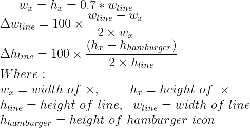
Equation

Or in code:

const line_width = 26; // px
const line_height = 3; // px
const hamburger_height = 21; // px

const x_width = x_height = 0.8 * line_width;
const line_move_y_percent = 100 * (line_width - x_width) / (2 * line_height)
const line_move_right_percent = 100 * (x_height - hamburger_height) / (2 * line_height)
Adonis Gaitatzis
  • 3,189
  • 26
  • 24
12

You don't need Javascript, CSS will do the Job

.navbar-toggle {
    .icon-bar {
        transition: 300ms ease-in-out;
        background-color: #fff;
        position: relative;
        width: 24px;
        height: 3px;
    }
    .icon-bar:last-child {
        -webkit-transform: rotate(-45deg);
        -ms-transform: rotate(-45deg);
        -o-transform: rotate(-45deg);
        transform: rotate(-45deg);
        top: -7px;
    }
    .icon-bar:nth-child(2) {
        -webkit-transform: rotate(45deg);
        -ms-transform: rotate(45deg);
        -o-transform: rotate(45deg);
        transform: rotate(45deg);
        top: 0px;
    }
    .icon-bar:nth-child(3) {
        opacity: 0;
    }
    &.collapsed {
        .icon-bar {
            -webkit-transform: rotate(0deg);
            -ms-transform: rotate(0deg);
            -o-transform: rotate(0deg);
            transform: rotate(0deg);        
            top: 0;
            opacity: 1;
        }
    }
}
Helmut
  • 443
  • 2
  • 9
  • 1
    Update 2020: This still works and looks great. Bootstrap dropped .icon-bar in 4.0. So you need to manually re-add it to get this nice looking animation: .navbar-toggler .icon-bar { display: block; width: 22px; height: 2px; border-radius: 1px; } .navbar-toggler .icon-bar + .icon-bar { margin-top: 4px; } – Robert Mar 29 '20 at 21:19
9

As of Bootstrap 4.1, the "hamburger" toggler is no longer <span> tags, and is now a single SVG icon background image.

Therefore it's simplest to swap it out with a little CSS. Then you can use another font icon (like FontAwesome) or a simple '✖' character...

   <button class="navbar-toggler collapsed border-0" type="button" data-toggle="collapse" data-target="#collapsingNavbar">
        <span class="navbar-toggler-icon"></span>
        <div class="close-icon py-1">✖</div>
   </button>

   /* hide close when burger shown */
   .navbar-toggler.collapsed .close-icon {
      display: none;
   }

   .navbar-toggler:not(.collapsed) .navbar-toggler-icon {
      display: inline;
   }

Demo


Another option is this animated hamburger:
https://codeply.com/p/L9HT5GaUtt

Carol Skelly
  • 351,302
  • 90
  • 710
  • 624
  • Slightly simpler: you could also put the ✖ in the `.navbar-toggler-icon` itself and just style it to be transparent (i.e. `color: rgba(0,0,0,0)`). Then rather than hiding the icon you can set `background-image: none` and the colour to whatever you want using a CSS `:not(.collapsed)` rule. Needs a line-height set to get it centred. – richplane May 03 '21 at 14:40
6

Smart decision helped me in codepen

HTML

<div class="navbar-header">
     <button type="button" class="navbar-toggle collapsed" data-toggle="collapse" data-target="#bs-example-navbar-collapse-1" aria-expanded="false">
         <span class="icon-bar"></span>
         <span class="icon-bar"></span>
         <span class="icon-bar"></span>
     </button>
</div>

CSS

.navbar-toggle .icon-bar:nth-of-type(2) {
    top: 1px;
}
.navbar-toggle .icon-bar {
    position: relative;
    transition: all 500ms ease-in-out;
}
.navbar-toggle.active .icon-bar:nth-of-type(1) {
    top: 6px;
    transform: rotate(45deg);
}
.navbar-toggle.active .icon-bar:nth-of-type(2) {
    background-color: transparent;
}
.navbar-toggle.active .icon-bar:nth-of-type(3) {
    top: -6px;
    transform: rotate(-45deg);
}

JS

$(".navbar-toggle").on("click", function () {
    $(this).toggleClass("active");
});
dimitar
  • 1,019
  • 13
  • 19
  • 1
    Thanks, this solution helped me to solve the problem I had by using icons and ng-click, because in some cases they 2 icons swapped with a delay respect to the collapsing time. – silvanasono Apr 14 '16 at 12:16
  • Indeed very smart solution. Thumbs Up! – Jklyn Jul 10 '21 at 10:19
3

No need to use javascript through css also you can do please follow below code.

HTML

<div class="navbar-header">
     <button type="button" class="navbar-toggle collapsed" data-toggle="collapse" data-target="#bs-example-navbar-collapse-1" aria-expanded="false">
         <span class="icon-bar"></span>
         <span class="icon-bar"></span>
         <span class="icon-bar"></span>
     </button>
</div>

CSS (in css use :not which will perform faster animation rather than javascript)

.navbar-toggle .icon-bar {
    position: relative;
    transition: all 200ms ease-in-out;
}

.navbar-toggle:not(.collapsed) .icon-bar:nth-of-type(1) {
    top: 6px;
    transform: rotate(45deg);
}

.navbar-toggle:not(.collapsed) .icon-bar:nth-of-type(2) {
    background-color: transparent;
}

.navbar-toggle:not(.collapsed) .icon-bar:nth-of-type(3) {
    top: -6px;
    transform: rotate(-45deg);
}      
Soubhagya Kumar Barik
  • 1,979
  • 20
  • 26
1

The below code helps you to solve this issue.

Html:

<div class="content">
<h1>Mobile Navigation menu using css and jquery</h1>
<div class="icons">
<button class="icon">
<span></span>
<span></span>
<span></span>
</button>
</div>
</div>

css:

.btn {
background-color: #ffd200;
color: #00174f;
display: inline-block;
text-decoration: none;
padding: 13px 30px;
margin: 30px 0 0 0;
border-radius: 3px;
font-weight: bold;
}
.btn:hover {
background-color: #fff;
}
.btn--transition {
-webkit-transition: -webkit-transform 0.2s;
-webkit-transition: all 200ms ease-in-out;
transition: all 200ms ease-in-out;
}
:focus {
outline: none;
}
.icons {
margin: 50px 0;
}
.icon {
margin: 0 30px 0 0;
}

.icon {
background-color: #ff3000;
border: 0;
height: 79px;
width: 79px;
border-radius: 50%;
cursor: pointer;
position: relative;
}
.icon span {
display: block;
height: 5px;
width: 33px;
background-color: #ffffff;
border-radius: 2px;
position: absolute;
left: 23px;
-webkit-transition: -webkit-transform 0.3s;
-webkit-transition: all 300ms ease-in-out;
transition: all 300ms ease-in-out;
}
.icon span:first-child {
top: 28px;
}
.icon span:nth-child(2) {
top: 37px;
}
.icon span:last-child {
top: 46px;
}
.icon--active span:first-child {
-webkit-transform: rotate(45deg);
-ms-transform: rotate(45deg);
transform: rotate(45deg);
position: absolute;
top: 37px;
}
.icon--active span:last-child {
-webkit-transform: rotate(-45deg);
-ms-transform: rotate(-45deg);
transform: rotate(-45deg);
position: absolute;
top: 37px;
}
.icon--active span:nth-child(2) {
opacity: 0;
}
.icon--button {
border-radius: 10px;
}
.icon-transition {
-webkit-transition: -webkit-transform 0.3s;
-webkit-transition: all 300ms ease-in-out;
transition: all 300ms ease-in-out;
}

javascript

<script>
var animation = 'rubberBand';
$('.icon').on('click', function () {
$(this).toggleClass('icon--active');
});
$('.icon').on('click', function () {
$(this).addClass('animated ' + animation).one('webkitAnimationEnd mozAnimationEnd MSAnimationEnd oanimationend animationend', function () {
$(this).removeClass('animated ' + animation);
});
});
</script>

This snippets is used to change the mobile icon to close icon on click the button.

Zoe
  • 27,060
  • 21
  • 118
  • 148
M. Lak
  • 903
  • 9
  • 18
0

I tried @Zim's solution and it worked perfectly, thanks for sharing. I did make 2 slight adjustments:

  1. I changed border-0 to border-1 to keep a border around the hamburger image.
  2. I added a background color on the div since the X ended up being a similar color to my existing background.
MEDZ
  • 2,227
  • 2
  • 14
  • 18
0

Bootstrap v5.2:

HTML:

<button class="navbar-toggler" id="navbar-toggler" type="button" data-bs-toggle="collapse" data-bs-target="#navbarNav" aria-controls="navbarNav" aria-expanded="false" aria-label="Toggle navigation">
    <span class="navbar-toggler-icon"></span>
    <span class="close py-1"><i class="bi bi-x-lg"></i></span>
</button>

CSS:

.navbar button[aria-expanded="true"] > span.close {
   display: inline;
}

.navbar button[aria-expanded="true"] > span.navbar-toggler-icon {
   display: none;
}

.navbar button[aria-expanded="false"] > span.close {
   display: none;
}

In my example I'm using Bootstrap Icons to display the close icon. So make also sure to download or at least include the icon fonts stylesheet.

Bassam
  • 497
  • 4
  • 12