3

I have a dataframe which contains the x coordinate, y coordinate, and a value at that position. I would like to create a heatmap (density plot?) from this data which is colored based on value at each position. I am looking for a heatmap like heatmap 
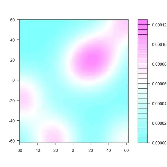
which came from this https://stackoverflow.com/questions/5004063/creating-a-heat-map-from-x-y-corrdinates-in-r. My data is different however. Rather than having a value for x and a value for y, I have coordinates and a value found at that pair. I also am needing the axes of the plot to be the x and y coordinates.

Here is an example of my data:

x_coord <- c(1,2,3,4)
y_coord <- c(1,2,3,4)
value <- c(12,15,19,30)
foo.df <- data.frame(x_coord, y_coord, value)

      x_coord y_coord value
 1       1       1    12
 2       2       2    15
 3       3       3    19
 4       4       4    30

If this is a repost, please link me and I will delete this post. I have found quite a bit on heatmaps for R, but none which seemed to work with data of this nature.

Any ideas?

Community
  • 1
  • 1
branch.lizard
  • 595
  • 1
  • 5
  • 15
  • You need to first interpolate your irregular data to a grid. Search for kriging or inverse distance weighting. – Spacedman Mar 22 '15 at 09:29
  • Are your coordinates in the range x=1..4,y=1..4 and do you have all 16 complete values? I suspect you're looking for an `image()` plot, i.e. simple tiles on a 4x4 grid, rather than a continuous function/heatmap. See `image()` in base, or `geom_tile()` in ggplot2 package. – smci Mar 22 '15 at 11:35
  • See: [image of a pixel matrix](http://stackoverflow.com/questions/5638462/r-image-of-a-pixel-matrix) and [Visualize 2-variable...function in R](http://stackoverflow.com/questions/5554165/visualize-2-variable-joint-probability-mass-function-in-r/5554352#5554352) – smci Mar 22 '15 at 12:03

2 Answers2

2

Try this one :

x_coord <- c(1,2,3,4)
y_coord <- c(1,2,3,4)
value <- c(12,15,19,30)
foo <- data.frame(x_coord, y_coord, value)
library(MBA)
foo=foo[ order(foo[,1], foo[,2],foo[,3]), ]
mba.int <- mba.surf(foo, 300, 300, extend=T)$xyz.est
library(fields)
fields::image.plot(mba.int)

enter image description here

Math
  • 1,274
  • 3
  • 14
  • 32
  • That looks awesome! I have two additional questions. I have multiple plots like this and want to make them comparable. 1. Can I set fixed values of the x- and y-axis (independent of the data input)? 2. Can I give the color scale a fixed color, always ranging from for example 1:400, indepent on the individual plot? – Rosanne Oct 25 '21 at 16:37
1

I suspect you're looking for an image() plot, i.e. simple tiles on a 4x4 grid, rather than a continuous function/heatmap. Especially if your coordinates are in the range x=1..4,y=1..4 and you have all 16 complete values.

See image() in base, or geom_tile() in ggplot2 package; or qplot(..., geom='tile')

When you say "create a heatmap (density plot?) from this data which is colored based on value at each position" you simply mean "plot a tiled image".

smci
  • 32,567
  • 20
  • 113
  • 146