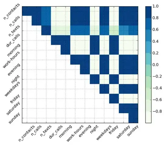
I want to plot a correlation matrix with rotated labels. However, the labels are misplaced as seen below. I've tried to look at Matplotlib Python Barplot: Position of xtick labels have irregular spaces between eachother, but I can't make it work in my case as it builds on the layout of the bar diagram. The labels are added using the following code:
    fig  = plt.figure()
    ax1  = fig.add_subplot(111)
    varLabels = ['n_contacts', 'n_calls', 'n_texts', 'dur_calls', 'morning', 'work-hours', 'evening', 'night', 'weekdays', 'friday', 'saturday', 'sunday']

    ax1.set_xticks(np.arange(0,12))
    ax1.set_yticks(np.arange(0,12))
    ax1.set_xticklabels(varLabels, rotation=45);
    ax1.set_yticklabels(varLabels, rotation=45);