I really can't seem to work out fairly complicated (from my perspective) facet gridded pie chart with annotations. I'm aware of easier ways to portray the same data (such as stacked bar charts without facet). But I do have a feeling that understanding how this particular chart is made will benefit to my (or anyone else interested) understanding of ggplot2.
Here's data:
df <- data.frame(time = c("201501", "201501", "201502", "201502", "201503", "201503"),
                 factors = c("x", "y", "x", "y", "x", "y"),
                 values = c(0.33, 0.15, 0.36, 0.15, 0.39, 0.18))
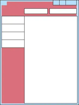
My intention is to show changes of structure over time while subtly highlighting variable y which is included in x.
And here's expected (quite approximate) output made in paint:

And, well, here's what I have figured out so far:
- pie chart is nothing more than
geom_bar()but withcoord_polar(). - to avoid placement issues on x scale, I can set
x = factor(1)in myaes()string. - I can facet grid by factors that are not necessarily used in
aes()string. Hencefacet_grid(time~.)-timevariable is not used anywhere else.
I'll avoid posting my results thus far because they are.. well, quite sad.
Any leads and tricks are very welcome.
Update:
Well, looks like I'm slowly getting there myself:
 df <- data.frame(time = c("201501", "201501", "201502", "201502", "201503", "201503"),
                 factors = c("x", "y", "x", "y", "x", "y"),
                 values = c(0.33, 0.15, 0.36, 0.15, 0.39, 0.18))

seq_adj <- seq(from = 1, to = nrow(df)-1, by = 2)

df$val_mod <- ""
df$val_mod[seq_adj] <- paste(as.character(df$values[seq_adj] * 100), "%(",
                             as.character(df$values[seq_adj + 1] * 100), "%)", sep = "")
df$val_mod2 <- df$values
df$val_mod2[seq_adj] <- df$values[seq_adj] - df$values[seq_adj + 1]

ggplot(data = df, aes(x = factor(1), y = val_mod2, fill = factor(factors))) +
  geom_bar(stat = "identity", position = "stack", color = "black") +
  scale_y_continuous(limits = c(0,1)) +
  coord_polar("y") +
  facet_grid(.~time) +
  geom_text(aes(x = factor(1), y= .5, label = val_mod, vjust = 4.5)) +
  theme(axis.text.x=element_blank()) +
  theme(legend.position="bottom") +
  theme(axis.title.x = element_blank(),
        axis.title.y = element_blank()) +
  theme(panel.background = element_blank()) +
  theme(legend.title=element_blank()) +
  scale_fill_discrete(labels=c("x","y"))
Which produces:

Now there are just few tweaks left - pie chart circle contour and a way to make slices look like variable y is part of (or included in) variable x. I've read a couple of posts that clearly tell that texture fill is not an option in ggplot2. Maybe any suggestions in this part?