5

I would like to plot something like this (from this paper) where icons, in this case small graphs, are used as tick labels.
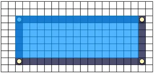
enter image description here

I get this far, where icons are more or less properly placed: enter image description here This is the code:

library(igraph)    
npoints <- 15
y <- rexp(npoints)
x <- seq(npoints)

par(fig=c(0.05,1,0.3,1), new=FALSE)
plot(y, xlab=NA, xaxt='n',  pch=15, cex=2, col="red")
lines(y, col='red', lwd=2)

xspan <- 0.9
xoffset <- (0.07+0.5/npoints)*xspan
for(i in 1:npoints){  
  x1 <- (xoffset+(i-1)/npoints)*xspan
  x2 <- min(xspan*(xoffset+(i)/npoints),1)
  par(fig=c(x1,x2,0,0.5), new=TRUE)
  plot(graph.ring(i), vertex.label=NA)  
}

However, if the number of points grows (e.g. npoints <- 15) it complains because there is no place for the icons:

Error in plot.new() : figure margins too large

I wonder wether there is a more natural way to do this so that it works for any (reasonable) number of points.

Any advice is welcome.
alberto
  • 2,625
  • 4
  • 29
  • 48

1 Answers1

6
library(igraph)    
npoints <- 15
y <- rexp(npoints)
x <- seq(npoints)

# reserve some extra space on bottom margin (outer margin)
par(oma=c(3,0,0,0))
plot(y, xlab=NA, xaxt='n',  pch=15, cex=2, col="red")
lines(y, col='red', lwd=2)

# graph numbers 
x = 1:npoints   

# add offset to first graph for centering
x[1] = x[1] + 0.4
x1 = grconvertX(x=x-0.4, from = 'user', to = 'ndc')
x2 = grconvertX(x=x+0.4, from = 'user', to = 'ndc')

# abline(v=1:npoints, xpd=NA)
for(i in x){  

  print(paste(i, x1[i], x2[i], sep='; '))

  # remove plot margins (mar) around igraphs, so they appear bigger and 
  # `figure margins too large' error is avoided
  par(fig=c(x1[i],x2[i],0,0.2), new=TRUE, mar=c(0,0,0,0))
  plot(graph.ring(i), vertex.label=NA)  

  # uncomment to draw box around plot to verify proper alignment:
  # box()

}

enter image description here

koekenbakker
  • 3,524
  • 2
  • 21
  • 30
  • Thanks ! Note the leftmost graph is not well aligned though (it's more clear when you have 10 points for instance). – alberto Apr 28 '15 at 16:14
  • 1
    Yes, I noticed that as well. If you add an extra line with `box()` after plotting the graph, you'll see that the plot box is aligned nicely, but the graph itself is not centered within that box. So for the leftmost graph you may have to add a offset manually. Will add to post. – koekenbakker Apr 28 '15 at 16:25
  • Great! Just one more thing just in case is trivial. Why using ggplot instead of plot breaks it all? – alberto Apr 28 '15 at 17:05
  • @alberto those are two different graphics packages. ggplot/lattice are based on grid graphics – rawr Apr 28 '15 at 17:30
  • Argh, ok, I thought I could just plug-in ggplots here. Maybe I should open a new question then. – alberto Apr 28 '15 at 17:37