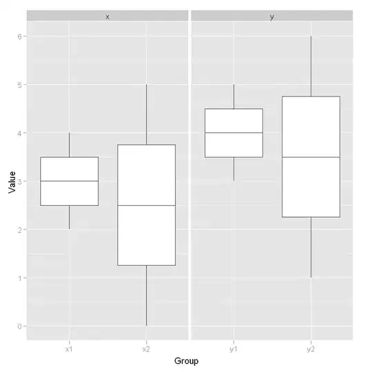
This is the closest I could get to your example figure. It is not much of an improvement beyond what you've already sorted but puts less of an emphasis on the white bar borders on the grey background.
library(ggplot2)
p <- ggplot(DF1, aes(x = Rank, y = value, group = variable))
p <- p + geom_bar(stat = "identity", position = "stack", lwd = 1.5,
                  width = 0.5, colour = "white", fill = "black")
p <- p + theme_classic()
p <- p + theme(axis.text.x = element_text(angle = 90, vjust = 0.5))
p
That produces:

If you want to keep the grey background you can find out exactly what shade of grey it is and use that colour for the line while removing the background grids (this is not the right shade).
p <- ggplot(DF1, aes(x = Rank, y = value))
p <- p + geom_bar(stat = "identity", position = "stack", lwd = 1.5,
                  width = 0.5, colour = "grey", fill = "black")
p <- p + theme(panel.grid = element_blank())
p
An issue with this solution is that very small groups will not be seen (e.g., when Rank = 4 variable F3 = 10; this small value is completely covered by the white bar outline).
Your sample data:
DF1 <- structure(list(Rank = c(1L, 2L, 3L, 4L, 1L, 2L, 3L, 4L, 1L, 2L,
3L, 4L), variable = structure(c(1L, 1L, 1L, 1L, 2L, 2L, 2L, 2L,
3L, 3L, 3L, 3L), .Label = c("F1", "F2", "F3"), class = "factor"),
    value = c(500L, 400L, 300L, 200L, 250L, 100L, 155L, 90L,
    50L, 30L, 100L, 10L)), row.names = c(NA, -12L), .Names = c("Rank",
"variable", "value"), class = "data.frame")


