0

i've decadal time series from 1700 to 1900 (21 time slices) and for each decade i've got 7 categories that represent a quantity; see here

As you can see, only 5 of the decades actually have data.

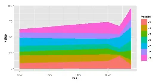
I can plot a nice little stacked area chart in R, with the help of this very nice example, which retains only the 5 time slices that have data.

My problem is that i want an x-axis that retains all 21 times slices but still plots a stacked area chart using only the 5 time slices. The idea is that the stacked areas will still only be plotted against the correct year but simply connect up to the next point, 10 ticks down the x-axis, ignoring the no-data in between. i can achieve something in excel but i dont like it.

My reasoning is i want to plot lines on the top of the stacked area that are much more complete, for example from 1700 to 1850, or 1800 to 1900, for visual comparison purposes.

This post suggests how to connect dots in a line chart when you want to ignore NAs but it doesnt work for me in this instance.

a <- 1700:1900
b <- a[seq(1, length(a), 10)]
df <- data.frame("Year"=b,replicate(7,sample(1:21)))
rows <- c(2:10,11:15,17,19,21)
df[rows,2:8] <- NA
df

thanks a lot

Community
  • 1
  • 1
Sam
  • 1,400
  • 13
  • 29
  • 1
    please provide an reproducible example: http://stackoverflow.com/questions/5963269/how-to-make-a-great-r-reproducible-example – grrgrrbla Jun 12 '15 at 08:51
  • sorry about that, not used to the site so much from an R perspective – Sam Jun 12 '15 at 09:29

1 Answers1

1

If you wish to transform your year to factor, on the lines of the code below:

# Transform the data to long
library(reshape2)
df <- melt(data = df, na.rm = FALSE, id.vars = "Year")
df$Year <- as.factor(df$Year)

# Chart
require(ggplot2)
ggplot(df, aes(Year, value)) + 
  geom_area(aes(colour = variable, fill= variable), position = 'stack')

It will generate the chart below: factor year

I wasn't sure if you are interested in mapping all of the X variables. I was thinking that this is the case so I reshaped your data. Presumably, it is wiser not to change the Year to factor. The code below:

a <- 1700:1900
b <- a[seq(1, length(a), 10)]
df <- data.frame("Year"=b,replicate(7,sample(1:21)))
rows <- c(2:10,11:15,17,19,21)
df[rows,2:8] <- NA

# Transform the data to long
library(reshape2)
df <- melt(data = df, na.rm = FALSE, id.vars = "Year")
# Leave it as int.
# df$Year <- as.factor(df$Year)

# Chart
require(ggplot2)
ggplot(df, aes(Year, value)) + 
  geom_area(aes(colour = variable, fill= variable), position = 'stack') 

would generate much more meaningful chart:

proper area

Potentially, if you decide to use years as factors you may group them and have one category for a number of missing years so the x-axis is more readable. I would say it's a matter of presentation to great extent.

Konrad
  • 17,740
  • 16
  • 106
  • 167
  • Thanks Konrad, i shall have a look into your code. I would like the x-axis only to display the years where there are data. Eventually i will plot another line graph on top of this, using the same axes, but with a more complete dataset (eg 17 of the 21 time slices) – Sam Jun 12 '15 at 10:27
  • I see, presumably one of the easiest ways to achieve that would be to use `complete.cases` and filter your `df` to a `df` with non-missing values only. My initial understanding was that you want to show gaps (first chart, but it would be wise to adjust the way factors are shown) or to map over missing values (2nd chart). Third alternative would simply mean cleaning your `df` via `complete.cases` boolean condition so you only get the rows you want to chart. – Konrad Jun 12 '15 at 10:35
  • The 2nd chart is ideal for the stacked area, there are data only for 6 certain time slices out of 21 but i want the x-axis to reflect the entire time span so i can plot more complete line graphs on to it. – Sam Jun 12 '15 at 10:58