I would like a column of divs, of any number, each with width 100% and height 100% of their parent div, so one is visible initially, and the others overflow the parent downwards. I've set the divs to have flex: 0 0 100%;, inside a parent div with display: flex and flex-direction: column to achieve this.
The parent div is itself of unknown height, so it is also a child of a display: flex and flex-direction: column, set to flex: 1 0 0 to take remaining space in its container.
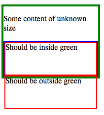
In Firefox the output is as I would like it:
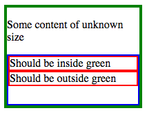
However, not in Chrome:
How can I achieve the Firefox style in Chrome, without Javascript?
You can see this in action at http://plnkr.co/edit/WnAcmwAPnFaAhqqtwhLL?p=preview, as well as the corresponding version with flex-direction: row, which works consistently in both Firefox and Chrome.
For reference, the full CSS
.wrapper {
  display: flex;
  flex-direction: column;
  height: 150px;
  width: 200px;
  border: 4px solid green;
  margin-bottom: 20px;
}

.column-parent {
  flex: 1 0 0;
  display: flex;
  flex-direction: column;
  border: 2px solid blue;
}

.column-child {
  flex: 0 0 100%;
  border: 2px solid red;
}
and HTML
<div class="wrapper">
  <p>Some content of unknown size</p>
  <div class="column-parent">
    <div class="column-child">
      Should be inside green
    </div>
    <div class="column-child">
      Should be outside green
    </div>
  </div>
</div>