8

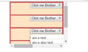
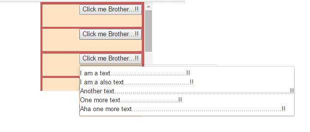
Bootstrap dropdown is getting clipped, i looked at all option mentioned in following questions but did not work.

Bootstrap drop down cutting off

Twitter Bootstrap Button dropdown z-index layering issue

z-index issue with twitter bootstrap dropdown menu

Requirements

  • I want scrolling in main div
  • I want bootstrap dropdown to not get clipped
  • Height width of the div and dropdown should not be changed

Plunker: http://plnkr.co/edit/HOKKYJ?p=preview

<!DOCTYPE html>
<html>

  <head>
    <title>Clipping problem</title>
        <link data-require="bootstrap@*" data-semver="3.3.5" rel="stylesheet" href="https://maxcdn.bootstrapcdn.com/bootstrap/3.3.5/css/bootstrap-theme.min.css" />
        <link data-require="bootstrap@*" data-semver="3.3.5" rel="stylesheet" href="https://maxcdn.bootstrapcdn.com/bootstrap/3.3.5/css/bootstrap.min.css" />
        <script data-require="jquery@*" data-semver="2.1.4" src="http://code.jquery.com/jquery-2.1.4.min.js"></script>
        <script data-require="bootstrap@*" data-semver="3.3.5" src="https://maxcdn.bootstrapcdn.com/bootstrap/3.3.5/js/bootstrap.min.js"></script>
        <script src="https://ajax.googleapis.com/ajax/libs/angularjs/1.4.3/angular.js"></script>
    <link rel="stylesheet" href="style.css" />
    <script src="script.js"></script>
     <script>
            angular.module("myApp", []).controller("MainCtrl", function($scope) {
            });
        </script>
  </head>

 <body style="height:100%;" ng-app="myApp">
        <div style="background: indianred; position: relative; left:40%; height: 200px; width: 250px; overflow-y: auto;">
                <div ng-repeat="num in [1,2,3,4,5]">
                    <div style="background: bisque; margin:5px; height: 50px;">
                        <div style="position: relative; float: right">
                            <button class="dropdown-toggle" data-toggle="dropdown">Click me Brother...!!</button>
                            <div class="dropdown-menu">
                                <div style="text-wrap: none; white-space: nowrap;">I am a text......................................!!</div>
                                <div style="text-wrap: none;white-space: nowrap;">I am a also text.................................!!</div>
                                <div style="text-wrap: none;white-space: nowrap;">Another text........................................................................................!!</div>
                                <div style="text-wrap: none;white-space: nowrap;">One more text.............................!!</div>
                                <div style="text-wrap: none;white-space: nowrap;">Aha one more text...........................................................................!!</div>
                            </div>
                        </div>
                    </div>
                </div>
            </div>
    </body>

</html>

With problem:

Current situation

What do i want:

This is what i want

Thanks in advance

Community
  • 1
  • 1
Magnum23
  • 407
  • 1
  • 4
  • 10
  • In your Plunkr, could you refactor this to use a style sheet rather than inline styles? It would be easier to debug that way. – jmargolisvt Sep 04 '15 at 04:18
  • @Trans you need the whole sentence to see.? because if want so then how would be manageable coz you dn't want to break the sentence and you don't want to make overflowscroll in x direction as well – Himesh Aadeshara Sep 04 '15 at 05:08
  • @Trans so what's your expected result.? can you explain more.? – Himesh Aadeshara Sep 04 '15 at 10:49
  • Main div dropdown's overflow property should be intact. with that drop down content (whatever) should not be clipped, adding two screenshot in the question for the requirement – Magnum23 Sep 04 '15 at 16:39
  • can anybody answer my question? – Magnum23 Sep 13 '15 at 06:22

3 Answers3

4

Problem

I use Bootstrap 3 and had the same problem with a div container with overflow auto. It contains a dropdown that must pop out from the container.

Solution

The solution is to set position:fixed to the dropdown and then calculate coordinates with jQuery on click. Coordinates is calculated with offset() so its relative to document window instead of elements parent.

This solution probably also works for overflow:hidden containers.

CSS

.somecontainer .dropdown-menu {
    position:fixed;
}

jQuery

$(".somecontainer .dropdown").on('click', function() {
    $(this).find('.dropdown-menu').css('top',$(this).offset().top);
    $(this).find('.dropdown-menu').css('left',$(this).offset().left);
});

Optionaly add this to hide dropdown on window resize:

$( window ).resize(function() {         
    $('.somecontainer .dropdown-menu').parent().removeClass('open');
}); 
Turbojohan
  • 637
  • 9
  • 13
  • I can confirm that this works for overflow:hidden containers. In fact it is the only solution that did work for me of those – justkt Dec 05 '17 at 18:06
0

Actually this has nothing to do with dropdown. CSS logic - you cannot have absolute element not cropped which is inside the div(overflow:auto) with fixed height.

The solution would be bit messy, but you will need have append the dropdown div outside your scrolling container and align it to the trigger link.

Chetan
  • 945
  • 1
  • 5
  • 14
0

hi it's been nice to give this answer because tried to give efforts for this so

bdw i agree with Chetan that you would need to make the dropdown div out of the main div

though i don't know much about the angular so i can't say what would be your limitations

though i managed to work in my way

 <body style="height:100%;" ng-app="myApp">
        <div class="main-div">
                <div ng-repeat="num in [1,2,3,4,5]">
                    <div class="repeated-div">
                        <div class="grouped-dd">
                            <button class="dropdown-toggle" data-toggle="dropdown">Click me Brother...!!</button>
                            <div class="dropdown-menu temp">
                                <div class='no-wrap-text-div' title="I am a text......................................!!">I am a text......................................!!</div>
                                <div class='no-wrap-text-div' title="I am a also text.................................!!" >I am a also text.................................!!</div>
                                <div class='no-wrap-text-div' title="Another text........................................................................................!!">Another text........................................................................................!!</div>
                                <div class='no-wrap-text-div' title="One more text.............................!!">One more text.............................!!</div>
                                <div class='no-wrap-text-div' title="Aha one more text...........................................................................!!">Aha one more text...........................................................................!!</div>
                            </div>
                        </div>
                    </div>
                </div>
            </div>
    </body>

CSS

 .temp {
            max-width: 43px;
            min-width: 142px;
            text-overflow: ellipsis;
            overflow: hidden;
        }
        .no-wrap-text-div{
            white-space: nowrap;
            text-overflow: ellipsis;
            overflow: hidden;
            max-width: 160px;
        }

my tried Demo

note that : though one thin is that you need to give the title's of all div dynamically if you will include in dynamical environment so.

and another thing i overridden the min-width of the bootstrap dropmenu's width 160 px to 142 px that would be not preferable as per my suggestion also

Himesh Aadeshara
  • 2,114
  • 16
  • 26