6

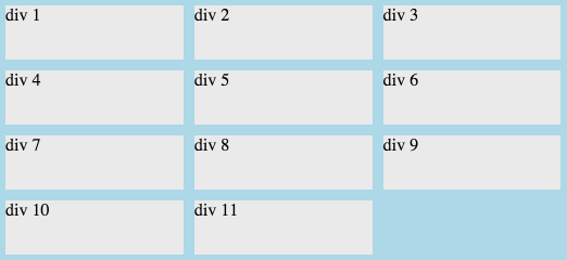
I'm looking for a good way to remove the left and right margins from each first and last item in each row without using ::nth-child or JavaScript. If that's not possible then I guess the next best way would be to set negative left/right margins on the main flexbox element, but I'm not quite sure the best way to do it with a flexbox that is width: 100%. Basically what I want is for there to be no blue color on the left and right of this flexbox.

EDIT: I'm gonna have to provide a solution to my own question here. I put together something that works using a wrapper element with overflow: hidden and the flexbox is set to width: calc(100% + 5px). Turns out Internet Explorer doesn't support box-sizing: border-box in flexboxes, but there's a workaround that I found here.

jsFiddle

Example

HTML:

<div id="main">
    <div><span>div 1</span></div>
    <div><span>div 2</span></div>
    <div><span>div 3</span></div>
    <div><span>div 4</span></div>
    <div><span>div 5</span></div>
    <div><span>div 6</span></div>
    <div><span>div 7</span></div>
    <div><span>div 8</span></div>
    <div><span>div 9</span></div>
    <div><span>div 10</span></div>
    <div><span>div 11</span></div>
</div>

CSS:

#main {
    margin-right: 40px;
    display: -ms-flexbox;
    display: flex;
    -ms-flex-pack: start;
    justify-content: flex-start;
    -ms-flex-wrap: wrap;
    flex-wrap: wrap;
    width: 100%;
    background-color: lightblue;
}
#main div {
    box-sizing: border-box;
    display: -ms-flexbox;
    display: flex;
    -ms-flex: 0 0 33.3%;
    flex: 0 0 33.3%;
    border: 5px solid transparent;
}
#main div > span {
    display: block;
    width: 100%;
    min-height: 50px;
    background-color: #eaeaea;
}
Spencer O'Reilly
  • 515
  • 1
  • 7
  • 20
Gavin
  • 7,544
  • 4
  • 52
  • 72
  • You're aware there is no `margin` anywhere in your code? The blue color around each box is created by a transparent border, not margin. And the `margin-right` in your code above isn't in your fiddle demo. So you want to remove the left border from the first div and and right border from the last div in each row? – Michael Benjamin Oct 07 '15 at 19:56
  • Yep, that's what I mean. – Gavin Oct 07 '15 at 21:05
  • I've almost got it using calc and a wrapper with overflow:hidden, but IE keeps wrapping the 3rd div to the next line: [jsFiddle](http://jsfiddle.net/cufpjq9d/) – Gavin Oct 07 '15 at 21:06
  • Looks like Internet Explorer has a bug where it doesn't support `box-sizing: border-box` on flex elements. – Gavin Oct 07 '15 at 21:13
  • I think I've got it working on IE using the last answer here: http://stackoverflow.com/questions/21942183/multiline-flexbox-in-ie11-calculating-widths-incorrectly jsFiddle: http://jsfiddle.net/bgvqctcu/ – Gavin Oct 07 '15 at 21:18
  • 1
    If you want to get a bit *crazy*, ditch the `div` box styling, and focus on the container. Add a `border`. Apply an inner box shadow. Sprinkle a little `blur-radius` and `spread-radius` and, voilà: http://jsfiddle.net/Ljmkxvgk/1/ ;-) – Michael Benjamin Oct 07 '15 at 21:21
  • LOL. That's hilarious. It does indeed get rid of the borders haha – Gavin Oct 07 '15 at 21:26

2 Answers2

3

I changed the justify-content to space-between, and adjusted the flex-basis to accompany this change as well as giving the elements padding on top and bottom, but 0 on left and right.

Relevant CSS:

#main {
    display: -ms-flexbox;
    display: flex;
    -ms-flex-pack: space-between;
    justify-content: space-between;
    -ms-flex-wrap: wrap;
    flex-wrap: wrap;
    width: 100%;
    background-color: lightblue;
}

#main div {
    box-sizing: border-box;
    display: -ms-flexbox;
    display: flex;
    -ms-flex: 0 0 32.3%;
    flex: 0 0 32.3%;

   padding-right:0px;
   padding-left:0px;
   padding-bottom:5px;
   padding-top:5px;
}
Ivar
  • 6,138
  • 12
  • 49
  • 61
Jesse
  • 1,262
  • 1
  • 9
  • 19
  • Thanks for this. It does work nicely, however I need to control the exact pixel spacing between the items so it keeps to the same grid as the rest of the site. Sorry, should have mentioned that before. – Gavin Oct 07 '15 at 20:24
  • 1
    One other issue with this would be if there's two items on the last row, one gets put at the far left and another on the far right. Looks a bit strange :) – Gavin Oct 07 '15 at 20:31
0

I think that the best solution is to use calc property.

For example, if you wish 10px between columns you can do this:

Relevant CSS:

#main {
    display: -ms-flexbox;
    display: flex;
    -ms-flex-pack: start;
    justify-content: flex-start;
    -ms-flex-wrap: wrap;
    flex-wrap: wrap;
    width: 100%;
    background-color: lightblue;

    padding: 5px;  // gap-between-columns/2  
}

#main div {
    box-sizing: border-box;
    display: -ms-flexbox;
    display: flex;
    border: 1px solid transparent;

    margin: 5px; // gap-between-columns/2  
    flex: 0 0 calc(33.33% - 10px); // calc( (100/number-of-columns) - gap-between-columns )

}
Spencer O'Reilly
  • 515
  • 1
  • 7
  • 20
  • I tried this, but the divs stop wrapping. [jsFiddle](http://jsfiddle.net/pqnhha5u/) – Gavin Oct 07 '15 at 20:55
  • Ah, nevermind. The comments weren't CSS comments so it broke the CSS. I updated the jsFiddle here: http://jsfiddle.net/pqnhha5u/1/. It's not having the effect I was looking for... – Gavin Oct 07 '15 at 20:57
  • Try to remove the comments. :) – marisaroque Oct 07 '15 at 20:57
  • What effect do you want? I'll help you. – marisaroque Oct 07 '15 at 20:59
  • I'm trying to remove the space on the left and right of every 1st and last div on each row. So basically the main element shouldn't have any blue space on the left or right. – Gavin Oct 07 '15 at 21:03
  • 1
    Initially I didn't understand clearly what you wanted, but now I think that you already solved the issue. Nice job! :) – marisaroque Oct 07 '15 at 21:38