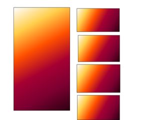
I have problem with bootstrap columns. I want to do something like this picture and I don't know how to do it.
Thanks a lot for helping.
I have problem with bootstrap columns. I want to do something like this picture and I don't know how to do it.
Thanks a lot for helping.
You could use the grid layout to give you something like:
 <div class="row">
   <div class="col-xs-6">
     <div>Big Image Goes Here</div>
   </div>
   <div class="col-xs-6">
     <div class="col-xs-12">Little Image #1</div>
     <div class="col-xs-12">Little Image #2</div>
     <div class="col-xs-12">Little Image #3</div>
     <div class="col-xs-12">Little Image #4</div>
   </div>
 </div>
However, you would need to add some padding to the images to give them the white area around them.
The grid layout is explained here: bootstrap grid layout
Here is a JSFiddle example.
Bootstrap is made up of 12 columns in a row. If you want something to display half and half for example, the first element would have a value of six like so: class="col-xs-6"and the second would be the same. To learn bootstrap really well make this site your best friend.
For a demo to your solution click here
Here we have your HTML
<div class="col-xs-7 left">
    <img src="http://placehold.it/300x500">
</div>
<div class="col-xs-5 right">
   <img src="http://placehold.it/200x100">
</div>
<div class="col-xs-5 right">
   <img src="http://placehold.it/200x100">
</div>
<div class="col-xs-5 right">
   <img src="http://placehold.it/200x100">
</div>
<div class="col-xs-5 right">
   <img src="http://placehold.it/200x100">
</div>
CSS
.left{
    float: left;
}
.right{
    float: right;
}
div{
    padding: 20px;
}
There is probably already a class for floating objects in bootstrap I just couldn't remember exactly, so I did it manually.