4

I have a two-column layout with one element on the left and two on the right.

How can I keep the last element inside the right column aligned relatively to the bottom of the left column?

<!DOCTYPE html>
<html lang="en">

<head>

<meta charset="utf-8">
<meta name="viewport" content="width=device-width, initial-scale=1, shrink-to-fit=no">
<meta name="description" content="">
<meta name="author" content="">

<title>Bare - Start Bootstrap Template</title>

<!-- Bootstrap core CSS -->
<link rel="stylesheet" href="https://stackpath.bootstrapcdn.com/bootstrap/4.4.1/css/bootstrap.min.css" integrity="sha384-Vkoo8x4CGsO3+Hhxv8T/Q5PaXtkKtu6ug5TOeNV6gBiFeWPGFN9MuhOf23Q9Ifjh" crossorigin="anonymous">

</head>

<body>

<!-- Navigation -->
<nav class="navbar navbar-expand-lg navbar-dark bg-dark static-top">
  <div class="container">
    <a class="navbar-brand" href="#">Start Bootstrap</a>
    <button class="navbar-toggler" type="button" data-toggle="collapse" data-target="#navbarResponsive" aria-controls="navbarResponsive" aria-expanded="false" aria-label="Toggle navigation">
      <span class="navbar-toggler-icon"></span>
    </button>
    <div class="collapse navbar-collapse" id="navbarResponsive">
      <ul class="navbar-nav ml-auto">
        <li class="nav-item active">
          <a class="nav-link" href="#">Home
            <span class="sr-only">(current)</span>
          </a>
        </li>
        <li class="nav-item">
          <a class="nav-link" href="#">About</a>
        </li>
        <li class="nav-item">
          <a class="nav-link" href="#">Services</a>
        </li>
        <li class="nav-item">
          <a class="nav-link" href="#">Contact</a>
        </li>
      </ul>
    </div>
  </div>
</nav>

<!-- Page Content -->
<div class="container-fluid">
  <div class="row">
      <div class="col-7">
          <div class="card card-block">
              <h3>Column 1</h3>
              <br />
              <br />
              <br />
              <p>..end of content</p>
          </div>
      </div>

      <div class="col-5">
          <div class="row no-gutters">
              <div class="col-12">
                <div class="card card-block">
                  <h3>Column 2</h3>
                </div>
              </div>

              <div class="col-12 align-self-end">
                <div class="card card-block">
                  <h3>Column 3</h3>
                </div>
              </div>
          </div>
      </div>
  </div>
</div>

<!-- Bootstrap core JavaScript -->
<script src="https://code.jquery.com/jquery-3.4.1.slim.min.js" integrity="sha384-J6qa4849blE2+poT4WnyKhv5vZF5SrPo0iEjwBvKU7imGFAV0wwj1yYfoRSJoZ+n" crossorigin="anonymous"></script>
<script src="https://cdn.jsdelivr.net/npm/popper.js@1.16.0/dist/umd/popper.min.js" integrity="sha384-Q6E9RHvbIyZFJoft+2mJbHaEWldlvI9IOYy5n3zV9zzTtmI3UksdQRVvoxMfooAo" crossorigin="anonymous"></script>
<script src="https://stackpath.bootstrapcdn.com/bootstrap/4.4.1/js/bootstrap.min.js" integrity="sha384-wfSDF2E50Y2D1uUdj0O3uMBJnjuUD4Ih7YwaYd1iqfktj0Uod8GCExl3Og8ifwB6" crossorigin="anonymous"></script>

</body>

</html>

enter image description here

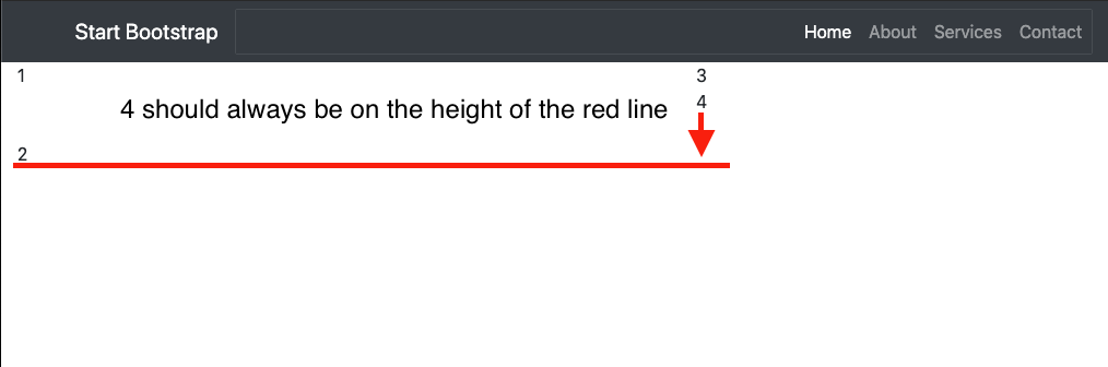
Thank you for your help!

Pepelius
  • 1,576
  • 20
  • 34
Dominic Meyer
  • 196
  • 2
  • 10

4 Answers4

4

By adding the .align-items-end to the parent row, it vertically aligns the columns to bottom of it.

If you want to have the column number 3 on the top but preserve the current position of column 4, I would suggest for you to take a look in to a jQuery library called eqHeight. This would allow you to stretch the parent columns (col-7 and col-5) to same height, after which the column number 3 should be on top with column 1.

<!-- Page Content -->
<div class="container-fluid">
  <div class="row align-items-end">
      <div class="col-7">
          1<br>
          <br>
          <br>
          2
      </div>

      <div class="col-5">
          <div class="col-12">
              3
          </div>

          <div class="col-12 align-self-end">
              4
          </div>
      </div>
  </div>
</div>
Pepelius
  • 1,576
  • 20
  • 34
  • Told in a more simplified way; You will need the eqHeight (or similar) library to ensure the columns are always equal on height. Only then you can start vertically aligning the elements inside them. You can also set a fixed height to both of these columns, but working with responsive designs often leaves this option out. – Pepelius Jan 07 '20 at 07:21
1
Why not use different row for 1 - 3  and 2 - 4.
Because you have using bootstrap grid system. 

7 col - 5 col
-------------

Bootstrap two column layout

Kindly add style in fourth column div. 

style="position: absolute;bottom: 0px;"

<!-- Page Content -->
<div class="container-fluid">
        <div class="row">
    <div class="col-7">
        1 <br />
        <br />
        <br />
        <br />
        2
    </div>

    <div class="col-5">
        <div class="row no-gutters">
             <div class="col-12 align-self-end">
                3
            </div>  
            </div>
            <div class="row no-gutters"  >
             <div class="col-12 align-self-end" style="position: absolute; 
            bottom: 0px; ">
                4
            </div>             

        </div>
    </div>
 </div>
</div>
Saket Yadav
  • 967
  • 1
  • 10
  • 23
  • The problem is, that the col on the left side is one element and is much higher. So there is no chance for 2 rows. – Dominic Meyer Jan 07 '20 at 07:12
  • Again the col on the left side is one element. The 2 is not like a new row is more the end of the element. I changed it in my post. So it should be much clearer now. – Dominic Meyer Jan 07 '20 at 07:24
  • Cheers looks in the real example pretty good. Do some testing with media queries. Thank you very much! – Dominic Meyer Jan 07 '20 at 08:54
-1

This could be what you are looking for:

<div class="row">
    <div class="col-md-6">
        1
    </div>
    <div class="col-md-6">
        3
    </div>
</div>
<div class="row">
    <div class="col-md-6">
        2
    </div>
    <div class="col-md-6">
        4
    </div>
</div>

OR

<div class="row">
    <div class="col-md-6">
        1
    </div>
    <div class="col-md-6">
        <div class="row">
            <div class="col-md-12">
                2
            </div>
            <div class="col-md-12">
                3
            </div>
        </div>
    </div>
</div>
Henry
  • 631
  • 10
  • 21
  • my mistake about the row, I changed it but it won't help :( – Dominic Meyer Jan 07 '20 at 06:59
  • Thanks, but the col on the left side is much larger in height and is one element, so no chance for 2 col's. – Dominic Meyer Jan 07 '20 at 07:10
  • Honestly, I'm still unsure how you want the grid to be displayed,. Could you perhaps sketch one in Paint and post it here for better clarity?? – Henry Jan 07 '20 at 07:14
  • @henry He wants to have a single column on the left side and two columns on the right, where the column number 4 should always be on the bottom (relative to the left column). – Pepelius Jan 07 '20 at 07:15
  • the 2 is like the end of the contend on the left side. The left side is simply larger then the two container on the right side. So our UX specialist find it a great idea to align the second container on the right on the bottom of this row. – Dominic Meyer Jan 07 '20 at 07:19
-2
<div class="col-5">
            <row class="no-gutters">
                <div class="col-lg-12">
                    3
                </div>

                <div class="col-lg-12">
                    4
                </div>
            </row>
        </div>

It will take full width in any screen size.

Guarav
  • 33
  • 1
  • 10