8

I'm making an animated SVG pie chart. Basically I have two SVG element, the first gets a border-radius of 50%, the second is a circle that I fill up to a specific value. In the end, that makes one circle above another circle, they both have the same dimensions.

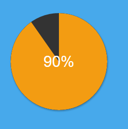
There is some kind of SVG aliasing that seems hard to get rid of. It's very visible on the top, left, bottom and right "corners" of the circle, at least on Google Chrome.

Here is the HTML part

<figure id="pie" data-percentage="60">
  <div class="receiver"></div>
  <svg width="200" height="200" class="chart" shape-rendering="geometricPrecision">
    <circle r="50" cx="100" cy="100" class="pie" shape-rendering="geometricPrecision"/>
  </svg>
</figure>

Here is my codepen for more accurate description of the problem. I tried various solutions including the shape-rendering SVG attribute but to no avail.

Here is a screenshot, the aliasing is not as visible as in the codepen (for me at least)

enter image description here

Antonin Cezard
  • 2,011
  • 1
  • 17
  • 30
  • Looks fine for me on Chrome 42.0.2311.135, maybe its worth including a screenshot as well. – Ian Dec 17 '15 at 11:30
  • I added one. I see this issue on several computers by the way. It's not extreme aliasing so might be hard to see at first – Antonin Cezard Dec 17 '15 at 11:37
  • Ah this reminds me of this question (not dub) [Progress bar](http://stackoverflow.com/questions/29350504/circular-percent-progress-bar/29622704#29622704) – Persijn Dec 17 '15 at 12:47

1 Answers1

2

Full svg percentage circle

I have also encountered this problem before: Pixel edge on circle This happens when you modify the an element with border-radius.
You could go for the answer in the above linked answer, but i think its better both performances and aesthetically if you only use/modify svg.

Example:

var circ = document.getElementsByClassName("pie2");
var text = document.getElementsByClassName("text");
text = text[0];
circ = circ[0];
var maxvalue = 320;
var value = maxvalue;
var stop = false;

function increase() {
  if (value > 0) {
    circ.style.strokeDashoffset = value--;
    text.textContent = Math.abs(Math.floor((value / maxvalue) * 100) - 100) + "%";
  } else {
    clearInterval(intervalid);
  }
}

var intervalid = setInterval(increase, 25);
.pie {
  fill: none;
  stroke: #222;
  stroke-width: 99;
}
.pie2 {
  fill: none;
  stroke: orange;
  stroke-width: 100;
  stroke-dasharray: 320;
  stroke-dashoffset: 320;
}
.text {
  font-family: Arial;
  font-weight: bold;
  font-size: 2em;
}
<figure id="pie" data-percentage="90">
  <svg width="200" height="200" class="chart" shape-rendering="geometricPrecision">
    <circle r="50" cx="100" cy="100" class="pie" shape-rendering="geometricPrecision" />
    <circle r="50" cx="100" cy="100" class="pie2" />
    <text class="text" x="80" y="110">0%</text>
  </svg>
</figure>
Community
  • 1
  • 1
Persijn
  • 14,624
  • 3
  • 43
  • 72
  • 1
    thanks, here is what I came up with (double circle method) http://codepen.io/toplefty/pen/pgyjzr. Still see some kind of rough edge though, but it's better than before. I'm not sure if it's technically possible to further reduce the aliasing – Antonin Cezard Dec 17 '15 at 13:46
  • can't edit my comment: I forgot to change the stroke width to 99 for the black circle, much better with it – Antonin Cezard Dec 17 '15 at 13:52
  • Who would know that one 1 unit difference would solve the question? – Persijn Dec 17 '15 at 20:50
  • If I can, how did you get 320 as stroke-dasharry and stroke-dashoffset value? I am using getTotalLength(). – Čamo Jun 23 '20 at 07:36