17

I'm using CSS flexbox to build a scalable, responsive grid. When applying a Google chart to one of the flexbox items, the item changes size ever so slightly. It's enough to throw the grid out of alignment. I put together the following images to help illustrate the issue.

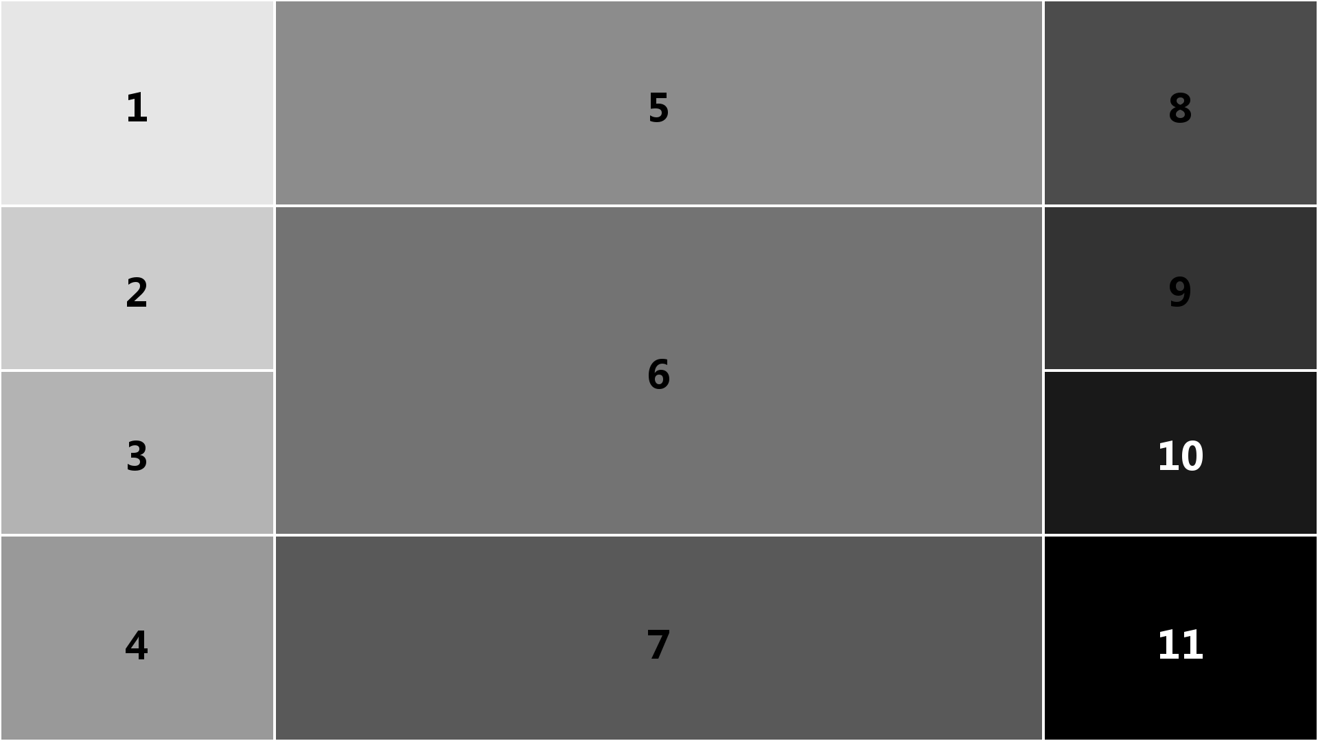
Flexbox grid before applying Google chart to item 6:

Flexbox Layout - Before Google Chart

Flexbox grid after applying Google chart to item 6:

Flexbox Layout - After Google Chart

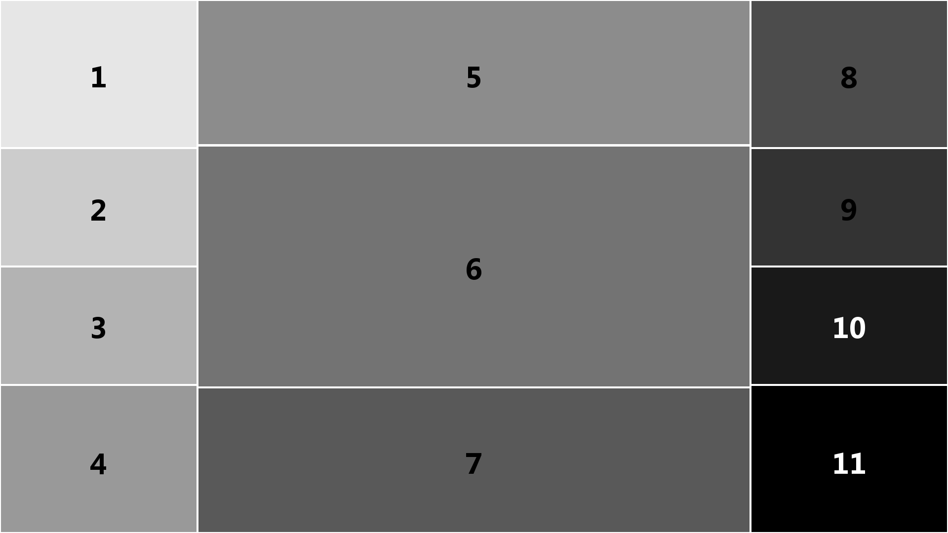
The Flexbox grid loads faster than the Google chart, so the grid originally loads correctly. However when the chart loads, item 6 expands slightly, causing image 2 above.

The middle column flex container and item 6 div are setup in css as follows:

#middlecolumn {
    width: 75%;
    height: 100%;
    display: flex;
    flex-flow: column;
    margin: 0.25%;
}

#item6_div {
    flex: 3;
    margin-top: 0.8vh;
}

Note that items 5 and 7 are setup the same way in css, with flex values of 1. I.e. item 6 is 3 times the height of items 5 and 7. As such, when item 6 resizes, the 3:1 ratio is maintained.

Is there something I'm missing in css to prevent the Google chart from resizing its flexbox container item?

Michael Benjamin
  • 346,931
  • 104
  • 581
  • 701
jars121
  • 1,127
  • 2
  • 20
  • 35

4 Answers4

32

When you tell a flex item to flex: 3 (Item 6) or flex: 1 (Items 5 & 7), here's how that shorthand property breaks down:

flex: ?  =  <flex-grow>, <flex-shrink>, <flex-basis>

flex: 3 =  flex-grow: 3, flex-shrink: 1, flex-basis: 0

flex: 1 =  flex-grow: 1, flex-shrink: 1, flex-basis: 0

In both cases, the flex-shrink factor is 1, meaning the flex item is allowed to shrink proportionally.

To prevent the flex items from shrinking, which may be causing the misalignment, I would change the flex-shrink to 0.

Instead of flex: 3 and flex: 1 try:

flex: 3 0 0;
flex: 1 0 0;

More details in the flexbox spec: 7.1.1. Basic Values of flex


But you may have another problem. You wrote:

Note that items 5 and 7 are setup the same way in css, with flex values of 1. I.e. item 6 is 3 times the height of items 5 and 7. As such, when item 6 resizes, the 3:1 ratio is maintained.

This is not how the flex-grow property works.

By applying flex-grow: 3 to a flex item you are telling it to consume three times more available space than flex items with flex-grow: 1. This does not necessarily mean Item 6 will be three times the size of Items 5 and 7.

Learn more about how flex-grow works here: flex-grow not sizing flex items as expected

As an alternative sizing method, you may want to use the flex-basis property. Try flex: 0 0 60% on Item 6, and flex: 0 0 20% on Items 5 and 7.

Community
  • 1
  • 1
Michael Benjamin
  • 346,931
  • 104
  • 581
  • 701
1

The following solution could be used to keep a column contain all the available space: use the grow and shrink to 0 on other columns, and flex-grow=1 to the full width column, eg (CodePen):

function update() {
  var text =
    "Lorem Ipsum is simply dummy text of the printing and typesetting industry. Lorem Ipsum has been the industry's standard dummy text ever since the 1500s.";
  document.querySelector(".three").innerHTML = text;
}
.container > div:not(.three) {
  flex-grow: 0;
  flex-shrink: 0;
}

.one { width: 10%; }    
.two { width: 200px; }    

.three { flex-grow: 1; }

.four { width: 200px; }    
.five { width: 10%; }

html,
body {
  margin: 0;
  padding: 0;
  height: 100%;
}

.container {
  background: tomato;
  display: flex;
  height: 100%;
}

.container > div:nth-child(even) {
  background-color: green;
}

.three { background: yellow; }
<div class="container">
  <div class="one"> one </div>
  <div class="two"> two <br />
    <button onclick="update()">update</button>
  </div>
  <div class="three"> three </div>
  <div class="four"> four </div>
  <div class="five"> five </div>
</div>
serge
  • 13,940
  • 35
  • 121
  • 205
0

I'm sure it's not the best solution but it works for me:

for example, if you have a line of four items that should spread evenly on your entire screen.

add in CSS for each of them:

min-width: 20vw;
aris
  • 409
  • 6
  • 8
0

Apply this css to the part you want to stretch:

flex: 1
slothstronaut
  • 921
  • 1
  • 13
  • 15