I am a bit new when it comes to web development.
I have created a menu but its buttons width are different depending on the browser (Firefox or Chrome)
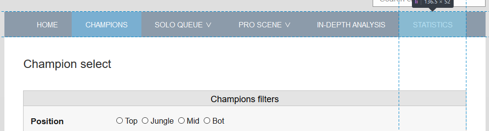
In Firefox, we can see that the end of the last button of the menu is aligned with the div below. We can also appreciate that the width of the button is 136.5px
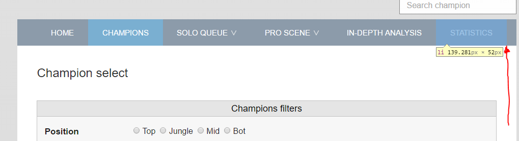
However, in Chrome the fonts are bolder and the menu end is pushed a bit forward. Here, the width of the button is 139.281px
This is the site, the menu is on the top: http://www.metagame.gg/champions/
This is the HTML and the CSS code for the menu
 .navigator {
  margin: 0;
  padding: 0;
  display: flex;
  padding-left: 39px;
  background: #8C9BAA;
 }
 .navigator li {
  display: inline-block;
  position: relative;
  z-index:100;
 }
 .navigator li a {
  text-decoration: none;
  font-size: 15px;
  display: block;
  line-height: 50px;
  padding: 2px 27.75px 0px;
  -webkit-transition: all 0.2s ease-in-out 0s;
  -moz-transition: all 0.2s ease-in-out 0s;
  -o-transition: all 0.2s ease-in-out 0s;
  -ms-transition: all 0.2s ease-in-out 0s;
  transition: all 0.2s ease-in-out 0s;
 }
 .navigator li a:hover, .navigator li:hover > a {
  color:#fff;
  background: #7AAFD1;
 }
 .navigator ul {
  display: none;
  margin: 0;
  padding: 0;
  width: 170px;
  position: absolute;
  left: 0px;
 }
 .navigator ul li {
  display:block;
  float: none;
  background:none;
  margin:0;
  padding:0;
 }
 .navigator ul li a {
  font-size:12px;
  font-weight:bold;
  display:block;
  color:#797979;
  border-left: 3px solid #ffffff;
  background: #fff;
  line-height: 42px;
  transition: 0s;
 }
 .navigator ul li a:hover, .menu ul li:hover > a {
  background:#EFEFEF;
  border-left:3px solid #83BEE4;
  color: #12303D;
 }
 .navigator li:hover > ul {
  display: block;
 }
 .navigator ul ul {
  left: 149px;
  top: 0px;
 }
 #in {
  color:#fff;
  background: #7AAFD1;
 }
 .sub-menu {
  border:1px solid #ddd;
  border-top:0px;
  border-left:0px;
  box-shadow: 3px 5px 5px -5px #3B3B3B;
 }
 .navigatorSecond {
  margin: 0;
  padding: 0;
  display: flex;
  padding-left: 39px;
  background: #d1d1d1 ;
 }
 .navigatorSecond li {
  display: inline-block;
  position: relative;
  z-index:80;
 }
 .navigatorSecond li a {
  font-weight:600;
  text-decoration:none;
  font-size: 13px;
  display:block;
  color:#4a4a4a;
  line-height: 40px;
  padding: 0px 35.3px;
  -webkit-transition: all 0.2s ease-in-out 0s;
  -moz-transition: all 0.2s ease-in-out 0s;
  -o-transition: all 0.2s ease-in-out 0s;
  -ms-transition: all 0.2s ease-in-out 0s;
  transition: all 0.2s ease-in-out 0s;
 }
 #ini {
  color:#fff;
  background: #7AAFD1;
 }
 .navigatorSecond li a:hover, .navigatorSecond li:hover > a {
  color:#fff;
  background: #7AAFD1;
 }
 .navigatorSecond ul {
  display: none;
  margin: 0;
  padding: 0;
  width: 170px;
  position: absolute;
  left: 0px;
 }
 .navigatorSecond ul li  {
  display:block;
  float: none;
  background:none;
  margin:0;
  padding:0;
 }
 .navigatorSecond ul li a  {
  font-size:13px;
  font-weight:bold;
  display:block;
  color:#797979;
  border-left: 3px solid #ffffff;
  background: #fff;
  line-height: 42px;
  transition: 0s;
 }
<div class="menuWrap">
<ul class="navigator">
<li><a href="http://www.metagame.gg/">HOME</a></li>
<li><a href="/champions">CHAMPIONS</a></li>
<li><a href="/soloq">SOLO QUEUE <img class="iconMenu" src="/icon/expandir.png" alt=""/></a>
<ul class="sub-menu">
<li><a href="/soloq">Tier List</a></li>
<li><a href="/soloq/tactics">Basics & Tactics</a></li>
<li><a href="/soloq/psychology">Psychology</a></li>
<li><a href="/soloq/picksandbans">Picks & Bans</a></li>
<li><a href="/soloq/divisions">Division analysis</a></li>
</ul>
</li>
<li><a href="/proscene">PRO SCENE <img class="iconMenu" src="/icon/expandir.png" alt=""/></a>
<ul class="sub-menu">
<li><a href="#">Sub-Menu 1</a></li>
<li><a href="#">Sub-Menu 2</a></li>
<li><a href="#">Sub-Menu 3</a></li>
</ul>
</li>
<li><a href="/analysis">IN-DEPTH ANALYSIS</a></li>
<li><a href="/statistics">STATISTICS</a></li>
</ul>
</div>I think it is because the font is a bit bolder in Chrome and that causes the button width to be higher.
Thanks in advance
