I recently started to explore into the depths of pandas and would like to visualize some time-series data which contains gaps, some of them rather large. an example mydf:
             timestamp       val
0  2016-07-25 00:00:00  0.740442
1  2016-07-25 01:00:00  0.842911
2  2016-07-25 02:00:00 -0.873992
3  2016-07-25 07:00:00 -0.474993
4  2016-07-25 08:00:00 -0.983963
5  2016-07-25 09:00:00  0.597011
6  2016-07-25 10:00:00 -2.043023
7  2016-07-25 12:00:00  0.304668
8  2016-07-25 13:00:00  1.185997
9  2016-07-25 14:00:00  0.920850
10 2016-07-25 15:00:00  0.201423
11 2016-07-25 16:00:00  0.842970
12 2016-07-25 21:00:00  1.061207
13 2016-07-25 22:00:00  0.232180
14 2016-07-25 23:00:00  0.453964
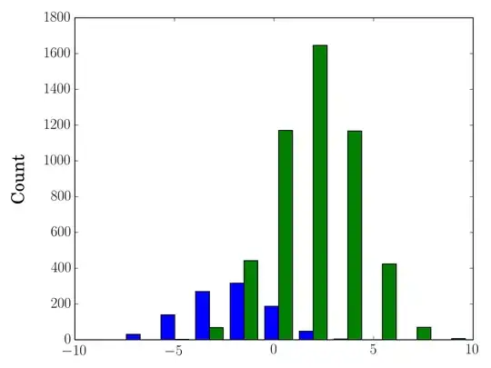
now i could plot my DataFrame through df1.plot(x='timestamp').get_figure().show() and data along the x-axis would be interpolated (appearing as one line):

what i would like to have instead is:
- visible gaps between sections with data
- a consistent gap-width for differing gaps-legths
- perhaps some form of marker in the axis which helps to clarify the fact that some jumps in time are performed.
researching in this matter i've come across
which generally come close to what i'm after but the former approach would yield in simply leaving the gaps out of the plotted figure and the latter in large gaps that i would like to avoid (think of gaps that may even span a few days).
as the second approach may be closer i tried to use my timestamp-column as an index through:
mydf2 = pd.DataFrame(data=list(mydf['val']), index=mydf[0])
which allows me to fill the gaps with NaN through reindexing (wondering if there is a more simple solution to achive this):
mydf3 = mydf2.reindex(pd.date_range('25/7/2016', periods=24, freq='H'))
leading to:
                          val
2016-07-25 00:00:00  0.740442
2016-07-25 01:00:00  0.842911
2016-07-25 02:00:00 -0.873992
2016-07-25 03:00:00       NaN
2016-07-25 04:00:00       NaN
2016-07-25 05:00:00       NaN
2016-07-25 06:00:00       NaN
2016-07-25 07:00:00 -0.474993
2016-07-25 08:00:00 -0.983963
2016-07-25 09:00:00  0.597011
2016-07-25 10:00:00 -2.043023
2016-07-25 11:00:00       NaN
2016-07-25 12:00:00  0.304668
2016-07-25 13:00:00  1.185997
2016-07-25 14:00:00  0.920850
2016-07-25 15:00:00  0.201423
2016-07-25 16:00:00  0.842970
2016-07-25 17:00:00       NaN
2016-07-25 18:00:00       NaN
2016-07-25 19:00:00       NaN
2016-07-25 20:00:00       NaN
2016-07-25 21:00:00  1.061207
2016-07-25 22:00:00  0.232180
2016-07-25 23:00:00  0.453964
from here on i might need to reduce consecutive entries over a certain limit with missing data to a fix number (representing my gap-width) and do something to the index-value of these entries so they are plotted differently but i got lost here i guess as i don't know how to achieve something like that.
while tinkering around i wondered if there might be a more direct and elegant approach and would be thankful if anyone knowing more about this could point me towards the right direction.
thanks for any hints and feedback in advance!
### ADDENDUM ###
After posting my question I've come across another interesting idea postend by Andy Hayden that seems helpful. He's using a column to hold the results of a comparison of the difference with a time-delta. After performing a cumsum() on the int-representation of the boolean results he uses groupby() to cluster entries of each ungapped-series into a DataFrameGroupBy-object.
As this was written some time ago pandas now returns timedelta-objects so the comparison should be done with another timedelta-object like so (based on the mydf from above or on the reindexed df2 after copying its index to a now column through mydf2['timestamp'] = mydf2.index):
from datetime import timedelta
myTD = timedelta(minutes=60)
mydf['nogap'] = mydf['timestamp'].diff() > myTD
mydf['nogap'] = mydf['nogap'].apply(lambda x: 1 if x else 0).cumsum()
## btw.: why not "... .apply(lambda x: int(x)) ..."?
dfg = mydf.groupby('nogap')
We now could iterate over the DataFrameGroup getting the ungapped series and do something with them. My pandas/mathplot-skills are way too immature but could we plot the group-elements into sub-plots? maybe that way the discontinuity along the time-axis could be represented in some way (in form of an interrupted axis-line or such)?
piRSquared's answer already leads to a quite usable result with the only thing kind of missing being a more striking visual feedback along the time-axis that a gap/time-jump has occurred between two values.
Maybe with the grouped Sections the width of the gap-representation could be more configurable?
