-1

I am trying to plot a line graph with several lines in it, one for each group. X axis would be the hour and y axis would be the count. Since there are 3 groups in the dataframe, i will have 3 lines in a single line graph. This is the code I have used but not sure where I am going wrong.

Group      Hour           Count
 G1          1             40
 G2          1             300
 G1          2             400
 G2          2             80
 G3          2             1211

Code used:

fig, ax = plt.subplots()
labels = []
for key, grp in df1.groupby(['Group']):
  ax = grp.plot(ax=ax, kind='line', x='x', y='y', c=key)
  labels.append(key)
lines, _ = ax.get_legend_handles_labels()
ax.legend(lines, labels, loc='best')
plt.show()
user3447653
  • 3,968
  • 12
  • 58
  • 100

1 Answers1

2

You can use df.pivot and save yourself some lines

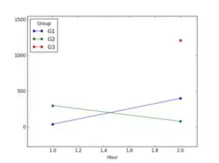
df.pivot('Hour', 'Group', 'Count').plot(kind='line', marker='o')

enter image description here

G3 is plotted as a point because there is only one point (2 hrs, 1211 count) associated with it.

lanery
  • 5,222
  • 3
  • 29
  • 43
  • Is there a way to set the interval range between points in y axis? Like in y axis, I need the numbers to be incremented by 50 starting from 0 – user3447653 Aug 25 '16 at 19:43
  • One way would be to add `yticks=np.arange(0, df['Count'].max(), 50)` as an argument to `plot`. Other methods have been covered in more detail on other stackoverflow posts. Here's one for example, http://stackoverflow.com/questions/12608788/changing-the-tick-frequency-on-x-or-y-axis-in-matplotlib – lanery Aug 25 '16 at 21:02