1

Part-way down my page I have a table with two columns and multiple rows, each containing varying amounts of dynamically generated text.

I would like to float a div (of fixed size) so that it spans as many rows of the second column as may be necessary from the top-right corner, with lines of text wrapping around it as required.

So if, for example, the bottom of the div is half-way down the third row, the text in that row should wrap around the left and bottom edges of the div.

I hope this makes sense. Can anyone please help?
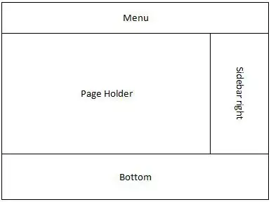
The linked illustration demonstrates what I'd like to achieve

Brian Tompsett - 汤莱恩
  • 5,753
  • 72
  • 57
  • 129
  • Hi Johnnie, here's a clean sample of my code: [link](http://scratchpad.io/abaft-tub-8047) - The div is stretching the table cell downwards instead of overlapping into the next row. – James North Sep 15 '16 at 20:47

1 Answers1

2

I don't believe that would be a correct usage of table element. To solve your problem it will be better to use div or p elements. If you float right the red element, those that follow will wrap around it. If you want to use table you may consider using third column or position absolute div next to the table.

p {
  margin: 0;
  padding: 10px;
}
#wrapper {
  width: 500px;
}
.row {
  position: relative;
  border-top: 2px solid #000;
  border-left: 2px solid #000;
  border-right: 2px solid #000;
}
.row:last-child {
  border-bottom: 2px solid #000;
}
#table p:first-child {
  position: absolute;
  top: 0;
  bottom: 0;
  left: 0;
  width: 20%;
  padding: 2%;
  border-right: 2px solid #000;
}
#table p:nth-child(2) {
  margin: 0 0 0 24%;
  width: 71%;
}
#rightColumn {
  border: 2px solid #000;
  position: relative;
  z-index: 1;
  float: right;
  background: #ff0000;
  width: 20%;
  margin: 0 0 2px 2px;
}
<div id="wrapper">
  <div id="rightColumn">
    <p>text text text text text text text text text text text text text text text text text text text text text text text text text text text text</p>
  </div>
  <div id="table">
    <div class="row">
      <p>text text text</p>
      <p>text text text text text text text text text text text text text text text text text text text text text text text text text text text text text text text text text text text text text text text text text text text text text text text text text
        text text text text text text text text text text text</p>
    </div>
  </div>
</div>
Stoycho Trenchev
  • 557
  • 4
  • 12
  • Hi Stoycho, thanks for your comment. Using divs instead of table cells allows the text to wrap around the floating div as desired, which you can see in this [first link](http://scratchpad.io/hissing-size-1637). However, my code isn't perfect as the text in the "second column" is also wrapping around the left-most div, which is supposed to act as the first column. I've tried to get around this by styling the divs to behave like a table, but you'll see in this [second link](http://scratchpad.io/abrupt-throne-6177) that it works a little too well, replicating my original problem... – James North Sep 15 '16 at 21:19
  • Stoycho, you're a superstar! The code you've edited into your answer is exactly what I need, thank you and kudos! :) – James North Sep 16 '16 at 19:04