34

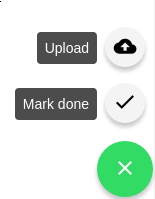
i want to insert a label so that matches every FAB icon on the Fab list whats the correct way of doing it. the way i did it it doesn't work

<ion-fab left middle>
  <button ion-fab color="dark">
    <ion-icon name="arrow-dropup"></ion-icon>
    <ion-label>here</ion-label>
  </button>
  <ion-fab-list side="top">
    <button ion-fab>
      <ion-icon name="logo-facebook"></ion-icon>
      <ion-label>here</ion-label>
    </button>
    <button ion-fab>
      <ion-icon name="logo-twitter"></ion-icon>
    </button>
    <button ion-fab>
      <ion-icon name="logo-vimeo"></ion-icon>
    </button>
    <button ion-fab>
      <ion-icon name="logo-googleplus"></ion-icon>
    </button>
  </ion-fab-list>
</ion-fab>
Muzi Jack
  • 788
  • 1
  • 7
  • 20

9 Answers9

55

For what it's worth, I was able to accomplish what you ask with the following SCSS.

It'd be nice if this was supported directly by Ionic, but I can't find anything indicating this is built-in.

    button[ion-fab] {
        overflow: visible;
        position: relative;

        ion-label {
            position: absolute;
            top: -8px;
            right: 40px;

            color: white;
            background-color: rgba(0,0,0,0.7);
            line-height: 24px;
            padding: 4px 8px;
            border-radius: 4px;
        }
        contain: layout;
    }

enter image description here

Khurshid Ansari
  • 4,638
  • 2
  • 33
  • 52
ross
  • 802
  • 10
  • 13
32

ross solution is great,but in order for it to work on Ionic v2 I had to change the .fab class that comes with Ionic from contain: strict to contain: layout.

This is how the class is originally:

.fab {
    -moz-appearance: none;
    -ms-appearance: none;
    -webkit-appearance: none;
    appearance: none;
    position: relative;
    z-index: 0;
    display: block;
    overflow: hidden;
    width: 56px;
    height: 56px;
    border-radius: 50%;
    font-size: 14px;
    line-height: 56px;
    text-align: center;
    text-overflow: ellipsis;
    text-transform: none;
    white-space: nowrap;
    cursor: pointer;
    transition: background-color, opacity 100ms linear;
    background-clip: padding-box;
    -webkit-font-kerning: none;
    font-kerning: none;
    -webkit-user-select: none;
    -moz-user-select: none;
    -ms-user-select: none;
    user-select: none;
    contain: strict;
}

So, add the following on your page .scss file:

.fab {
    contain: layout;
}

It will overwrite the default .fab class for the page and it will work.

paulovitorjp
  • 538
  • 5
  • 14
16

If you are using ionic 4, this is for you

ion-fab-button[data-desc] {
  position: relative;
}

ion-fab-button[data-desc]::after {
  position: absolute;
  content: attr(data-desc);
  z-index: 1;
  right: 55px;
  bottom: 4px;
  background-color: var(--ion-color-dark);
  padding: 9px;
  border-radius: 15px;
  color: white;
  box-shadow: 0 3px 5px -1px rgba(0,0,0,0.2), 0 6px 10px 0 rgba(0,0,0,0.14), 0 1px 18px 0 rgba(0,0,0,0.12);
}
<ion-fab horizontal="end" vertical="bottom" slot="fixed">
    <ion-fab-button color="primary" class="">
      <ion-icon name="add"></ion-icon>
    </ion-fab-button>
    <ion-fab-list side="top">
      <ion-fab-button color="primary" routerLink="/contacts/create" routerDirection="forward" data-desc="Create Contact">
        <ion-icon name="person-add"></ion-icon>
      </ion-fab-button>
      <ion-fab-button color="primary" >
        <ion-icon name="stats"></ion-icon>
      </ion-fab-button>
      <ion-fab-button color="primary" routerLink="/reminder/create" routerDirection="forward" data-desc="Create Reminder">
        <ion-icon name="alarm"></ion-icon>
      </ion-fab-button>
    </ion-fab-list>
  </ion-fab>
Anjani Barnwal
  • 1,362
  • 1
  • 17
  • 23
  • HI, did you find a way to make it responsive? To have it, always centered below the ion-fab-button? That way, depending of the size of the variable you pass to dat-desc, you have to change the margin from right or left... – jcmendes98 Jan 08 '20 at 09:22
8

I Ionic 4/5 the accepted answer (labels next to icons) doesn't work anymore. You have to use ::after pseudo css styling using a global attribute like item or data-. See the example below:

HTML:

<ion-fab vertical="bottom" horizontal="end">
    <ion-fab-button>
      <ion-icon name="add"></ion-icon>
    </ion-fab-button>
    <ion-fab-list side="top">
      <ion-fab-button (click)="do1()" data-desc="Description 1">
        <ion-icon name="contact"></ion-icon>
      </ion-fab-button>
      <ion-fab-button (click)="do2()" data-desc="Description 2">
        <ion-icon name="person-add"></ion-icon>
      </ion-fab-button>
    </ion-fab-list>
  </ion-fab>

SCSS:

ion-fab-button[data-desc] {
  position: relative;
}

ion-fab-button[data-desc]::after {
  position: absolute;
  content: attr(data-desc);
  z-index: 1;
  right: 55px;
  bottom: 4px;
  background-color: var(--ion-color-primary);
  padding: 9px;
  border-radius: 15px;
  color: white;
  box-shadow: 0 3px 5px -1px rgba(0,0,0,0.2), 0 6px 10px 0 rgba(0,0,0,0.14), 0 1px 18px 0 rgba(0,0,0,0.12);
}

Source: https://forum.ionicframework.com/t/fab-labels-in-ionic-4/139823/6

Saba Ahang
  • 578
  • 9
  • 24
6

enter image description here

Yes, you can achieve like this.

  1. in component.html file.

<ion-fab vertical="bottom" horizontal="end">
      <ion-fab-button color="success">
        <ion-icon name="alert-circle-outline"></ion-icon>
      </ion-fab-button>
      <ion-fab-list side="top">
        <ion-fab-button (click)="callFunction()" data-desc="Sales" color="success">
          <ion-icon name="cart-outline"></ion-icon>
        </ion-fab-button>
        <ion-fab-button (click)="callFunction()" data-desc="Payment" color="success">
          <ion-icon name="cash-outline"></ion-icon>
        </ion-fab-button>
        <ion-fab-button (click)="callFunction()" data-desc="Edit" color="danger">
          <ion-icon name="create-outline"></ion-icon>
        </ion-fab-button>
      </ion-fab-list>
    </ion-fab>
  1. in component.css file..
ion-fab-button[data-desc] {
    position: relative;
}

ion-fab-button[data-desc]::after {
    position: absolute;
    content: attr(data-desc);
    z-index: 1;
    right: 50px;
    bottom: 7px;
    color: var(--ion-color-contrast, #fff);
    background-color: var(--ion-color-base, #fff);
    padding: 5px 10px;
    border-radius: 10px;
    box-shadow: 0 3px 5px -1px rgba(0, 0, 0, 0.2), 0 6px 10px 0 rgba(0, 0, 0, 0.14), 0 1px 18px 0 rgba(0, 0, 0, 0.12);
}
Rohit Tagadiya
  • 3,373
  • 1
  • 25
  • 25
4

Update for Ionic versions 6+ with shadow DOM and ::part selector :

ion-fab-list ion-fab-button {
    overflow: visible;
    position: relative;
    contain: layout;
}
ion-fab-list ion-fab-button ion-label {
    position: absolute;
    right: 50px;
    color: var(--color);
    background: var(--background);
    line-height: 1rem;
    padding: 4px 8px;
    border-radius: 8px;
    box-shadow: var(--box-shadow);
    height: 40px;
    width: max-content;
    display: flex;
    align-items: center;
}
ion-fab-list ion-fab-button::part(native) {
    contain: initial;
    overflow: visible;
}
Alexis Deprez
  • 550
  • 2
  • 12
1
<ion-fab horizontal="end" vertical="bottom" size='small'>
  <ion-fab-button>
    <ion-icon name="md-arrow-dropup"></ion-icon>
  </ion-fab-button>
  <ion-fab-list side="top">
    <ion-item
      style="position: absolute; margin: auto; border: 1px solid; right: 20px; border-radius: 30px; he`ight: 38px;">
      <ion-icon style=" margin-top: 0px;" slot="end" src='assets/icon/lock.svg'></ion-icon>
      <ion-label style=" margin-top: 0px;">Log out</ion-label>
    </ion-item>
  </ion-fab-list>
</ion-fab>

ion-fab with label and icon (Preview):

enter image description here

Tomislav Stankovic
  • 3,080
  • 17
  • 35
  • 42
Azhar Ali
  • 1,961
  • 3
  • 13
  • 24
1

I use that way for works with translations and bootstrap

    <ion-fab horizontal="start" vertical="bottom" slot="fixed">
    <ion-fab-button color="secondary" class="">
        <ion-icon name="add"></ion-icon>
    </ion-fab-button>
    <ion-fab-list side="top">
        <ion-button color="success" (click)="callFunction()" style="text-transform:none">
            <ion-label class="fw-bold">{{'fab-nonstop' | translate }} </ion-label>
            <ion-icon name="airplane" class="ms-1"></ion-icon>
        </ion-button>
        <ion-button color="warning" (click)="callFunction()" style="text-transform:none">
            <ion-label class="fw-bold">{{'fab-stop' | translate }} </ion-label>
            <ion-icon name="car" class="ms-1"></ion-icon>
        </ion-button>
    </ion-fab-list>
</ion-fab>

This is the result:

results

0

The chosen answer seemed to work most of the time, but in some iOS devices it was not picking up the contain: layout; setting, making the label not align. I didn't need my label as part of the clickable button, so my FAB label addition is below which works on iOS. Fairly simple.

HTML

<ion-fab top right edge>
    <button ion-fab color="primary">
        <ion-icon name="add"></ion-icon>
    </button>
    <ion-label>Scan</ion-label>
</ion-fab>

CSS

ion-fab ion-label {
    font-weight: bold;
    color: color($colors, primary, base);
    text-align: center;
    margin: 0px !important;
}
BRass
  • 3,698
  • 2
  • 28
  • 46
  • This way, label do not get align in center below the fab button. For example, if the width of the button is 30px, and the "text" on the label is bigger than that, it will align to the left. Do you know a way to have it center, independent on the size of the label? – jcmendes98 Jan 08 '20 at 09:12