12

I wish to have a div section that fills its div parent as much as possible while maintaining a ratio.

the render result would be like this :

enter image description here

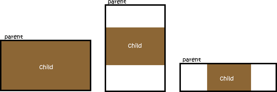
What I do have so far :

html,
body {
  height: 100%;
}

.parent {
  /* Parent's height and width are unknown,
     it could be dynamic, e.g. parent is part of a flex layout. */
  height: 80%;
  width: 90%;
  border-style: solid;
  border-width: 2px;
  border-color: black;
}

.child {
  width: 90vw;
  /* 90% of viewport vidth */
  height: 50.625vw;
  /* ratio = 9/16 * 90 = 50.625 */
  max-height: 90vh;
  max-width: 160vh;
  /* 16/9 * 90 = 160 */
  margin: auto;
  position: absolute;
  top: 0;
  bottom: 0;
  left: 0;
  right: 0;
  background: #A0522D;
}
<div class="parent">
  <div class="child">
    content that is not images...
  </div>
</div>

This css behaves like the way I want BUT this is using the viewport instead of the parent div which is a problem in real conditions.

I am looking for a way to fill based on the parent div.

  • Instead of using 90vw use 90%, or whatever percent(%) you need. Do note that 50.625% also works. – Krik Oct 25 '16 at 23:10
  • using 90% & 50.625% makes the child div to just follow the parent without keeping its ratio. – Joris La Cancellera Oct 26 '16 at 01:16
  • Try changing "child" `position: relative;` and remove top, bottom, left, and right positioning. With margin you may want to remove it as well, unless you need horizontal centering, then use `margin 0 auto;` I have some test code right now with the parent div at 40% and the child div at 80% and it works, and I have tried several different percentages for each. And other than these changes there is no other difference. – Krik Oct 26 '16 at 01:41
  • I could not manage to make your suggestion; the child div follows the width of the parent so I does break the child ratio contraint I want to have. – Joris La Cancellera Oct 26 '16 at 08:32
  • I think I need to say that, if you want to have a browser independent solution for this exact behavior, sooner or later, you are going to have to resolve to deploying a JavaScript solution. This is a cross-referential double unknown equation problem which will cause some headache to finalize, even if you resolve to using a script solution for the job. – Bekim Bacaj May 17 '21 at 17:54
  • @JorisLaCancellera Just apply position: relative to .parent then you can use % in .child dimensions. I did the same and it worked. – ac_mmi May 18 '21 at 12:40
  • It was not said, but I was suggesting a situation where the parent element was a flexbox. What you propose would be conflicting right ? – Joris La Cancellera May 19 '21 at 09:26
  • @JorisLaCancellera I thought you wanted the `.child` class's dimension should assign measurement with respect to `.parent` class – ac_mmi May 19 '21 at 11:48
  • 1
    related: https://stackoverflow.com/a/65864592/8620333 – Temani Afif May 19 '21 at 12:31
  • Thanks @TemaniAfif, same output as me, using viewport as workaround – Joris La Cancellera May 20 '21 at 12:02

4 Answers4

10

Using aspect-ratio: 16 / 9; overflow: hidden; (aspect-ratio MDN docs) should give you the exact result you're looking for without needing to use the padding trick. Make sure the parent is set to display: grid or else it may not scale properly.

The aspect-ratio CSS property is supported by all major browsers (caniuse.com) except Safari, though Safari plans to add support this year. This is the best/correct way to achieve this effect, without having to resort to JavaScript or any hack solutions.

Related questions and answers here on Stack Overflow:

Here is my solution in action:

html, body { height: 100%; }

.parent {
  display: grid;
  resize: both;
  height: 50%;
  width: 90%;
  border: 2px solid #000;
  overflow: hidden;
}

.child {
  width: 100%;
  max-height: 100%;
  margin: auto;
  aspect-ratio: 16 / 9;
  overflow: hidden;
  box-sizing: border-box;
  position: relative;
  background: #a0522d;
  text-align: center;
  font-size: 20px;
  color: white;
  /* using the below to center the text, optional */
  display: flex;
  align-items: center;
  justify-content: center;
}
<div style="padding: 5px 10px; margin-bottom: 10px; background: #f00; color: #fff; text-align: center; z-index: 1;">Resize the block below using the resize controls to see this in action.</div>
<div class="parent">
  <div class="child">content that is not images...</div>
</div>
Brandon McConnell
  • 5,776
  • 1
  • 20
  • 36
  • 1
    @QuentinRoy I've just posted my solution which I believe does exactly what you're looking for. Please take a look when you have a chance. The aspect-ratio CSS property is supported by all major browsers except Safari, though Safari plans to add support this year. This is the best way to achieve this effect, without having to resort to JavaScript or any hack solutions. – Brandon McConnell May 19 '21 at 18:35
  • 1
    Thank you! I did not know about the aspect-ratio property. Unfortunately I cannot use it because Safari, but I cannot wait for it to be widespread. I believe this is the only way. – Quentin Roy May 24 '21 at 15:07
  • @QuentinRoy yes, I'm excited about that too. Should be this year hopefully. – Brandon McConnell May 24 '21 at 18:12
  • This answer doesn't produce [the behavior requested in the question](https://i.stack.imgur.com/ZA2N4.png). When the parent is wide, the brown area should not stretch to the full width, it should maintain its aspect ratio. – mrossman Oct 05 '21 at 23:59
  • @mrossman It does not stretch to fill the parent. It maintains the aspect ratio correctly in all cases. What browser and version are you using? – Brandon McConnell Oct 06 '21 at 01:08
  • 1
    @BrandonMcConnell In Firefox 93 it [looks like this](https://i.imgur.com/MQkJ0FL.png) when I click "Run code snippet". However, I just tried it in Edge and it appeared correctly there. According to MDN, Firefox fully supports `aspect-ratio` as of version 89 so I'm not sure why the disparity. – mrossman Oct 06 '21 at 20:03
  • @BrandonMcConnell Thanks for `aspect-ratio` input is great.@mrossman experience the same issue. Did you resolve this? – Kaan Dec 06 '21 at 14:17
  • 1
    Seems that the `overflow: hidden` trick doesn't work anymore (Safari, Firefox, Chrome v103+). – tavoyne Jun 25 '22 at 14:46
0

Use flexbox and padding. Use media queries to determine if the min-aspect-ratio of the viewport. Then adjust accordingly.

html,
body {
  height: 100%;
}

.parent {
  height: 100%;
  width: 100%;
  border-style: solid;
  border-width: 2px;
  border-color: black;
  /* to center */
  display: flex;
  align-items: center;
  justify-content: center;
}

.child {
  width: 100vw;
  /* 16:9 aspect ratio = 9 / 16 = 0.5625 = padding-bottom*/
  padding-bottom: 56.25%;
  background: #A0522D;
}

@media (min-aspect-ratio: 16/9) {
  .child {
    height: 100vh;
    /*16:9 aspect ratio = 9 / 16 = 177.77 = width*/
    width: 177.77vh;
    padding: 0;
    margin: 0px;
    background: red;
  }
}
<div class="parent">
  <!-- the viewbox will provide the desired aspect ratio -->
  <div class="child">
    content that is not images...
  </div>
</div>

Here's a fiddle.

Prosy Arceno
  • 2,616
  • 1
  • 8
  • 32
  • Thank you! This is a good trick. However, children only adapts to width, not height. Adjusting to both width and height is the tricky part I am not able to solve without JS. – Quentin Roy May 16 '21 at 16:19
  • @QuentinRoy, how about this? I used media queries to check the viewport's aspect ratio. It adjusts to the height when the ratio is at least 16:9. No javascript required. – Prosy Arceno May 16 '21 at 18:03
  • Thanks! But now the child depends on the viewport. What if the parent isn't the size of the body? What if it is just any other component of the page? E.g., if it is part of a flex layout (c.f. the example), then its size will often depend on its siblings.. – Quentin Roy May 16 '21 at 18:07
  • @QuentinRoy, so i guess you already solved this via js. What kind of solution are you exactly looking for? – Prosy Arceno May 17 '21 at 01:42
  • @QuentinRoy I assigned position relative to parent container that would position the child element absolute relative to the parent i did the same and it worked you can see the code. – ac_mmi May 18 '21 at 13:32
0

maybe add position absolute and it works, by setting top, right ,bottom,left to 0 with margin auto. you could as well use flex to center it or absolute with left 50% and transform -50% too.

body {
            padding: 0;
            margin: 0;
            height: 100vh;
            width: 100vh;
           

        }

        .child {
            width: 90vw;
            /* 90% of viewport vidth */
            height: 50.625vw;
            max-height: 90vh;
            max-width: 160vh;
            /* Adding this maybe min-width and min-height */
            min-height: 90vh;
            min-width: 160vh;
            
            /* 16/9 * 90 = 160 */
            background: #f7f7f7;
            box-shadow: 0px 5px 30px 0px rgba(0, 0, 0, 0.18);
            border-radius: 4px;
            margin: auto;
            position: absolute;
            top: 0;
            left: 0;
            right: 0;
            bottom: 0;
        }
<!DOCTYPE html>
<html lang="en">

<head>
    <meta charset="UTF-8">
    <meta http-equiv="X-UA-Compatible" content="IE=edge">
    <meta name="viewport" content="width=device-width, initial-scale=1.0">
    <title>Parent Child</title>
</head>

<body>  <!-- parent -->
    <div class="child"></div>
</body>

</html>
  • This is nice, but the children does not depend on the parent's size, but the viewport's. – Quentin Roy May 16 '21 at 16:15
  • thx , didn't get what you want to do exactly, but the parent take all the viewport, now the children gonna get limited with max-width and max-height, you can set max width/height to the parent with pixel as well. – Younes Keraressi May 16 '21 at 16:24
  • 1
    Yes, but but my problem is that often you have no control on the parent's dimensions. In my case parent is part of a flex layout. – Quentin Roy May 16 '21 at 16:28
  • Yeah, got you but not 100%, you can use calc as well, if u can provide an example like u did with images and some numbers it will be really helpful, the parent can be limited with it (max, min) height and width. – Younes Keraressi May 16 '21 at 16:34
  • I have no control over the parent's size. I cannot limit its dimensions, and I cannot know its size as a function of the viewport, because it also depends on what other elements are in the page. – Quentin Roy May 16 '21 at 16:37
  • Yeah thats true, is there a sample code that you can provide to see what's the problem exactly to solve it. – Younes Keraressi May 16 '21 at 16:43
  • The example provided by Joris is great. We just need to acknowledge parent's dimensions could be anything. – Quentin Roy May 16 '21 at 16:44
  • 1
    Joris drawings perfectly illustrate what we are looking for. – Quentin Roy May 16 '21 at 16:45
  • by adding min-width and min-height to children, children gonna force it size on whatever parent getting small, other then this couldn't get you. – Younes Keraressi May 16 '21 at 16:58
  • The problem is to make the child fit the parent, not the other way around. – Quentin Roy May 16 '21 at 16:59
  • At the moment of questioning this, it was for a webGL canvas that were taking 80% of the viewport anyway; So I kept using the viewport. I couldn't use javascript either as Unity WebGL canvas are (were ?) terrible at resizing. – Joris La Cancellera May 19 '21 at 09:14
  • Crazy that this seems still tricky 4 years later :) I suspect I raised the question in a wrong way. – Joris La Cancellera May 19 '21 at 09:20
0

So as to make child's dimensions dependent on parent container set position:relative of the parent container.

Normally when we make an element position:absolute it is positioned relative to initial containing block(i.e the <body>) unless any other closest parent container is given a position other than static(which is by default).So, by giving relative position to parent container we positioned .child element relative to .parent which was earlier positioned relative to the document or body.

This will work for you

html,
body {
  height: 100%;
}

.parent {
  /* Parent's height and width are unknown,
     it could be dynamic, e.g. parent is part of a flex layout. */
  position:relative;
  height: 80%;
  width: 90%;
  border-style: solid;
  border-width: 2px;
  border-color: black;
}

.child {
  width: 90%;
  /* 90% of viewport vidth */
  height: 50.625%;
  /* ratio = 9/16 * 90 = 50.625 */
  max-height: 90%;
  max-width: 160%;
  /* 16/9 * 90 = 160 */
  margin: auto;
  position: absolute;
  top: 0;
  bottom: 0;
  left: 0;
  right: 0;
  background: #A0522D;
}
<div class="parent">
  <div class="child">
    content that is not images...
  </div>
</div>
ac_mmi
  • 2,302
  • 1
  • 5
  • 14